Hey there,
In Today’s Email:
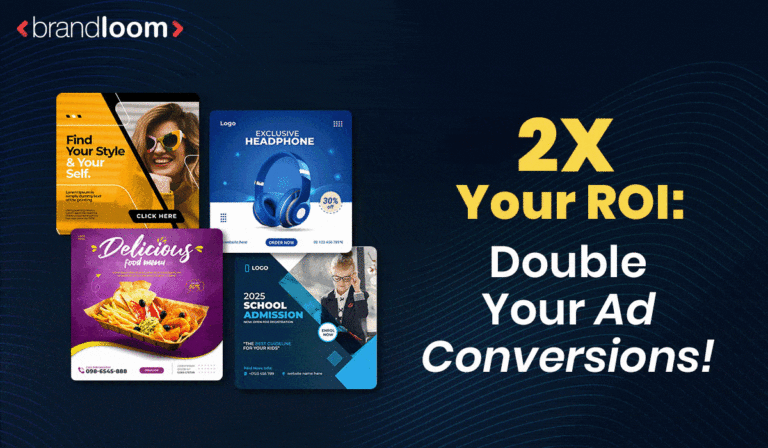
💰 2X Your ROI: This One Change Can Double Your Ad Conversions!
📲 3 Website Speed Hacks: Get Instant Load Times!
🧠 Discover How The ‘Pepsi Challenge’ Flipped Coca-Cola Loyalties!
🤯 Learn How To Craft Unforgettable Messaging From Amul!
💰 2X Your ROI: This One Change Can Double Your Ad Conversions!
After running hundreds of paid adverts for hundreds of businesses, here is what we learned at BrandLoom –
When we changed our advert CTA’s, we easily doubled, and sometimes even 5X’d our conversion rates!
Industry research also backs us up.
A recent survey found that Ads with engaging and unique CTA’s may receive up to 9x times higher conversion rates. 🚀
Moreover, CTAs can get your Ads receive a whopping 285% higher click-through rate which is MASSIVE. 📈
If your ads are not seeing conversions, try using UNIQUE and ENTICING CTAs on your landing page. 💥
Here’s how you can get your CTA’s right:
1. Use Action Words:
Use Action-Oriented, Benefit-Focused Language. Readers are more likely to take action if they know exactly what to expect and what’s in it for them.
Your CTA should clearly express a direct action and highlight a benefit.
Use active verbs like “Unlock,” “Grab,” or “Explore” to pique the interest of your audience in the right direction. 🌟
Takeaway: Transform your CTA into a command, not a mere suggestion..
2. Add A Value Proposition:
A good Call to Action (CTA) is built on a strong value proposition. Users are promised something in exchange for doing the required activity. Furthermore, a true value proposition creates relevance and trust, which motivates people to interact and buy. 💡
For instance, the clever value proposition from Dropbox, “Simplify your life. Work smarter, not harder,” clearly explains the advantages and solutions. Users who want to manage their files effectively will find this useful. ✅
Takeaway: Craft your CTA with an irresistible value proposition that directly addresses consumers’ needs and pain points. 🌈
3. Add Urgency & Scarcity, When Appropriate:
Including a feeling of scarcity and urgency in your Call to Action (CTA) may significantly increase conversion rates. This tactic plays on customers’ fear of missing out (FOMO), pushing them to buy immediately. ⏰
Amazon’s “Lightning Deals,” which provide limited-time goods discounts, is a good example of this a tactic at play.⚡
Takeaway: Incorporate phrases like “Limited Time Offer” and “Limited Stock Available” into your CTAs and a visual countdown or real-time quantity updates. 🕒
Some Examples:
1. Weak CTA: “Submit.”
Good CTA: “Get My Free eBook Now.”
Magnetic CTA: “Download Free 2X Traffic Formula.”
2. Weak CTA: “Join Now”
Good CTA: “Join Our Weight Loss Program.”
Magnetic CTA: “Drop A Dress Size in 4 Weeks.”
Of course, it’s important to back up your words.
So don’t overpromise. Only claim what you CAN deliver.
Low click-through rates? Let’s discuss. 💬
https://www.brandloom.com/lead-generation-services
📲 3 Website Speed Hacks: Get Instant Load Times!
In 2020, an SEO software company was experiencing a significant decline in conversions and traffic on its website. 😟
Upon further investigation, we realized that the low loading speeds were causing their target audience to abandon their site entirely. ⏳
The website had a loading time of 5 seconds which doesn’t seem like a big deal. However, the data showed that a one-second delay was causing the page to lose 7% of its conversions. 📉
The company immediately took the precautionary measures we suggested to resolve the issue and improved its organic traffic by 52%. 👍
Moreover, their website began to load in just 3 seconds which was a massive improvement.
This is a classic example of how slow loading speeds can cause your website to underperform. 😩
Moreover, it can lead to poor user engagement, low conversions, and overall poor business performance. 📊
Here are 3 unconventional speed hacks to improve your website’s loading time: 💨
1. Use Optimized Image Sizes
Optimizing image sizes is crucial for improving website speed. Large image files can significantly slow down page load times. By reducing the file size without compromising image quality, you can enhance user experience.
Example: You can use image compression tools like TinyPNG or JPEGmini to compress images before uploading them to your website. Additionally, consider using responsive images that adapt to different screen sizes, ensuring that users only download the necessary image data.
Takeaway: Optimizing image sizes not only improves website speed but also reduces bandwidth usage, benefiting both your website’s performance and your users’ experience..👍
2. Swap Fonts Wisely:
Fonts give your website its appearance but may also slow it down. Assume you’re reading a book; you’d begin with standard text and then look for any unusual fonts or styles. Make the ordinary text show rapidly while the fancy fonts load in the background using a technique.🔄
Example: Think of a food blog where the directions and recipes are written in a straightforward typeface that is simple to read. The ornamental handwriting-style font for the titles and headers then appears when the page settles.
Takeaway: Before swapping to the elegant font, you should present the fundamental text first. This way, visitors can read the content while the fonts catch up. 📝
3. Load More, When Needed:
Imagine your website as a magic book with more pages than you can read. Instead of loading everything at once, prioritize the most critical content first and add more as visitors scroll or click, allowing them to explore without waiting for everything to load.⏳
Example: As you scroll down the page of an online shop, more product possibilities become available. You do not need to wait for all of the objects to load before you can begin exploring.
Takeaway: Always prioritize loading essential elements first on the site. You can later on use clever techniques such as dropdowns to introduce additional content for the users to interact with. This ensures a smooth and fluid browsing experience. 📲
Want better website performance? Let’s talk. 💪
https://www.brandloom.com/web-development-services
Fun Fact About Us
82% of BrandLoom clients see an uptick of at least 20% in their revenue after the implementation of BrandLoom’s strategies.
🧠 Discover How The ‘Pepsi Challenge’ Flipped Coca-Cola Loyalties!
In the late 1970s, Pepsi ran a ‘Pepsi Challenge’ campaign, which attracted millions of participants from all over the world to be part of it. 🌍
Shoppers in malls, attendees at events, and pedestrians on the streets all participated in this massive challenge undertaken by Pepsi. 🛍️
According to the report, 50% of the participants chose Pepsi over Coca-Cola during the blind test. 📊
Moreover, the result demonstrated that there was a significant shift in market share. 📈
So, what was the secret to Pepsi’s success? 🤔
Well, the answer lies in Cognitive Dissonance. 🧠
Cognitive dissonance is when our thoughts and actions don’t match, making us feel uncomfortable. It’s like wanting to be healthy but eating junk food – it’s a mental clash. 🥗🤯
Example: Assume you’re attempting to conserve money, but you purchase pricey coffee daily. This causes cognitive dissonance since your desire to conserve money contradicts your behavior of spending money on expensive beverages. ☕❌
It’s unsettling because your ideas and actions don’t match. 😣
Using this psychological marketing approach, Pepsi turned the table around. 🔄
People who had previously vowed loyalty to rival cola companies began gravitating toward Pepsi. This was a typical example of cognitive dissonance, which occurs when our beliefs do not match our reality. 🔄
The challenge caused a schism between their perceptions of what they liked and what their taste senses informed them. 🧠
Pepsi had effectively placed a seed of mistrust in the minds of Coca-Cola enthusiasts. The “Pepsi Challenge” revealed a contradiction, leading cola fans to contemplate their cola preferences. 🌱
Key Takeaways:
- Challenge Beliefs: Question consumer assumptions to pique their interest. ❓
- Engage Senses: Use sensory experiences (such as taste) to cause cognitive dissonance. 🧠
- User Involvement: Make customers active participants for a lasting impression. 👥
- Embrace pain: Use pain to elicit a shift in preferences. 😖
- Highlight Benefits: Showcase unexpected outcomes to influence perspective successfully. 🌟
- Cultural Impact: Create campaigns that speak to the cultural moment. 🌍
Want to build a strong and successful brand? Let’s have a discussion! 💬
https://www.brandloom.com/strategic-branding/consultants
🤯 Learn How To Craft Unforgettable Messaging : From Amul!

Amul’s Billboard campaign, also known as the “Amul Butter Girl” Campaign, is one of India’s longest-running outdoor advertising campaigns. 🎯
But did you know that Amul’s billboards marketing campaign isn’t as simple as it may seem? 🤯
Amul’s billboards frequently cover movies, sports, social matters, politics, and pop culture issues. 🎬🏀🗳️
Apart from using humor, Amul’s billboards would often use subtle yet impactful social commentary. 💬
As a result, they were able to resonate with millions of people all across India. 🇮🇳
So, what was so unique about their billboards? 🤔
Well, there are two key aspects to all the Amul girl billboards:
1. Timely connection to current national events (e.g., cricket matches, politics)
2. Infused with playful and clever humor, always tongue-in-cheek
A classic Amul Billboard example is “Can’t say Naa tu an Osca RRR.”
Naatu Naatu winning an Oscar was a historic moment for India. It marked the first time that an Indian production brought home the prestigious award.
The film’s success was celebrated by many, including the iconic Amul girl, who cleverly expressed her joy by saying, “Can’t say Naa tu an Osca RRR.” 🏆
This phrase playfully captures the excitement and pride felt by the nation for this remarkable achievement. 😊
And as usual, the campaign was a hit. 💡
Similarly, the “Swach Bharat Abhi Yahaa!” was another great billboard campaign hit!🧹
This eye-catching display aimed to raise awareness about the significance of cleanliness and hygiene.
And it became a major hit! 👊
So what’s the secret recipe to Amul’s hit ads?
- Embrace Relatable Moments: Even giants stumble; being relatable makes your brand charming for the audiences. 🙌
- Relatable Wit Wins: Witty takes to build instant rapport. ✅
- Real-time Relevance: Timely responses show agility and relevance. ⏰
- Amplify Authenticity: Small missteps amplify genuine connections. 🔍
If you want to keep your audiences hooked, leave it to our pros to do the heavy lifting. 🏗️
www.brandloom.com
That’s it for today, thanks for reading.
Yours Sincerely,

Avinash Chandra
Founder,BrandLoom
☎︎ +91-7669647020
✉️ care@brandloom.com
💻 – https://team.brandloom.com/book-a-meeting
Note: If you want to discuss strategy, just hit reply on this mail.

