Hi there,
Today I am going to talk about the kind of mistake that ALL businesses make to some degree or the other.
This mistake even looks like a success!
But only on the surface — in reality, it is slowly draining your money every single day.
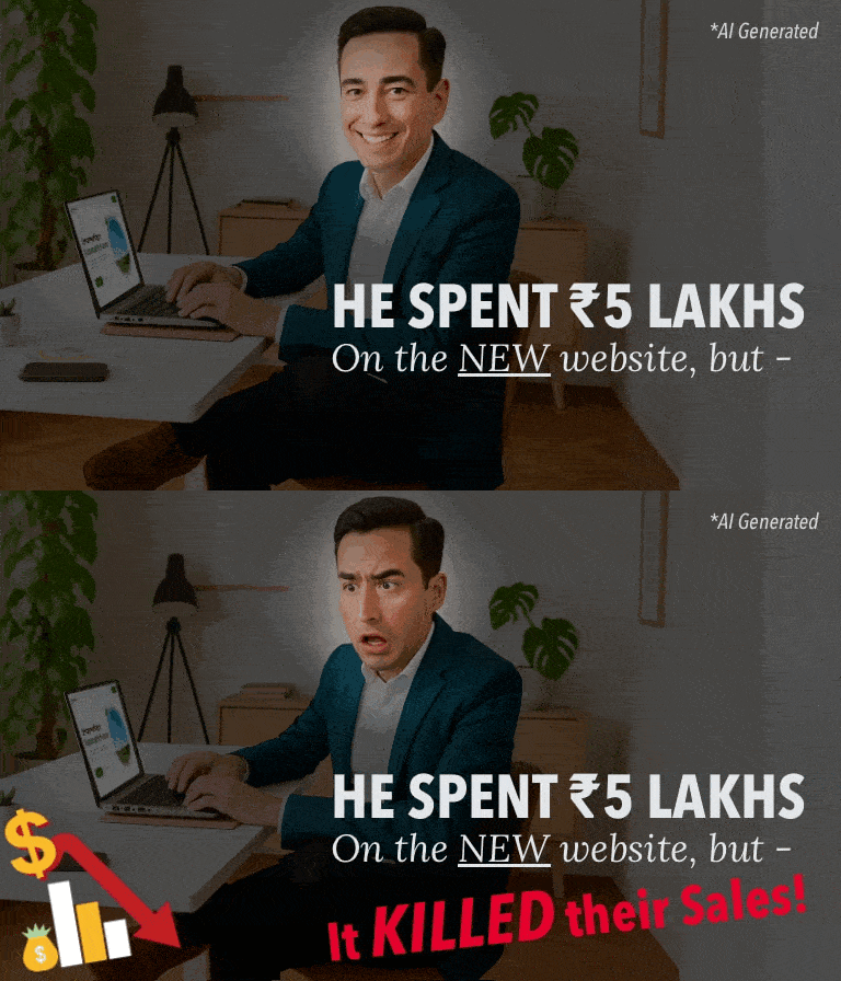
A friend of mine, also a founder, pinged me on Zoom. His brand had just launched their new website. “We spent a little over 5 lakhs on this,” he said, grinning. “Wait till you see it.”
He shared his screen.

And I’ll be honest — the website looked stunning. Great colors, crisp visuals, custom photoshoot. Pages loaded fast too. It had that high-end D2C polish — the kind that makes investors nod & designers beam.
But something was off.
So I asked the simplest question I could: “How are sales?”
He hesitated. Smiled politely. And then, after a pause, admitted: “Honestly? Not good. Traffic’s okay. People are clicking through from ads, but sales are less than our expectations. We are still figuring that out”
Then I asked him the question that most design teams don’t ask: “Was this site built to impress people… or to convert them?”
He didn’t answer immediately. And to be fair, I didn’t expect him to.
It’s the same silence I’ve seen in boardrooms, in founder meetups, in review calls. Because somewhere along the way, someone has convinced us that if a website looks beautiful, it must work.
But the truth is — design isn’t the destination. It’s only the vehicle, and this one was stalling. . .
So we ran a quick audit, and the gaps were obvious.
There was no clear value proposition above the fold — just a big, beautiful image of a model with a vague tagline. The calls-to-action were passive. “Learn more.” “Discover now.”
Harmless words — but that’s the problem. Harmless doesn’t sell.
Harmless is forgettable.
And then there was the layout — cluttered, full of competing elements. A carousel here, a floating badge there, pop-ups layered over drop-downs. Nothing technically wrong. But not helpful to the user in decision making either.
When someone lands on your site, they’re looking for direction — not decoration.
We didn’t suggest a website redesign. We suggested an update and a re-alignment.
Here are some of the common ui-ux and behavioral principles among many others that we used to target conversion:
- The “F-pattern” reading flow
We guided key content (value prop, benefits, CTA) along the natural eye scan path. Visitors didn’t have to hunt for what mattered. It just appeared at the right time.
- Hick’s Law
The more choices you present, the slower people decide. So we trimmed the navigation.
We also removed decision fatigue by keeping just one goal per screen.
Only one prominent next step.
- Visual Anchoring
We placed consistent buttons and messages in expected places so users didn’t have to “learn” the interface as they scrolled.
When you “anchor” CTAs visually in these consistent zones, users don’t have to think — they just act. This reduces cognitive load and increases action.
- Loss Aversion
We reminded visitors not just what they’ll gain by acting, but what they risk losing by ignoring us — like time, money, opportunity, or peace of mind.
- Cognitive fluency
People trust what they understand easily.
So we simplified the language, reduced jargon, and used “mirror phrases” — copy that sounds like how they think.
And we timed every CTA — not just where it appeared, but when in the mental journey it made sense.
We didn’t make the site more “creative.”
We made it more predictable — in all the right ways.
Because conversions aren’t driven by novelty.
They’re driven by clarity. Familiarity. Trust.
Four weeks later, the bounce rate dropped by 28%.
Time on site doubled.
And most importantly the conversions rose by 35%.
Same brand.
Same traffic.
Same budget.
Just a website that was finally doing its job.
The founder who showed me that site? He wasn’t lazy. He wasn’t clueless. He just did what most smart people do — he focused on the visible things: fonts, images, speed. But what really matters is what happens between the pixels. The emotion. The flow. The journey.
And that’s what we fix at BrandLoom.
We build digital experiences that are engineered for decision-making.
We know that behind every scroll is a distracted, skeptical, busy person.
And if you don’t respect their time and psychology, you lose them. No matter how great your product is.
So if your site looks good but doesn’t convert, you need BrandLoom.
Your website shouldn’t just win compliments. It should win customers too.
And if this email made you pause and reflect — you’re already ahead of most.
Let’s make your site catch up too.
Click here to book your free website audit:
https://www.brandloom.com/web-development-services
Because your website should be your best salesperson. Not your most expensive artwork.
P.S. Hope you read my last marketing story: #70 – He spent ₹30L on influencers. And It failed.
That’s it for today, thanks for reading.
Yours Sincerely,

Avinash Chandra
Founder, BrandLoom Consulting
🌐 https://www.brandloom.com/
☎︎ +91-7669647020
📩 care@brandloom.com
💻 https://team.brandloom.com/book-a-meeting
1. Note: If you feel like talking, just hit reply on this mail.
2. Fun Fact: 82% of BrandLoom clients see an uptick of at least 20% in their revenue after the implementation of BrandLoom’s strategies.
BrandLoom Is Regularly Featured In :

Meet Us At:
Gurgaon. Mumbai. Pune. New Delhi. Bangalore. Texas. New York. London.

