Eye Movement Pattern on a Web Page: F-Shape
Several of our clients compare between e-mail interface such as Yahoo & Gmail with commerce interface such as Flipkart & Snapdal, when they start thinking of wireframe for the their web interface. The common questions they ask are:
- Whether to have an horizontal menu or a vertical menu
- Which menu structure will provides their audience good reading experience
Well Nielsen Norman Groups reports that in their eyetracking study they found that the users’ main reading behaviour (represented by Eye Movement Pattern on a web page) was fairly consistent across many of the different type of sites and tasks. So what is eye movement, Wikipaedia defines it as voluntary or involuntary movement of the eyes, helping in acquiring, fixating and tracking visual stimuli.
When we refer to eye-movement patterns on web pages, it refers to the complete paths that the human eye takes while browsing through a web page – from the moment they enter a page to the moment they leave it.
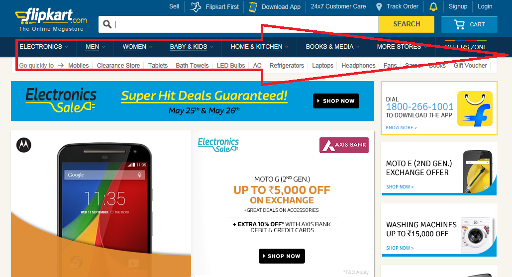
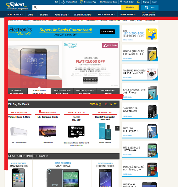
Their dominant reading pattern looked somewhat like an F with the following three key elements:
- Users first read horizontally, which is generally the top menu of the webpage under consideration what it means is that their eyes were tracked to move horizontally and not vertically. This forms the initial element of the “F” pattern. We believe similar is the trend observed by leading E-Commerce players like Flipkart and Snapdeal. We also believe that having the top horizontal menu provides them sufficient space for drop-down menu options to feature in. Generally when consumers come to an e-commerce site they already know what they are looking for, therefore e-commerce sites also provide search bar just above the top horizontal menu.

- Next, readers move down the page and then read across in a second horizontal movement which is generally shorter than the movement on the top of the page. This eye movement forms the second horizontal movement of F shape pattern. You will find that e-commerce players put a second row of links in the form of shorter menu, see the attached snap from Flipkart.

- The third eye movement happens on the left vertical side of webpage, which form the third element of “F” shape pattern.

Please note that this is a rough patterns witnessed during the eyetracking study by Nielsen Norman and may not resemble several other eye movements.

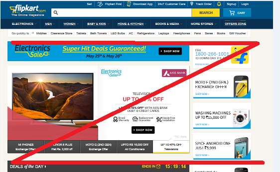
Sometimes users brows a page in Z pattern rather then F pattern, though it is quite similar to F pattern.

Eye movement pattern on a web page are mostly overlooked by web designers. Web designers today wants to make a prettier looking website. Most often web-designers and marketers do not see eye to eye and the business objectives are ignored. Web designers want to put the most complex graphics and animations, background images, drop shadows etc, As if they are going through an exam. The onus of taking benefit of this scientific study is on marketers.


I particularly enjoy the information you have on your webpage it extremely has helped me out a great deal thanks
For example, you might have a very clean homepage that utilizes the Z pattern; however, when the user delves deeper into the site, you might present much more data and use an F pattern instead.