
Off late everyone is talking about mobile and designing mobile website. Internet is enabling business to enhance effectiveness of their commerce and consumer engagement activities. Your web interface is the first step when your brands connects with consumer today. Experts believe that by early 2016, the majority of internet traffic will be driven by mobile devices. If you are a startup, brand or retailer do not wait till then as your competitor is already up and running with a mobile ready website. However there is more to just having a mobile web presence, try to build a website which is designed for a good mobile experience i.e. mobile optimised website.
Mobile Optimization simply means that your website provides a compelling user experience for whatever device and network your site visitors and or a machine, like a search engine, may be using to view your site. It might be coming from a smartphones, cheap feature phone, tablets, desktops, laptops, Smart TV’s, smart watches, or any number of different screens.
Three Configuration for Designing Mobile Website
As per Google, they recognise three different configurations for designing mobile website.
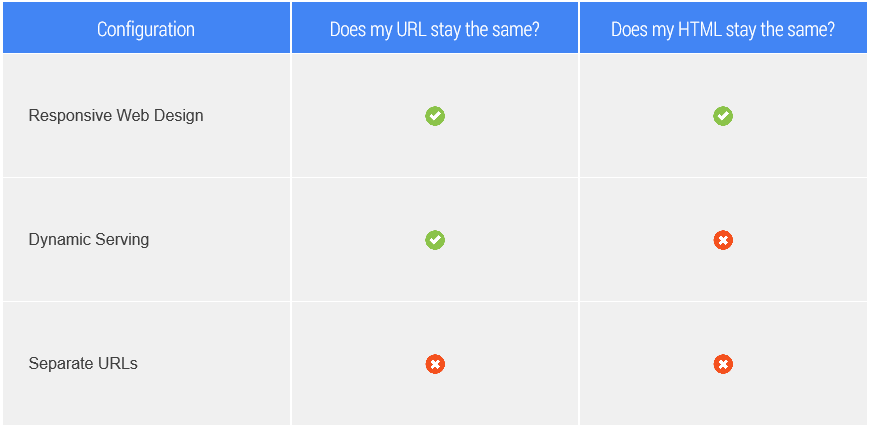
- Responsive web design: These websites uses the same HTML code on the same URL regardless of the users’ device (desktop, tablet, mobile, non-visual browser, TV, smartwatch), but can render the display differently based on the screen size. Responsive design is Google’s recommended design pattern.
- Dynamic serving: Uses the same URL regardless of device, but generates a different version of HTML for different device types based on what the server knows about the user’s browser.
- Separate URLs: Serves different code to each device, and on separate URLs. This configuration tries to detect the users’ device, then redirects to the appropriate page using HTTP redirects] along with the Vary HTTP header.
Whatever method you follow Google will not penalise you as long as your site provide good consumer experience. Therefore when you are designing mobile websites keep in mind the best practices listed below and take advantage of the small size of mobile screen or tablet and the behavior of mobile users. This best practice guide will ensure that your mobile site provides a good experience to your visitor and direct/enable them to convert, thereby helping you achieve your business objective.
Make it simple and quick
- Use bullet points and reduce large blocks of text
- Use compresses images to enable faster website loading time on mobile
Make it easy to convert (To buy something or contact you)
- Shorten the steps to complete a transaction or contact with you
- Do not be too greedy or data dumb. ask what is important and keep data fields as low as possible.
- Use check boxes, lists, and scroll menus to make data entry easier. this will also help you crunch the data.
- Use click-to-call functionality for all phone numbers.
Build Consumer Centric and Intuitive navigation
- Minimize scrolling and keep it vertical only.
- Use a clear hierarchy in menus and avoid rollovers.
- Help customers navigate between levels with clear back and home buttons.
- Use seven links or fewer per page of navigation.
Help people find, reach and use your local website
- Have your address or store locator on the landing page.
- Include maps and directions. Use GPS to personalise when possible.
- Allow customers to check stock at nearby stores.
- Make sure your mobile website is being indexed for web search.


I really appreciate the material you include on your site it extremely has helped me out a lot thanks
I really appreciate the material you include on your site it extremely has helped me out a lot thanks
I think that is among the most important information for me.
And i am glad reading your article. However wanna
commentary on few general issues, The site taste is wonderful,
the articles is really great : D. Good task, cheers
I think that is among the most important information for me.
And i am glad reading your article. However wanna
commentary on few general issues, The site taste is wonderful,
the articles is really great : D. Good task, cheers