E-commerce can be significantly impacted by call-to-action (CTA) buttons and other seemingly inconsequential elements. Whether a website visitor completes a deal or departs is frequently determined by these clickable icons. As a result, picking the appropriate CTA is more crucial than ever.
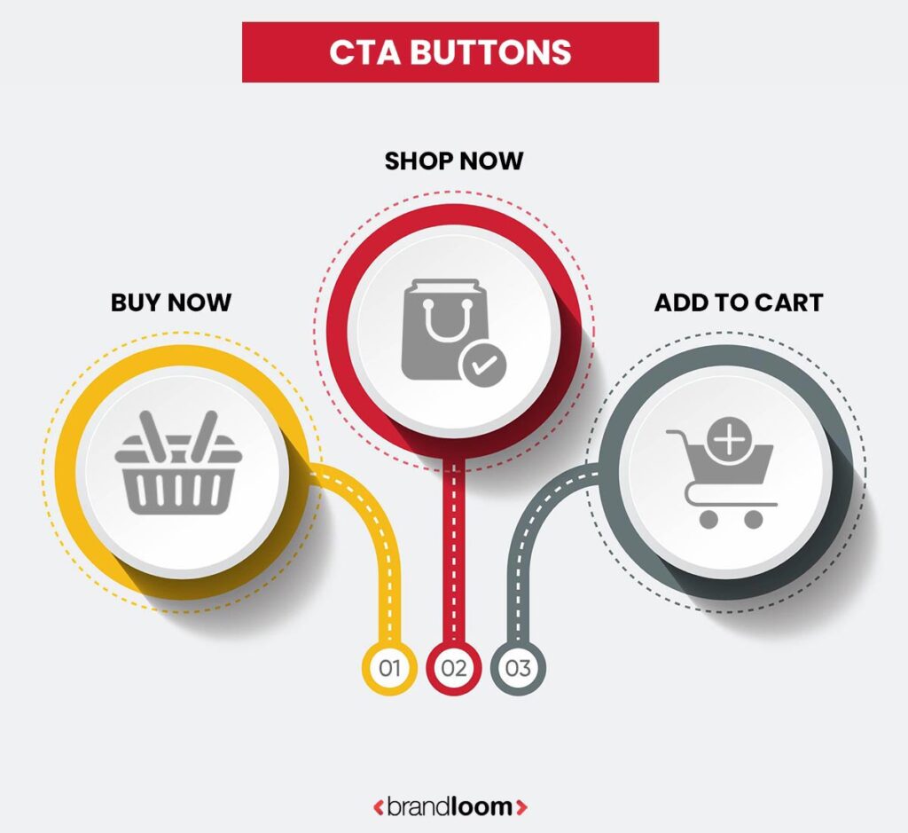
Online shoppers might get confused when it comes to buy now vs add to cart vs shop now. Each button serves a distinct purpose in the customer journey and can significantly impact user experience and sales. “Buy Now” allows you to check out immediately, “Add to Cart” lets you browse, and “Shop Now” sends you to product websites.
This blog post will talk about the pros and cons of buy now, add to cart, and shop now. It will also talk about how each one affects sales and how to choose the best call to action for your website, your goals, and your target market. There are insights you’d typically get from the best e-commerce marketing agency. Brandloom has the right experts who can help you build e-commerce sites and guide you on which is the best button for eCommerce product pages.
Buy Now vs Add to Cart vs Shop Now: Understanding the CTA Options
It’s not enough to just think about how the call to action (CTA) looks on an e-commerce site. You also need to think about how people will act and think in order to get them to buy. These are the three effective eCommerce CTAs that are most often used when shopping online. Shop Now, Add to Cart, and Buy Now are the common CTA buttons. Each has a distinct function and causes various user behaviors.
Buy Now
In the debate of buy now vs add to cart vs shop now, the “Buy Now” button is often seen as the fastest way to convert a ready customer. Pressing “Buy Now” makes you act right away. Clicking on this link takes customers straight to the checkout page, avoiding the basket. This rapid flow is ideal for marketing limited-time bargains or targeting impulse buyers, as waiting could result in lost transactions.
When to Use:
- Ideal for single-product landing pages (e.g., flash sales, bestsellers, subscriptions).
- Works well for mobile-first experiences where minimizing steps boosts conversions.
- Effective during festive or seasonal campaigns with clear, time-sensitive offers.
User Intent:
If a customer clicks “Buy Now,” it means they are ready to buy right away. This CTA gets rid of distractions. It speeds up the conversion process. Users who are still undecided or who want to explore more options might find it too pushy.
Advantages of the Buy Now button
Here are some of the pros of the “Buy Now” button.
1. Less trouble during the buying process
Instead of forcing clients to complete the “cart” step, clicking “Buy Now” directs them to the payment page. This straightforward approach enables customers to complete their purchases more quickly and with shorter wait times, particularly when using mobile phones.
2. A greater need to act quickly
The clear wording in “Buy Now” makes people want to act right away. It works well during flash sales. Deals that are good for a short time or when time is of the essence, like when stock is low.
3. Higher Conversions for Impulse Purchases
A “Buy Now” button takes advantage of people who are emotionally invested or who find exactly what they’re looking for. They can convert without hesitation or further browsing since it eliminates choice fatigue.
4. Perfect for Single-Product Pages
For landing pages, digital products, or high-performing single-item funnels, “Buy Now” is best. It provides an efficient and focused buying experience without unnecessary steps.
Disadvantages of the Buy Now button
Here are some of the disadvantages of the “Buy Now” button.
1. No Opportunity for Upselling or Cross-Selling
Because the button skips the cart page, customers don’t see related or complementary product suggestions. This eliminates chances to increase order value through product bundles, accessories, or special offers.
2. Can Lead to Higher Checkout Abandonment
Clicking “Buy Now” too soon could cause someone to change their mind about what they want to buy. If they have to go through the checkout process again, especially if they have to traverse the website or enter their information again, customers can become irate and leave.
3. Not Ideal for Browsing Shoppers
Not every customer is ready to commit instantly. For those in the consideration phase, “Buy Now” may feel too pushy or premature, potentially causing hesitation rather than action.
4. Less Flexibility in Cart Management
Customers typically cannot alter the number or remove products from their shopping basket after clicking the “Buy Now” button. For those who wish to purchase numerous products at once, this reduces its usefulness.
Although the Buy Now button restricts your selections and upsell opportunities. It is most effective for single-item checkouts, fast purchases, and mobile consumers who want to make an immediate purchase. It’s ideal when speed matters more than basket size.
Add to Cart
When evaluating buy now vs add to cart vs shop now, “Add to Cart” is the most flexible CTA. It allows users to browse and plan their purchases. With good reason, the “Add to Cart” button is the traditional, preferred call to action for most e-commerce websites.
The buyer is given freedom by being able to browse further, compare items, and change amounts before making a purchase. It also makes it possible to use discount codes, upsell, and cross-sell.
When to Use:
- Best for multi-product stores where customers are likely to buy more than one item.
- Suits shoppers who are still exploring options or building a wishlist.
- Works well when combined with cart reminders, exit-intent offers, or free shipping thresholds.
User Behavior:
For customers who need more time to decide, “Add to Cart” is a great option. It is easy to recognize, doesn’t terrify people, and persuades them to buy without being unduly forceful. Customers may abandon their carts if the checkout process isn’t streamlined, since it adds another step.
Advantages of the “Add to Cart” Button
Here are some Add to Cart button benefits:
1. Encourages Browsing and Multi-Item Purchases
When buyers select “Add to Cart” instead of “Buy Now,” they have more time and room to browse other items. This type of behavior is beneficial in industries where numerous purchases are made, such as food stores, fashion, and technology.
2. Enables Upselling and Cross-Selling
An important chance to display related items, bundles, or accessories is provided by the cart page. By recommending helpful additions, this improves the shopping experience in addition to raising average order value (AOV).
3. Familiar and Comfortable UX
Putting items in a shopping bag is a common and easy CTA that people are used to applying. This familiarity makes it easier for new or hesitant users. It helps connect with your store by lowering their stress.
4. Better for Promotions and Minimum Order Thresholds
With a cart in play, you can introduce shipping incentives. For instance, offer free delivery over ₹999, offer bulk discounts, or apply coupon codes. This motivates users to add more before checking out.
Disadvantages of “Add to the Cart Button”
Here are some cons of the “Add to cart” button:
1. Longer Purchase Path = More Drop-Off Points
The biggest downside of “Add to Cart” is that it adds extra steps between product discovery and checkout. With every additional click, there’s a chance the customer may abandon the process altogether.
2. Higher Cart Abandonment Rates
Some people “save for later,” or utilize the cart as a wishlist, but never finish the transaction. This may lead to lost income in the absence of efficient remarketing or reminders.
3. Less Effective for Single-Product Campaigns
If you’re only selling one thing, such as a flash sale, digital download, or contract, “Add to Cart” may get in the way. The added step may feel redundant when a quick purchase is expected.
4. Potential Overload in Cart Experience
The customer may become overwhelmed. He may opt not to convert or abandon the basket if it is disorganized or difficult to grasp. For instance, if there are poor product images, incorrect totals, or no “checkout” buttons.
Stores that wish to offer, sell multiple things, and make purchasing more comfortable will find the “Add to Cart” button ideal. Although it works best for buyers who are planning to buy rather than those who are shopping on the spot. But for it to have the most impact, the cart-to-checkout process needs to be smooth.
Shop Now
In the buy now vs add to cart vs shop now comparison, “Shop Now” serves as a gentle entry point for first-time visitors and top-of-funnel campaigns. Unlike the other two, “Shop Now” is more about browsing than making a purchase.
It’s a navigational call to action used to entice users to look into your product line. Instead of taking the customer to the checkout, clicking it usually directs them to a category, collection, or featured product page.
When to Use:
- Common on homepage sliders, hero banners, or digital ads.
- Effective in brand awareness campaigns or top-of-funnel (TOFU) experiences.
- Effectively draws visitors to a well-designed website through social media posts and email marketing.
User Mindset:
Users who are open to browsing but not yet ready to buy are drawn to “Shop Now.” At that point, engagement and discovery are more important than conversion. By generating curiosity and guiding customers further into your store, this call to action helps create conditions for subsequent conversions.
Advantages of the “Shop Now” Button
Here are some of the pros of the “Shop Now” button:
1. Great for Top-of-Funnel Engagement
For first-time visitors, the curiosity-driven, non-intrusive CTA “Shop Now” is effective. Because it allows visitors to peruse without committing, it’s ideal for generating initial curiosity.
2. Ideal for Ads, Emails, and Homepage Promotions
You can often find this button in newsletters, hero posters, and paid ads. It leads people to carefully chosen collections, new arrivals, or seasonal sales. This acts as a gateway into your product environment.
3. Encourages Product Discovery
“Shop Now” encourages more thorough browsing by directing customers to category or collection sites. When it comes to fashion, home décor, or lifestyle businesses, customers may view a variety of possibilities, compare styles. After that, they might pick something that works for them.
4. Less Pressure, More Exploration
Instead of being interpreted as a command, “Shop Now” is seen as an offer. For consumers who aren’t ready to buy but are willing to browse and get inspired, this is a pleasant, low-friction call to action.
Disadvantages of the “Shop Now” Button
Here are some of the cons of the “Shop Now” button:
1. Low Purchase Intent
This CTA doesn’t suggest any urgency or purchasing activity, in contrast to “Buy Now” or even “Add to Cart.” Without a compelling product experience, it might not immediately increase sales. This is because the goal is to increase clicks rather than conversions.
2. Vague Destination Can Hurt UX
“Shop Now” can irritate customers if it isn’t combined with an obvious landing page or an appropriate assortment. If users are unable to find what they are looking for right away, generic or unfocused pages may result in drop-offs.
3. Requires Additional CTAs to Drive Purchase
Users still need to click “Add to Cart” or “Buy Now” when they get to a page for a product or topic. If you don’t organize your funnel well, you might lose their attention before they convert.
4. Less Effective in the Bottom Funnel
Customers who are already interested in buying may find “Shop Now” too broad or non-committal. This button lacks the directness necessary to seal the deal at subsequent points in the buyer journey.
The “Shop Now” button is a good way to get potential buyers interested and involved during the “awareness” and “deliberation” stages. While it encourages exploration and brings more people to your store, that attention needs to be turned into sales with the help of good product pages and thoughtful follow-ups.
The user journey is shaped differently by each of these CTAs. The first stage in creating an e-commerce website that turns users into devoted consumers is to understand their goals, benefits, and ideal use cases.
Benefits of Effective CTA Buttons
Understanding the impact of buy now vs add to cart vs shop now on user behavior can help design a more optimized and user-friendly e-commerce journey.
Your CTA button is a silent salesman that helps your visitors convert; it’s more than simply a clicking box. A strong call to action (CTA) such as “Buy Now,” “Add to Cart,” or “Shop Now” can yield quantifiable commercial benefits.
Here’s how:
1. Higher Conversion Rates
A rational and obvious call to action aids in the buyer journey. The possibility that the user will complete the transaction is increased by a button that is placed strategically, such as “Add to Cart” for scheduled purchasing or “Buy Now” for last-minute purchases. They will always know what to do next as a result.
2. Improved User Experience
Effective calls to action (CTAs) make it easier for users to browse your website. By aligning the call to action with the user’s goal, whether it be exploring, evaluating, or making a purchase, you can enhance the purchasing experience and lower confusion and bounce rates.
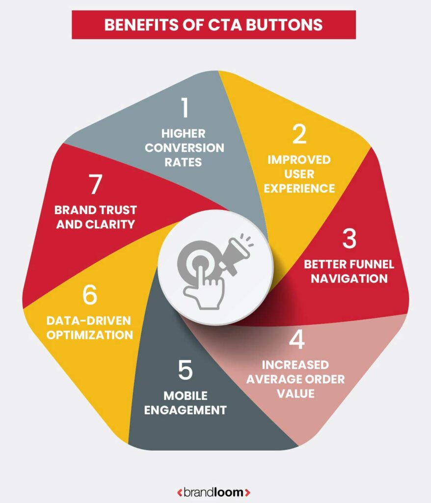
3. Better Funnel Navigation
Every CTA has a specific function in the buyer’s funnel. “Buy Now” expedites purchasing decisions, “Add to Cart” encourages contemplation, and “Shop Now” starts product research. Users can be purposefully moved through your sales funnel by using the appropriate CTA at the appropriate moment.
4. Increased Average Order Value (AOV)
“Add to Cart” CTAs encourage bundling and upselling. When they have a basket, customers are more likely to browse and add goods to it, especially if there are incentives like free delivery or product recommendations.
5. Enhanced Mobile Engagement
Smartphone users act and pay attention differently and for shorter amounts of time. A targeted call to action, such as “Buy Now,” expedites the closing process by eliminating unnecessary processes. Tools like one-click payments and expedited checkout are quite helpful.
6. Data-Driven Optimization
One of the simplest components to the A/B test is a call-to-action. You may discover a lot about the mindsets of your clients and gradually enhance your user experience and sales strategies by comparing “Buy Now vs. Add to Cart vs. Shop Now” click-through rates and conversions.
7. Brand Trust and Clarity
Users are more comfortable exploring your website when your calls to action are clear, purposeful, and beneficial. A powerful CTA reaffirms the professionalism and dependability of your brand, whereas a vague or unclear one may raise questions.
Instead of just buttons, CTAs are really conversion tools. You can use the right words, style, and placement on your product pages to make them useful sales tools.
Case Studies: How CTA Optimization Transformed E-Commerce Funnels?
At BrandLoom, we’ve worked with multiple e-commerce brands across fashion, electronics, skincare, and lifestyle niches. Over time, we’ve seen how a small shift in the call-to-action (CTA) can lead to a big jump in conversions. Below are three real-life examples where we tested different CTAs—Buy Now, Add to Cart, and Shop Now—to align better with audience behavior and campaign intent.
1. Flash Sales, Fast Conversions
One client ran limited-time sales on high-impulse products. Despite heavy traffic, the cart abandonment rate was over 68%. The checkout journey was too long for mobile shoppers who just wanted to grab the deal.
What We Did:
We introduced a “Buy Now” button on mobile-first landing pages, skipping the cart and sending users straight to checkout. Desktop CTAs remained unchanged.
What Happened:
- Conversion rate on mobile increased by 24%.
- Check-out time dropped by 38%.
- Bounce rate on landing pages reduced by 16%.
When urgency is high, especially on mobile, “Buy Now” removes friction and encourages impulse decisions.
2. Boosting Discovery with Low-Commitment CTAs
A fashion retailer wanted to promote a new seasonal collection via Instagram and email campaigns. Previously, they directed users to individual product pages with “Buy Now” CTAs, resulting in high bounce rates.
What We Did:
We changed all CTA links in their TOFU campaigns to “Shop Now,” leading to curated collection pages instead of individual product SKUs.
What Happened:
- Click-through rates rose by 41%.
- Session duration doubled.
- First-time visitor return rate increased by 29%.
“Shop Now” builds curiosity. When discovery is the goal, don’t rush the user—invite them in.
The right CTA button isn’t just a UI element—it’s a behavior trigger. Whether you want to drive urgency, build bigger carts, or invite exploration, choosing between Buy Now, Add to Cart, and Shop Now should be intentional.
Choosing the Right CTA Button for Your e-commerce Store
The choice between ‘buy now,’ ‘add to cart,’ and ‘shop now’ depends on multiple factors, such as audience behavior, product type, and the sales experience you want to create. Your target market will influence your best choice, the products you sell, the price, and the type of experience you want your customers to enjoy.
Let’s explore how each factor should shape your CTA decision.
1. Understand Your Target Audience and Their Buying Behavior
The call to action you select is greatly influenced by your audience’s feelings on making a purchase. A “Buy Now” button can force your normal consumer, who is driven by urgency, discounts, or flash deals, to take immediate action by eliminating the need for additional steps. When there is no barrier, these users are more likely to convert because they typically value speed.
If your clients want to browse, consider their alternatives, and take their time before making a decision, “Add to Cart” might be a better choice. It enables individuals to think through their options, save items, and feel in control of the process.
For audiences who are just discovering your brand or who are discovering new collections through ads or social media, a “Shop Now” button allows them to peruse without feeling pressured to make a purchase right away.
2. Match CTAs with Product Type and Price Point
The nature of your products and their pricing structure also influence which CTA to use. For lower-priced items, like accessories, impulse buys, or digital goods, “Buy Now” simplifies the process and speeds up the conversion. Users typically don’t require much deliberation for inexpensive or one-off items.
In contrast, for high-value purchases such as electronics, furniture, or bundled products, customers often want time to evaluate their choices. “Add to Cart” supports this thoughtful decision-making by allowing them to build a basket, compare products, and consider value before checking out.
Meanwhile, if you’re promoting a broad product category, like a new clothing collection or holiday gift guide, “Shop Now” can act as a soft prompt, directing traffic to a themed product page and encouraging browsing.
3. Consider the Desired Customer Experience
Think about the journey you want your customer to have on your site. If you’re focused on delivering a fast, no-hassle buying experience, especially for returning customers or mobile users, a “Buy Now” button minimizes effort and aligns with that goal. It helps users complete their purchase quickly and decisively.
Alternatively, if you aim to increase average order value or encourage customers to consider complementary products, “Add to Cart” gives you room to upsell, cross-sell, and engage users over a longer buying session. This can be especially valuable for retailers who rely on product bundling or offer incentives like free shipping thresholds.
If your goal is to create a more relaxed, exploration-driven environment, such as when launching a new collection or promoting a category, “Shop Now” offers a low-pressure, discovery-first experience that lets customers ease into your store’s offerings.
You don’t necessarily need to choose just one CTA for your entire store. Many successful e-commerce brands use a mix of “Shop Now” for top-of-funnel engagement, “Add to Cart” for product browsing, and “Buy Now” for driving quick conversions. The key is to align each button with its context and the user’s mindset at that stage of the journey.
Conclusion
When it comes to driving e-commerce conversions, the choice between Buy Now, Add to Cart, and Shop Now isn’t about which is universally better; it’s about which is best suited to your products, audience, and goals. Each button serves a distinct purpose in the buyer’s journey.
Buy Now excels at quick, decisive conversions, ideal for low-ticket items and urgency-driven campaigns. Add to Cart supports thoughtful browsing and higher-order values, making it a staple for most online stores. Meanwhile, Shop Now is your best tool for drawing users in at the top of the funnel and encouraging exploration.
The most effective e-commerce sites don’t rely on just one CTA; they use them strategically, placing the right button at the right stage of the customer journey. By understanding the strengths and limitations of each, you can create a smoother shopping experience and maximize your store’s conversion potential.
To build a conversion-focused e-commerce experience, work with a proven e-commerce marketing agency that understands how to align CTAs with buyer intent. To know more about e-commerce web development, marketing strategy of BrandLoom, and buy now vs add to cart vs shop now, schedule a call today!
FAQs
The user journey and purchase intent they support are where the main differences can be found.
The “Buy Now” button is made to be quick and easy to use. When a user clicks on it, the cart is completely bypassed, and they are taken directly to the checkout page. This cuts down on the steps needed to make a purchase and works best when users only want to buy one thing or need to make a quick choice. It’s often used on landing pages for specific products, in flash sales, limited-time offers, or mobile shopping, where the goal is to get people to buy quickly with as little trouble as possible.
The “Add to Cart” button, on the other hand, lets you shop in a more traditional and flexible way. It doesn’t send the user straight to checkout; instead, it puts the item in a virtual shopping cart and lets them keep browsing. This helps a lot when a customer wants to buy more than one thing, look at different options, or take their time choosing what to buy. It also lets you upsell and cross-sell by suggesting products that go well together or giving discounts to people whose carts are worth more.
To put it simply, “Buy Now” means taking action right away, while “Add to Cart” helps you look around and make a choice. Which to use depends on how your customers usually shop, the type of product you’re selling, and the shopping experience you want them to have. Many e-commerce stores that do well use both, strategically placing “Buy Now” for quick purchases and “Add to Cart” for more options.
A “Buy Now” button works best when speed and ease of use are important for conversion. It’s best to use it when you want to speed up the buying process and get the customer to act right away.
It works especially well on landing pages that only show one product, so users don’t have to look through or compare different options. Also, it works great for flash sales, limited-time deals, or cheap items, since customers are more likely to buy them on the spot without having to put together a full shopping cart.
On mobile-first e-commerce sites, where users want to click less and move around more quickly, the “Buy Now” button helps speed up the process of buying, preventing the potential drop-offs that come with extra steps. “Buy Now” can also help you get more sales if you’re trying to get returning customers or sell items that sell quickly. It does this by providing a direct, hassle-free checkout flow.
In short, when talking about buy now vs add to cart vs shop now, use a “Buy Now” button when you want to cut down on the time a customer has to wait, make them feel like they need to act quickly, or appeal to shoppers who are sure what they want. To know more about e-commerce website development schedule a free call with BrandLoom.
Yes, the “Add to Cart” button usually does a better job of raising the average order value (AOV) than the “Buy Now” button. This is because it allows for a more open-ended and adaptable shopping experience, which makes people want to look around the site more and add more items to their cart before checking out.
Customers who use the cart are more likely to see suggestions for related products, bundle deals, or threshold-based incentives (for example, “Get free shipping on orders above ₹999”). These chances to upsell and cross-sell naturally lead to bigger baskets and more money spent overall.
The cart also lets users look over, compare, and change their choices, which makes it perfect for stores that sell items that go well together, like clothes and accessories, electronics with warranties, or skin care and combos. The “Buy Now” button, on the other hand, frequently results in a one-item, fast-purchase path with little to no opportunity for add-ons.
Therefore, “Add to Cart” gives you more flexibility to encourage users to make additional purchases without interfering with their journey if your objective is to maximize revenue per transaction.
“Buy Now” and “Shop Now” have quite different functions. “Shop Now” is more exploratory and navigational in nature, whereas “Buy Now” is a transactional CTA designed to encourage instant purchases by directing users straight to the checkout page.
A user is usually taken to a product category, collection page, or a carefully chosen area of your website, like “New Arrivals,” “Sale Items,” or “Best Sellers”, when they click “Shop Now.” The objective is to engage the user, pique their interest, and persuade them to look at a wider range of products rather than to immediately initiate a transaction.
For top-of-funnel audiences, such as new visitors resulting from email campaigns, homepage banners, or social media advertisements, this call to action works particularly well. It enables customers to browse and become acquainted with your products without feeling rushed to make a choice.
“Buy Now,” on the other hand, is typically found on product pages or landing pages for particular campaigns and targets users who are prepared to make a purchase with a single click. Therefore, “Shop Now” increases traffic, brand awareness, and deeper engagement, whereas “Buy Now” increases conversions. Although they are at different phases of the customer journey, both are significant.
There is no one-size-fits-all solution to “which CTA button increases conversions”. The effectiveness of “Buy Now,” “Add to Cart,” or “Shop Now” is largely determined by the particular business context, which includes the product type, target market, price point, and stage of the funnel.
“Buy Now” generally results in higher instant conversion rates, especially for single-item sales, low-cost products, or temporary promotions where customers are prepared to act quickly. When there is little need for comparison and the buyer’s intent is strong, it performs well.
Even though it doesn’t convert as quickly, “Add to Cart” frequently performs better for retailers that sell bundled or highly considered products because it promotes exploration and results in larger basket sizes. A/B testing is essential to determining what works best for your store and your audience because, in the end, different brands will have different top-performing calls to action.
“Buy Now” typically works better on mobile devices because it requires fewer steps. Mobile users usually expect seamless interactions, multitask frequently, and have shorter attention spans. These behaviors are supported by a single-tap checkout process, which also lowers the chance of cart abandonment.
Nevertheless, if your website or app provides a seamless, mobile-optimized cart experience, “Add to Cart” can still work well on mobile devices. This includes things like quick previews, carts that are easy to change, and checkout buttons that stay in place. People may give up on the process if the mobile cart is crowded or takes too long to load.
So, “Buy Now” is better for quick, one-item purchases on mobile, but “Add to Cart” is still useful, especially when it’s made with how people use mobile devices in mind.
People’s actions have a big impact on how well your CTA buttons work. People have different ways of shopping. Some are quick and sure of what they want, while others like to look around, compare prices, or come back later. Matching your call to action (CTA) to these patterns of behavior is key to getting more people to engage and buy.
For example, a “Buy Now” button will probably work well for shoppers who want to buy something right away or for returning customers who already know what they want. It lets them skip steps that aren’t necessary and finish the purchase quickly. On the other hand, visitors who aren’t sure about the product or are still looking at their options tend to click “Add to Cart” because it makes them feel less committed. They can look it over, make changes, and take their time before making a decision.
When you align your call to action (CTA) with the customer’s intent, how familiar they are with your brand, and where they are in the buying funnel, it works much better. If you know how people act in these situations, you can put the right button in the right place and help them have a more personalized shopping experience. To understand more about how CTA buttons buy now vs add to cart vs shop now affect lead generation, visit the official page of Brandloom.
When used on homepage banners, sliders, landing pages, and digital marketing materials, the “Shop Now” button works best. It doesn’t work well on individual product pages. Its main goal is to get people to look at what you have to offer instead of buying right away.
It’s an inviting way to get to category pages like “New Arrivals,” “Best Sellers,” or “Summer Essentials” when put on homepage sliders or seasonal collections. Top-of-funnel visitors, those who are just starting out with your brand and aren’t ready to commit to a specific product, will find it especially helpful.
However, more definitive CTAs like “Add to Cart” or “Buy Now” are better suited for product pages where the objective is to encourage a clear purchase decision. At that point, when the customer is already looking at a particular item and probably thinking about making a purchase, these buy now vs add to cart vs shop now align with their intent.
By making your CTA buttons smarter and more customized, AI can greatly increase their efficacy. Large volumes of user data, including browsing habits, session history, device type, geolocation, and previous purchases, are analyzed by modern AI tools to dynamically customize CTAs in real time.
An AI engine might, for example, recognize that a user regularly purchases inexpensive goods and react by displaying a “Buy Now” button with a streamlined checkout process. The site might show a first-time visitor a ‘Shop Now’ button that leads to a curated collection based on their referral source or device.
Additionally, button color, placement, timing, and text can all be tested and optimized by AI. It automatically modifies your site’s layout or call-to-action (CTA) based on performance, identifying which variations produce the highest engagement by learning from thousands of micro-interactions.
The “Buy Now” button has many benefits, particularly if you want to increase conversions quickly. The direct path to checkout, which minimizes the number of steps a user must take to finish a purchase, is its greatest advantage. This works particularly well for consumers who are on the go, are returning customers, or are looking at deals that expire soon. By taking advantage of impulsive purchasing, “Buy Now” can significantly raise conversion rates when used properly.
Nevertheless, there are some compromises associated with this simplified experience. The largest disadvantage is the lost chance for cross-selling and upselling. Customers are unable to view related products, accessories, or exclusive bundles because “Buy Now” bypasses the cart, which restricts your ability to raise the average order value. Also, the strict “Buy Now” flow can be annoying and even result in abandoned checkouts if the customer wishes to add more items or come back to the purchase later.
To put it briefly, “Buy Now” increases speed but reduces flexibility. When used properly, buy now vs add to cart vs shop now can be very effective, but it’s not always the best choice for intricate or multi-product shopping situations.
Absolutely not. The “Add to Cart” button is still an essential component of the e-commerce experience, even though one-click purchases and speedy checkouts are becoming more and more popular, particularly among mobile users and repeat customers. It is essential when shopping for multiple items, as consumers are likely to compare products, buy bundles, or peruse different categories before deciding.
Additionally, “Add to Cart” enables store owners to recommend related products during the cart stage, something that the “Buy Now” flow completely avoids. Furthermore, a lot of users still think of the cart as a location to check their selections, apply discounts, or change quantities prior to checking out. Eliminating it completely may make the experience less flexible and more hurried, particularly for first-time or highly deliberate buyers.
Speed is important, but “Add to Cart” encourages deliberate, value-driven purchases, so it’s by no means out of date.
You will need to conduct A/B tests (split tests) to find out which CTA button is most effective for your audience. This entails displaying distinct iterations of your call to action (CTA), such as “Buy Now” versus “Add to Cart,” to distinct user groups under the same circumstances. Key performance indicators such as click-through rate (CTR), conversion rate, average order value (AOV), and bounce rate can then be measured.
Heatmaps and user session recordings can also be used to monitor how users engage with various calls to action on your website for more detailed insights. Keep an eye out for repeat behavior, drop-off points, and user flow patterns. Device type, traffic source, and user segment (new vs. returning visitors) should all be taken into consideration during testing.
Finding the CTA that works best in particular situations will help you adjust your approach for various landing pages, product categories, and customer journeys.
Yes, and this is among the most fascinating ways AI is being used in e-commerce. Based on real-time user data, AI-powered personalization tools can dynamically change the text, size, placement, and even behavior of call-to-actions. This covers things like past purchases, device type, location, browsing history, and session behavior.
For instance, a first-time visitor may see a “Shop Now” CTA that leads to a beginner-friendly collection, while a repeat customer may see a “Buy Again” button that has their previous purchases preloaded. AI is also capable of identifying user hesitancy (such as extended periods of time without clicks) and changing the call to action to a less commitment-demanding option, such as “Save for Later” or “Explore More.”
CTAs like buy now vs add to cart vs shop now that feel extremely timely and relevant are the end result, improving engagement, lowering bounce rates, and increasing conversion rates.
CTA buttons like buy now vs add to cart vs shop now act as critical checkpoints in the e-commerce conversion funnel; they guide the user from one stage of the buying journey to the next. Each type of CTA supports a different funnel stage.
“Shop Now” is most effective at the top of the funnel (TOFU), capturing attention and directing users to product discovery or category pages.
“Add to Cart” belongs in the middle of the funnel (MOFU), where users are evaluating products and starting to build their basket.
Use ‘Buy Now’ at the bottom of the funnel (BOFU) to remove friction and close the sale quickly.
Using the wrong CTA at the wrong time can confuse the user. CTA buttons such as buy now vs add to cart vs shop now, however, produce a seamless, user-friendly experience that raises the possibility of conversion when they are in line with user intent and funnel positioning.
Removing the “Add to Cart” button in favor of a simpler “Buy Now” experience may appear to increase conversion rate, but there are a number of ways in which this can go wrong.
First of all, it limits the freedom to shop. Before making a purchase, many buyers would rather peruse several products, evaluate costs, or create a wishlist. Shopping may feel hurried or constrained if you are unable to gather and examine items in a cart.
Second, by using suggested products, bundles, or discount thresholds, you miss out on upsell and cross-sell opportunities, which usually happen in the cart stage. The average order value and overall revenue may suffer as a result of these missed interactions.
Last but not least, deleting the cart may irritate buyers who are unsure or meticulous, which could lead to a rise in bounce rates or abandoned sessions. Many users use the cart as a temporary holding area while they make decisions, in addition to being a tool for purchases.
In summary, although speed is crucial, the cart offers control, context, and opportunities to build value, so it would be dangerous to do away with it unless you are certain that your audience is completely on board with quick, one-item purchases.
The best call to action for first-time visitors is typically “Shop Now” or “Add to Cart,” not “Buy Now.” These consumers are still learning about your company, line of products, and costs. A “Buy Now” button could come across as overly forceful, particularly if they haven’t done enough research or aren’t ready to commit.
“Shop Now” provides a soft, undemanding introduction to your products. In order to foster familiarity and trust, it promotes exploration and directs users to carefully chosen collections or categories. “Add to Cart” lets users save items, compare them, and keep browsing after they’ve become interested and found something they like, without having to worry about checking out right away.
You have a better chance of converting new visitors over time than losing them with an overly transactional approach if you steer clear of high-commitment CTAs up front and instead concentrate on engagement and discovery.
The positioning and style of call-to-action buttons on product pages can greatly impact user engagement and conversions. Placing the call to action (CTA) above the fold is one of the most crucial best practices. This is because it makes sure the user can see it right away without having to scroll. This attracts attention at the ideal moment for product interest.
The CTA should be visually striking, usually with contrasting colors and lots of white space surrounding it. It should use straightforward, action-oriented language like “Add to Cart” or “Buy Now.” Make sure the button has enough padding and spacing. This prevents inadvertent clicks, and it is big enough for mobile users to comfortably tap.
Maintain a logical visual hierarchy when you have multiple calls to action. You should highlight the main action, typically ‘Add to Cart,’ more clearly. Because some users prefer to scroll before making a decision. It’s also a good idea to restate the call to action lower on the page. This is particularly after reviews or product descriptions.
Lastly, confirm that the CTA results in a quick, safe, and responsive checkout process. If the follow-up encounter causes conflict or uncertainty, a strategically placed button is meaningless.