When we talk about brands, the first thing that comes to our mind is their logo. The logo is the visual calling card for your brand; you have to make sure it is designed correctly. When we talk of logo design, a few components such as font, color and design comes up for the discussion. Today in this article we will exclusively talk about logo colors and logo color combinations that fit your brand.
Importance of Colour in Logo Design
Words can’t define the importance of colors. Colors can add drama and life to anything. But do colors hold power over your logo and enhance its impact on the target audience? Conspicuously, YES! Color psychology plays a vital role in branding. So let’s find out the meaning of each color and how to choose the best logo colors (read the best logo color combinations) for your brand?
You must have heard about color psychology. It tells us how colors affect our emotions and behaviors. We usually use green for calmness and yellow for happiness. But is the color psychology same for branding?
Lauren Labrecque and George Milne are the two researchers who found that some colors can impact consumers, and some can’t. For instance, if you use yellow on your logo, it will make your brand look young but using green on your brand logo will not necessarily give a feeling of calmness. So how do we know the meaning of each color and its impact on the audience? Read on to figure out.
Logo colors- why should you pay attention to them?
Colors play a vital role in designing logos and branding exercises. To figure out which color will suit your brand, let us first understand what you need to understand about choosing the right color for your logo.
Your logo is the most important visual identifier for your brand. Being your brand’s most important representative, your logo should reflect your brand’s nature, values, and aspirations.
Colors invoke emotions and moods. When you choose your brand colors, you have to have some knowledge of color psychology. The colors used for your logo will give a subconscious push to your audience to get in a particular mental state or undertake some action.
The colors you use for your logo also define your aesthetic. Your logo colors will express your brand’s style and personality and appeal to your target audience. The other collaterals will inevitably have to borrow and reflect the colors you use in your logo, so you have to ensure you choose a color that translates well across all media.
To understand the best logo colors for your brand, we will first look at some of the popular colors used in logo designing and see what they represent.
Logo color schemes- popular colors and what they mean
Science has shown that our mind reacts in diverse ways to specific colors. Let us take up popularly used colors and see what they stand for in branding. While primary colors like red, yellow, and blue are always trendy in branding, there are many other colors that companies use to shape their brand identity.
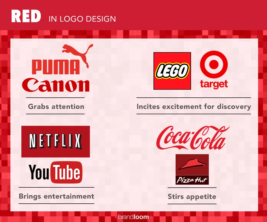
Red Color Logo
Red is a popular choice in logo design. Some brands with red color logos are Netflix, YouTube, Coca-Cola, Puma, Time, The Economist, Canon, Lego, and Pizza Hut.
The color red is an attention-grabbing one. It helps your brand stand out from the competition.
It is also the color of passion and excitement. Companies that bring you entertainment and things you like use red- as so companies that want you to explore new things.
And of course, it is a favorite color with food brands. The human mind associates red with fire- the element necessary for cooking. Moreover, the colors red, green, and yellow are associated with many food items- hence the popularity of red with food brands.
Bright red hues also prompt you to take action. Food brands use red to give their customers a subtle push to walk into their eateries, pick up their items from a store, or order them online.
Fun Fact: The first color that babies can see is the color red (besides white and black). Scientists say that people have the ability to see red better than any other color.
Blue Color Logo
Blue is probably the most widely used color in logo designing. Some brands that use the blue colour logo are Facebook, Visa, KPMG, Ford, HP, IBM, Skype, Twitter, Boeing, Unilever, and LIC.
Blue color meaning in logo
Blue is a versatile color- it is easy on the eye and has a wide range of shades that can invoke different moods. Blue symbolizes maturity, calmness, and trustworthiness. It is a color that inspires a sense of spiritual awareness.
As blue is the most popular color used in branding, you need to be very creative with the color and logo design if you want your brand to stand out in the market.
If your services or products are related to healthcare and wellness, you can use blue in your logo because it inspires a healing sense. Blue can be used in anything that requires trust, loyalty, spirituality, wisdom, sophistication, and respectability.
For instance, most banks opt for this color for their logo because the color symbolizes trustworthiness.
Deep Blue Colour Logo
Deep blues convey a sense of power. Shades like navy blue are authoritative. It is used by “serious” brands like IBM and LIC.
Deep blues also bring to mind still waters and the ocean- and give you a feeling of tranquility. Brands that want to appear responsible and want to assure their customers that they are in good hands often go for blues. This is very common with companies that deal in finance or providing advice- like Visa and KPMG.
Light Blue Color Logo
Lighter blues, on the other hand, invoke the sky. It brightens your mood. The sky also acts as the home to radio waves and clouds. This is why many technology companies favor light blues- like HP and Dell; and social media companies like Twitter.
Blue is the polar opposite of red- the color which stands for danger. Blue is a popular choice with companies that want to assure their customers that their products are safe and are durable. Think of brands like GE and BMW, for whom safety and sturdiness are a selling point.
Yellow Colour Logo
Yellow is the other primary color that is very popular for logo designs. However, being a very bright color, pure yellow color logos are rare. It is often part of color combinations that feature blues, reds, greens, and black.
Some famous brands whose logos have yellow color are Lay’s, IKEA, Best Buy, Ferrari, Snapchat, DHL, and National Geographic.
Yellow is an eye catching color that invokes the sun- the source of all life on earth and energy provider. Hence, it makes sense that brands like National Geographic and energy companies like Shell use it.
As we said before, yellow is a very bright color. It is the color of playfulness, friendship, and positivity. This makes it a prevalent choice for brands that target young audiences. Think of Lay’s and Snapchat.
Yellow is a bright color, and it compels you to look. “Yellow spot” is the name of the spot in our eyes that hosts that maximum concentration of cones or cells that perceive color. This is why brands that want you to “view” the world- choose yellow for their logos.
Yellow Colour in Logos
Yellow is the color of cheerfulness, youthfulness and it radiates positivity. This warm color is quintessential of friendliness and happiness. But it would help if you were very picky while choosing a shade of yellow for your brand logo because different shades of yellow can have different meanings. For instance, a soft and bright yellow is fresh and joyful, and a deep golden yellow holds more power and history.
If you want your consumers to get a sense of maturity and luxury through your brand logo, you should think twice before opting for yellow.
Example of Yellow colour in Logo
For example, Nikon, the makers of cameras- wants you to look at the world through their lenses and capture the scenes. IMDB, the Internet Movie Data Base- uses yellow. Movies, after all, are all about seeing.
McDonald’s picked yellow for their brand logo because it is associated with happiness and is the most visible color in daylight. No wonder why McDonald’s logo is so easy to spot on a busy road!
Yellow is a friendly color. Hence, brands that want to welcome everyone use yellow on a large scale. Pocket-friendly and approachable brands like Best Buy and Denny’s use yellow for this very reason.
Brands that associate with speed favor yellow. Think of fast car makers like Ferrari and Lotus Cars in this regard. Due to its association with driving and speed, yellow is also part of logo color combinations for brands like Goodyear and delivery companies like DHL.
Green Color Logo
Green is another popular color with companies. Some companies that use green color logos are Starbucks, Spotify, Land Rover, Rolex, Carlsberg, Animal Planet, Sprite, Tic Tac, BP, and Whole Foods.
Overall, green is a color that has strong associations with nature. Brands that want to emphasize their strong bond with nature or wish to proclaim the natural origin of their products almost always go for green—case in point- Animal Planet and Tropicana.
Looking at green refreshes our mind. Hence, brands that want to be associated with relaxation often use green. Think of beverage brands like Heineken and Carlsberg, which help you wind down.
However, green is an interesting color because different shades invoke entirely different feelings and dramatically represent opposite values.
Green Colour Variations in Logo
Let’s look at the lighter greens. Lighter shades of green invoke a sense of relief and have a cooling, soothing effect. When combined with blue, shades like jade, lemon or aqua can convey a sense of rejuvenation. Think of brands like Sprite or Tic Tac, which have some of the best logo color combinations to achieve this effect.
Deeper greens symbolize growth and vitality. This is why brands that are regarded as “entry-level luxury” often use deep greens. Some examples are Lacoste and Land Rover.
Deep green is the color of emeralds, one of the most precious stones in the world- and people go to the ends of the earth searching for it. Premium brands with dedicated followings often use green for this exact reason- like Starbucks and Rolex.
Lighter greens are young and playful colors. Think of Spotify and Android– two brands that target young audiences looking to explore the world.
Orange Color Logo
Orange balances the vitality of red with the playfulness of yellow. You can spot orange color logos for brands like Amazon, Fanta, Penguin, Nickelodeon, Harley Davidson, Gulf, and The Home Depot.
Orange is an invigorating color. It is a secondary color which is a good option for the brands trying to obtain feelings of felicity and vitality, such as travel companies. It is a soft color that can induce feelings of energy, warmth, playfulness, and change.
The color is associated with change, like- autumn leaves or orange skies. Therefore it is a good option for brands who consider themselves a little bit different.
Example of Orange Colour in Logo
Being bright and eye-catching, orange helps your brand stand out. Brands like Gulf and The Home Depot use orange in their logos.
It is also an exciting, happy color. Brands that want to put you in a good mood use orange- like Nickelodeon or Fanta.
At the same time, orange drums up a feeling of anticipation in the one who views it. Think of brands like Amazon or Penguin. Don’t you wait eagerly to open your Amazon package? Book lovers can’t wait to dive in and discover what story their new purchases tell.
This sense of anticipation also makes orange the color of choice for brands that want you to travel distances and discover new things. Think of Harley Davidson.
If you have seen the logo of Soundcloud, the brand chose the combination of orange and white because they think that it is a representation of the optimistic character and creativity of the company. For soundcloud this is one of the best logo color combinations for their brand as it has the power to evoke a smile and happy feelings.
Pink
While pink is not a color that immediately comes to your mind when thinking of logo designing, many prominent brands use it. Think of Baskin Robbins, Dunkin Donuts, Barbie, Airbnb, LG, Lyft, Enamor, and Instagram.
The color pink has strong associations with femininity, but it is most versatile than that. It is an unusual color with different shades, which we can use for different purposes. Pink symbolizes drama, love, sexuality, romance, warmth, and femininity.
Brands know this, and companies with pink logos are looking at welcoming women customers. However, the way they do it is often different.
Example of Pink in Logo Colour
Some brands are straightforward in their deployment of pink. Brands that make women’s products or have a predominantly female customer base often use pink in their logos- like Enamor and Nykaa.
Hot pink is a favorite with children, who often gravitate towards this color. This is why brands whose products are favorites with children use pink often- like Barbie and Justice. Not only do these brands welcome kids with pink, but they also court the mothers, who often make the purchases on behalf of their children.
Pinks with an ombre effect or carry tinges of gold are popular with brands who want to convey that they are “happening” and cultivate a sense of belonging. Think of Instagram or Airbnb. They welcome their customers and give off a sense of warmth. The pink is also a nod towards women who form a sizeable part of their customer base- and these companies want their customers to enjoy themselves.
Similarly, brands like LG and Airbnb go for pink because they want to welcome female customers. While they don’t offer women’s products per se, they know that their customers are often women. Women almost always choose household appliances.
Similarly, women often favor taxis to travel within a city- and Lyft ensures women are safe and a women-friendly brand.
Light pink is also the color associated with sweetness, making it a popular choice for bakers and confectioners. Think of Dunkin Donuts and Baskin Robbins.
Purple
Close on the heels of pink comes purple. An unusual color, purple, is used by brands like Volini, FedEx, Claire’s, Cadbury, Taco Bell, Yahoo!, and English Premier League.
As a color, purple invokes the colors pink, blue, and red. While it is attention-grabbing, it is not an overt color like red or pink, nor is it as calm as blue. Since it combines both masculine(blue) and feminine(pink) aspects, it is often used by brands to reflect the fluid nature of gender and sexuality. This is why purple’s most memorable association is with musician Prince, the most widely known symbol for androgyny.
Purple in Logo Colour Schemes
With its association with sensuality, purple is often opted by brands whose products give you pleasure. Most prominent among them are chocolate brands- because chocolates are associated with indulgence and pleasure. A popular chocolate brand that uses purple in their brand logo is Cadbury.
Purple is a color associated with royalty- since, in ancient times, only the very richest could afford to dye their clothes purple. Hence, purple reflects wealth and is often used by brands that stand for luxury and premium value—for example, the English Premier League and Hallmark- premium brands.
As the color of kings, purple also symbolizes leadership and aspirations. Brands that dominate their sector often go for purple- think of Yahoo!, which is only second to Google in search engines, or FedEx- which is synonymous with logistics.
Many sports teams also use purple in their logos to denote power and aspirations. Think of Los Angeles Lakers or Sacramento Kings– two of the most well-known basketball teams in the USA.
Apart from royalty, purple also symbolizes depth and mystery. Hence, medicinal or pharma brands are often used whose products alleviate you from deep within- like Volini. On the other hand, brands that stand for mystery- like Syfy, the channel that is home to mystery and science fiction movies- also go for purple.
Black Colour Logo
Of course, you cannot ignore the classic black color logos when it comes to logo designs. In most cases, black inevitably combines with white to create memorable logos, like Mont Blanc, Prada, Chanel, Jack Daniels, Zara, Caterpillar, and Burberry.
Black is a classic color and is associated with finesse, sophistication, and elegance. Hence, it is the choice color for many luxury brands Burberry and Mont Blanc.
Why Designers should not use Black color in Logo Design of Brands with Affordable Positioning
Black is the color for you if you want your brand to look modern and luxurious. It is a powerful color that symbolizes professionalism, seriousness, intelligence, glamour, luxury, and modernity. The brands that want to be affordable and economical should not go for black.
Black in Logos
Many expensive brands such as Chanel, Nike, Prada, and Adidas have used black to portray luxury, modern, and glamour.
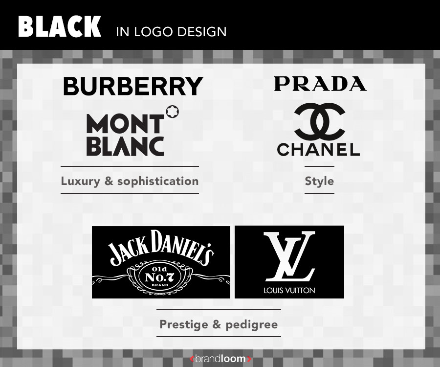
Black is an extremely stylish color, and for a long time, has been associated with sharp dressing. This is why prominent fashion brands like Chanel and Prada use it in their logos.
Black is also associated with brands with long histories- since it brings in an element of prestige. Think about brands like Jack Daniels and Louis Vuitton.
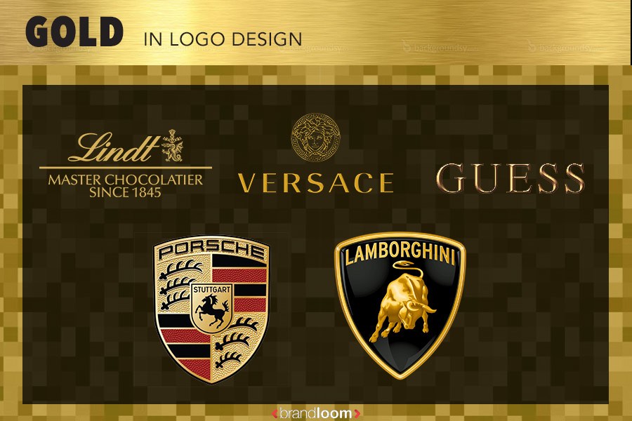
Gold Color Logo
How can we go without gold, another very popular color in branding? Some companies that feature gold color logos are Porsche, Versace, Lamborghini, Lind, Tory Burch, Guess, and MGM Resorts.
The colour gold is traditionally associated with wealth, success and power. It is your golden ticket to a golden future.
A Gold logo may help you communicate luxury and prosperity to your audience. Everyone desires Gold, so it inspires a sense of desire in most. Therefore Gold colour logos are perfect for high-end luxury brands. It is all about prestige and high status.
Famous Brands such as Rolex, Versace, Lamborghini, Porsche, MGM use gold colour in their logo.
Needless to say, Gold is a prominent colour for these luxury brands.
Why designers needs to be careful while using Gold in Logo Design
However, being a shade of yellow- gold is also a flashy colour that stands out against other colours to easily grab your attention. Hence, the colour gold is often used in connection with the nouveau riche who like to flaunt their wealth, and indulgence.
Designers must be cautious while using this colour- going overboard with it can make your brand look tacky and unsophisticated.
Gray color logo:
Want a classic, serious and mature color for your brand? Then go for gray. You can use different shades of color. Go darker if you want to add mystery and go lighter to be more accessible.
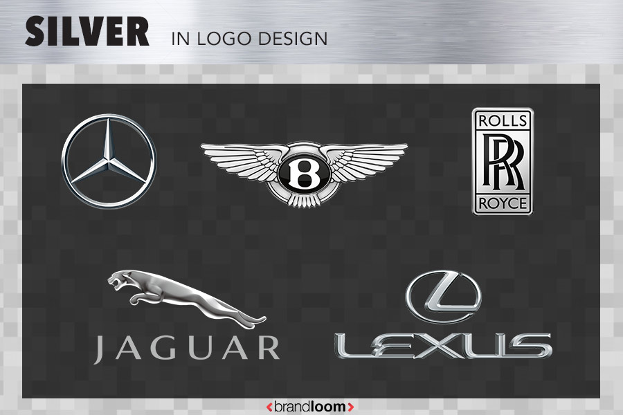
Silver
You must have seen the silver-gray logo of most automobile brands such as Honda, Mercedes-Benz, and Toyota. They have used color to emphasize sophistication and elegance.
Being a very urban, refined, and sophisticated color, silver is the favoured color for luxury brands like Rolls Royce and Bentley.
It is a widely used color in the automotive industry- especially for high-end brands. This color not only proclaims the products to be of premium quality but also conveys that their products come loaded with features. This is the reason brands like Jaguar, and Mercedes Benz use it.
Brown color logo:
Brown can be used in your brand logo to make it look more masculine, rugged, and serious. Although it is the least-utilized color, it can make your brand logo extraordinary. But if you want your brand to appear feminine, then you should avoid using this color.
Brown is also a natural color that gives a rugged and natural feel, making it a great option for outdoorsy companies. The color also represents aging. Therefore, brands that want to give a vintage feel can also use it.
The color can also be used by companies that sell brown products such as coffee or chocolates.
M&M used a dark shade of brown on their logo to represent chocolates and cookies.
Best logo color combinations – Know about the color wheel
If you want to create a good logo, you should not blindly use any color or simply go with your favorite colors. Colors that look good individually may not look good in combination. Hence, you should know what colors look good on logos.
For example, red and green individually may communicate different messages. But together, they inevitably invoke Christmas. Similarly, light shades like aqua may be pleasing to the eye, but if your logo features only aqua, it may not translate well on physical surfaces.
Bright, sunny shades of yellow as solo logo colors do not render well, so it is best to deploy bright yellows with contrasting deep colors like red, green, blue, and black.
If you want to design aesthetically pleasing logos- have a look at the color wheel. The color wheel represents the relationship between colors- for primary, secondary, and tertiary colors.
Choosing your logo color palettes- things to note
If you want to select the best logo colors that suit YOUR brand, keep a few things in mind:
-
- Understand your brand’s personality and purpose. Colors express your brand’s nature- so do not use colors that don’t go with your brand’s tone. For example, a brand like LIC, which deals with life insurance, will not have vibrant logo colors like hot pink. On the other hand, a spirited brand like Virgin will never do well with a somber color like black.
- Do not decide on colors after you have already created a logo. Try to think of both the color and the design while ideating on the logo.
- Your logo is going to be the permanent marker for your brand. Yes, logos can be updated from time to time, but usually, there is no drastic change during rebranding. So, choose your colors carefully. Do not change logo colors on a whim.
- When you design a logo, keep in mind that your logo has to feature on many surfaces- on your product, paper packaging, wraps, signboards, glow-boards, etc. Some colors look good on screen but don’t translate well on physical surfaces.
- Keep in mind that your logo color has to go with the logo font. So, decide on both the font and the colors so that your logo can harmonize both and not create a jarring effect.
Conclusion
Designing logos is not easy. If you find it to be a daunting task, or cannot translate your imagination on paper, take the help of professional designers of branding agencies, who can design a logo that will suit your brand the best.
So, have you decided on what colors to use for your logo? Do you have a favourite logo that inspires you? Let us know about it.
FAQ’s
-
Why Green colour is considered to be versatile for Logos?
Plants are green, and they come back to life after a long winter. Therefore, green is considered a color of growth or new life. But research shows that green is a versatile color and isn’t linked with many personality traits. So you can use it for any business.
Green color has strong cultural associations. In some Latin and South American countries, it is considered a color of death. In the US, they associate green with money because dollars are green.
You may have also seen monsters in green, which brings us to the point that green is a color of danger. But because of the versatility of the color, it can work for any brand. You can build meaning through the shade, hue, font, and shape of the logo. -
Where does logo color meaning come from?
Logo color meaning comes from the collision of art, science, and culture. The way your customers respond to colors depends on two factors:
Aesthetics: Some color combinations can blend well, but some can create tension and turn the customer off. Brands must think out of the box and use color combinations that can stand out among the competitors.
Learned associations: People have already learned to associate colors with certain feelings. For instance, white is the color of purity, and many Christian brides wear it on their wedding day, but for Hindus, white is the color of mourning.
-
How to choose a logo color for your brand?
Colors decide the purpose of your brand. So if you have a hard time choosing the appropriate color for your brand logo, the following points might help:
Understand your brand voice:
Stop and think about it. Ask yourself what kind of message do you want to convey through your brand? And is your company friendly? If not, then is it informative and authoritative? Jot down these points and answer them. When you reach the answer, consider the above list of colors and their meaning and find out which will suit your brand.Analyze your competition to stand out:
Pay attention to the color schemes used by your competitors. It will give you an idea about what colors are popular in your industry.This way, you will also know if using a similar color is safe or not. If not, you can make it different by picking up unused shades, hues, and symbols to standout.
Understand color psychology:
As we have mentioned earlier, a color has both positive and negative connotations. Therefore, you should comprehend color psychology as it will save you from conveying the wrong message.Mix and Match:
You are not limited to one color. For instance, eBay has used multiple colors on its logo because it wants to show its diversity. So if your business sells a variety of products, then you can also play with colors.
Do not be afraid of experiments. Take your time and do several experiments. Show the samples to the people and ask them for their review.The color wheel:
If you like only one color for your logo, then you should play around with a complementary color to add life to your logo. You may go for a simple color such as white, gray, and black or vibrant logo colors.Complementary logo colors:
Complementary colors enhances the effect of each other. You need to see which color is going well with your chosen color. The main purpose of these colors is to make your chosen color pop out. For example, green color boosts red, purple boosts green and orange boosts blue. You need to give it some time and find the best fit for your logo.Analogous logo colors:
When you combine three neighboring colors, they are called analogous colors. To make this color scheme work, first you need to choose your ‘hero’ color and then two neighboring colors to enhance the hero color.Look at the burger king logo colors, they have used three colors in which blue and yellow are the supporting colors and red is the hero color.
Monochromatic logo colors:
Using different hues of the same color is known as monochromatic colors. This is a great way to accentuate your audience. Oreo have used a monochromatic scheme and they are totally rocking it.Choosing a color for your logo is not simple as it looks. You need to consider a lot of factors before going for a logo color and design. Your logo color must convey the right message to the audience. Consider how you want your brand’s personality to be perceived and make attempts to reach your goal.
In case you want more tips or want to hire a professional to create a logo, don’t forget about us. Connect with us, as we can create your brand logo and other design elements that will give your company a sharp- and definitely attractive- edge over your competitors. -
List some best logo color combinations?
Some of the best logo color combinations are:
– Purple and yellow
– Deep orange, turquoise and navy blue
– Natural green and brown
– Light purple and beige
– Blue and gold
– Shades of green and blue -
What are the best 3 color combinations for logos?
Some best 3 color combinations for logos are as follows:
– Beige, brown and dark brown: This color combination gives a sense of warmness.
– Dark blue, turquoise and beige: this combination is best for brands that values creativity
– Blue, yellow and green: this combination symbolizes youthfulness
– Blue, red and yellow: this combination is funky and radiant
– Light pink, hot pink and maroon: this combination reflects innocence and friendliness -
How to change color of a logo in Photoshop?
1 Follow these steps to change logo colors in Photoshop:
2 Make sure that the color mode is RGB
3 Make sure you have the layers color palette on the screen
4 Click the Fx icon which you will find on the below
5 A dialog box will appear. From Effects menu, choose Color Overlay
6 Click on the color box and choose the desired color
7 Press OK in all dialog boxes
8 Make sure the file is in PNG-24
9 Click on save, and voila! You have successfully recolored the logo.


I reviewed your blog it’s really good. thank you for the information about this blog.I want more information
I read your blog. Having very use full information help me a lot. I will read more articles on your blog.
Interested reading the blog
Thanks for sharing the information