
When you want to launch your brand, you want the perfect logo to represent it. But do you know which type will serve you the best? Well, to take that call, you should have an idea about the different types of logos that brands are using today. Once you know the different logo styles that are prevalent in the world today, you will be able to see which type will be perfect for you.
After all, your logo acts like your style statement. You should know how many types of logos your brand can use for maximum impact. That’s why we have covered the different types of logos a business can use.
Carving out a brand identity where the brand and logo are in perfect sync
Why is it vital to know the different logo design styles you should use? Because your logo should perfectly symbolize what your brand is about. On the other hand, a good logo can make your brand very memorable. In fact, short logo design plays a big part in brand recognition.
Your digital logo design should perfectly represent your brand’s most important symbol. Think about the Nike swoosh- it is synonymous with the brand. Even without the brand name accompanying it, it is instantly recognizable.
The swoosh also depicts what type of brand Nike is and who it targets. It is an urban, contemporary brand whose appeal lies with young people of all genders. If Nike used some royal insignia or a floral design, it would be incongruous and probably never appeal to the target audience.
Different Types of Logos
There is no authoritative classification for the different kinds of logos. However, some broadly acknowledged groups exhibit distinct characteristics. We will have a look at some of the different types of logos.
1. Monogram Logos or Lettermark Logo
A Monogram logo or lettermark logo consists of only letters. In most cases, these are the brand initials. Monogram logos are very common in the media and entertainment sector.
Lettermark logo examples
Think of Home Box Office or HBO. The brand’s logo is a monogram of its initials. Some other famous examples are- HP (The Hewlett-Packard Company), WB(Warner Brothers), and CNN (Cable News Network).
Monogram or lettermark logos are known for their simplicity. They are formal, all-business, neat, and very streamlined in appearance. They are well-suited for brands that have long names. One famous example of this is NASA, the shortened form of the National Aeronautics and Space Administration.
Some other examples are NHS or National Health System of the UK, HDFC or Housing Development Finance Corporation, and FedEx – which was initially called Federal Express.
IKEA- one of the most famous monogram logos in the world, is an acronym. IKEA takes its name-style logo from the initials of the founder Ingvar Kamprad, Elmtaryd- the family farm he was born in, and Agunnaryd- the village near his birthplace.
Which brands can use them?
If your brand has a long name or comprises many words- go for it. Businesses based on partnerships, like legal businesses or advertising/consulting agencies, can go for this type. KPMG (Full name- Klynveld Peat Marwick Goerdeler) is a good example.
Monogram logos go well with formal brands and want to project an image of efficiency and expertise.
2. Wordmark Logo
Wordmark logos, as the name suggests, only comprise letters. These are standalone words. Think of the popular logos of eBay, Google, Netflix, or Facebook. These are perhaps the most common sort of logos you’ve seen.
Wordmarks are simple and enjoy high recall. Think of Uber, Subway, Coca Cola and Visa as wordmark logo examples. Also known as logotypes, these are especially popular with companies who want to keep the customer experience at their center. In most cases, brands that are named after a concept use wordmark logos.
Wordmark logos are also known as logotypes.
Which brands can use them?
Wordmarks work very well with brands that have catchy, easy-to-pronounce names. With attractive lettering, they can foster high recall. This is why companies that want customers to return to them go for wordmarks.
However, if your company is not very well known, wordmarks may not work for you. If your company takes its name from someone, you may want to avoid wordmark logos.
3. Pictorial Logo
Pictorial mark logos are instantly recognizable logos and symbols of a brand. Think of the apple of Apple or the bull’s eye of Target. The pictorial logo represents the company’s literal name and contains no letters.
Pictorial logos may look simple but are very carefully planned. Think about Twitter. It says a lot about the products and services, even though it is just a small blue bird. As the only thing left to represent the brand is a symbol and not words- they are tough to master. This is the reason why only the biggest corporations in the world go for this.
Which brands can use them?
Pictorial logos, as we said, are painstakingly designed. A simple design has to capture the brand’s nuance- so it should pay a lot of attention to detail.
A good example is Twitter. The bird representing the brand is flying, while it is chirping. The logo expresses the idea of broadcast and buzz very well.
Companies that do not have a high recall should not go for pictorial logos. They are not very suitable for new companies.
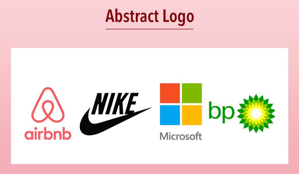
4. Abstract Mark Logos
An abstract logo is a well-known type of logo. They are highly conceptual and usually targeted at very niche audiences. They convey something definite about the brand in question. Some famous examples are Nike, Microsoft, Airbnb, and BP(British Petroleum).
Since abstract logos are conceptual, they require a high amount of creativity. There is a lot of room to play around with them because you can design something unique for your company that conveys its most necessary characteristics.
Think of the Microsoft logo. It comprises four squares in distinct colors. However, you can say that together, they look like a window- which is the name of Microsoft’s famous operating system. Similarly, the BP starburst may be used to allude to the fact that the brand is part of the energy sector, resulting from a starburst.
The Nike swoosh, again, is an abstract logo that may only look like a tick mark but can be interpreted in a lot of ways. It goes very well with Nike’s slogan- “Just Do It.” When you do something, you can tick mark it in your checklist. It invokes strong feelings- and can be seen as representing inspiration and progress too.
Which brands can use them?
Abstract marks are very conceptual and allow you to represent whatever values or services your company should be known for.
However, these do not lend well to amateur work.
However, you can play with abstract logos if you want to create something unique for your brand and appeal to exclusive niches.
5. Emblem Logo
As the name says, emblems look like badges or seals. These logos usually feature some letters inside a picture.
As the name suggests, emblems look like crests. These logos belong to brands that have a cult following. These brands focus on their target audiences and define an entire experience preferably than just what product they offer.
Emblem Examples
These belong to brands that can impress you with their pedigree- like Starbucks, Harley Davidson, and Harvard University offer different emblems as logo variations.
A great example is the siren of Starbucks. We all know how Starbucks has become a way of life for those who go for it. Like the siren in its logo- known to hypnotize sailors- it keeps its customers entranced. Similarly, Harley Davidson does not represent a bike but an entire lifestyle and passion.
What brands can use them?
Emblems are best left to well-known brands that have survived the test of time. They develop fandoms, are like exclusive clubs, and are not universal.
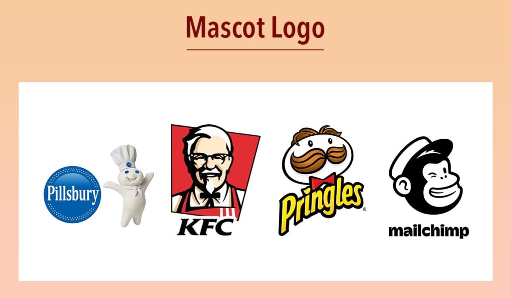
6. Mascots Logotype
These are logos that want to represent wholesomeness. Think of the various mascots of sports teams or other events. They are friendly and happy and often cartoonish.
Mascot Logotype Examples
Mascots are logos that show a character. Think of Colonel Sanders of the KFC logo or the Pillsbury doughboy. Mascots are family-friendly and colorful and always seem inviting and warm.
Gritty, the mascot of the NHL team Philadelphia Flyers has become an internet fixture – while it is not family-friendly and slightly terrifying- it has definitely managed to capture the attention of the entire world.
Which brands can use them?
Mascots are a great idea when you want your brand to be welcoming and family-friendly. This is especially true for restaurants that cater to families. Brands related to food often go for mascots for this reason.
7. Combination Mark Logo
As the name suggests, combination logos combine a symbol and some letters. These are probably the most widely used of all logotypes. Think of companies like Nestle, Taco Bell, Lacoste, and Burger King.
Combination marks give a “stacked” appearance. These are very versatile. Most businesses prefer them since they show both a name and an image. They can create a distinct impression on the target audience’s mind and can increase the brand’s recall value.
They are also easier to trademark, as the specific combination is unique and difficult to copy. Through the ages, brands can adapt combination logos in a variety of ways.
Which brands can use them?
Virtually any brand can go for combination logos. They can help you create a truly memorable and unique logo and can help you distinguish your brand easily from your competitors.
8. Letterform Logo
Letterforms are very scalable. You can use them on virtually anything since they occupy significantly less space. They translate well on both paper and in the virtual space.
Letterform logo examples
These are minimalist representations of brands. Letterforms are widely used. Think of the likes of WordPress or the McDonald’s arch. Many designers consider the letterform to be an offshoot of the monogram logo.
Since they are usually represented by just one letter, letterform logos must be genuinely well-designed to be memorable. These are best left to experts. These should be high-impact and dramatic.
Which brands can use them?
Brands that are popular and have a high recall can go for letterforms. They often become the natural result of the evolution of many brands that have survived for a long term and command a substantial market share.
However, they have to be very well designed since they are geared for maximum effect with just one letter.
These are roughly all the types that logos can be classified into. If you want to understand which type will suit your brand best- read on.
What are the different types of logos design styles are suitable for you?
Since logos are the most widely used symbols or brand marks, you must first understand what type of brand you have and who your target audience is. Depending on the audience and the kind of feelings you want to invoke in them- you have to choose your logo.
Here are some suggestions to consider while creating logo variations for your company.:
1. Be original
Always make sure that your logo is not aping any other catchy logos. This may lead to copyright issues.
2. Create something unique
An original and compact logo is good for avoiding legal hassles and for your brand in the long run. Otherwise, people may think your brand is a better brand’s copycat.
3. Wordmark and lettermark for new businesses
Wordmark and lettermark logo categories are easy to replicate across brand collaterals that require frequent reprints, like business cards and food packaging. New businesses can use them for this reason.
4. Abstract logos- a favorite with MNCs
Abstract logos work very well with multinationals with unique names. If the meaning of your brand’s name invokes a strong feeling but cannot be translated literally in other languages- you can opt for abstract logos.
5. Go for an emblem if you want to inspire exclusivity
If your brand carries a lot of prestige and becomes the mark of an exclusive lifestyle- emblem logos will work for you.
6. Mascot logos- give that family feeling
Mascots can work very well with brands that appeal to kids or families.
7. Combination logos- most versatile
Combination marks can be altered in many ways through the years- and hence serve almost every type of brand.
8. Emblems for the government bodies
Government agencies often use emblems- since they are the natural evolution of the royal crests, the emblem takes its name. They are also widely used by schools since they are public institutions many people would proudly claim affiliation with.
9. Pay attention to lettering & colors
Since letterforms and wordmarks comprise only letters- you have to be very particular about the color combinations and letterings you are going to use. To understand what sort of font will suit your logo best- check out our article on the best fonts for modern logos.
10. Do your research before you start designing
A logo creates a strong impression on your audience and conveys your company’s essence. So, pay attention to every detail. Brainstorm, do your research, and play around with concepts.
11. Sync your logo with your brand personality
Last but not least- your logo should match your brand’s personality. You cannot have an emblem logo for a chatting app or a mascot logo for a university. Ensure that your logo syncs perfectly with your brand- otherwise, you will only confuse your audience and create the wrong impression of your brand.
Conclusion
Your logo is going to be the most recognized symbol of your company- which will be used for a long time. So do not rush the process- invest in it since there are different types of logos to explore! You should take the help of professionals if you want to create something truly unique. Understand your brand, and pay attention to the basic types of logo you want for yourself.
Remember, designing a logo is the first concrete step toward carving out your brand identity. Understand what your brand stands for and who you are speaking to, and you will surely be able to find different types of logos that are suitable for your brand.
FAQs About The Different Types Of Logos
Ans. The most widely acknowledged types of logos are monograms, wordmarks, pictorial marks, abstract logos, emblems, mascots, and combination logos. The letterform is another type of logo. Designers often consider it to be a type of monogram logo. However, there is no hard and fast classification of logos. Designers also group different logos under a single umbrella as they see fit.
Ans. The Nike swoosh is an abstract logo. It represents certain values that are centric on the brand rather than any literal representation or illustration of what Nike produces. It evokes powerful emotions and is widely regarded as one of the most renowned logos of all time. Today, the swoosh is instantly recognizable and represents Nike as much as its name.
Ans. A mascot logo depicts a living being that represents the brand. Not necessarily, it has to be human; it can also be a cartoon or some anthropomorphic illustration. Some examples are- KFC and the Pillsbury Doughboy. The food industry and sports frequently utilize mascots. Family-friendly brands usually use them.
Ans. Lettermark logos are logos made of only the brand’s initials. They are very popular in the media, legal, finance, and corporate sectors. Think of CNN (Cable News Network), HBO (Home Box Office), KPMG (Klynveld Peat Marwick Goerdeler), and NASA(National Aeronautics and Space Administration). If your company has a long name or several partners, lettermark logos may suit you.
Ans. A logo made of text characters is called a wordmark. These are also called logotypes. Some companies that have wordmark logos are- Facebook, Netflix, Google, and eBay. These are companies that have catchy names, and their names usually refer to a concept.
Ans. As the name suggests, a combination logo consists of text, symbols, or pictures. Think of the logos of Taco Bell, Nestle, Puma, Pizza Hut, and Lacoste. Combination logos are the most famous logotype out there. The combination of text and pictures can leave a lasting impression of the brand on the audience’s mind and make it easy to trademark.
Ans. To add a logo in Word, do the following:
After opening your Word document, choose the “Insert” option from the ribbon’s top menu.
Select “Pictures” from the menu bar’s “Illustrations” section.
Locate and choose your logo file by browsing that folder.
To insert the logo into your document, choose “Insert.”
You may resize the logo by clicking and dragging on the corners of the picture.
Additionally, you may reposition the logo by clicking and dragging it around your page.
Ans. Different types of logos are made up of four parts:
Color: A logo’s color scheme may suggest many feelings and meanings. Red, for instance, might stand for fervor or enthusiasm, whereas blue for reliability or competence.
Typography: A logo’s font or typography may also suggest a tone or personality. For instance, a computer business would choose a strong, contemporary typeface, whereas a law office might use a more conventional font.
Symbol: A logo might include a symbol or icon to symbolize the firm or brand. Both literal and abstract representations are acceptable, such as the Nike swoosh or a depiction of a meal for a fast food establishment.
Layout: The layout or arrangement of a logo’s components can also influence its overall appearance and feel. A logo might be vertically or horizontally oriented, layered, or organized in a circular design. It should be simple to read and aesthetically balanced.
Ans. The following three rules govern logo design:
Simplicity: A logo should be straightforward and simple to understand. Even on a tiny scale, it must be instantly recognizable and memorable. A simple logo has more versatility and can serve multiple purposes.
Memorability: The viewer must easily recall a logo in their mind. It should be distinctive and distinct from other logos used in the same sector. A brand’s familiarity and loyalty may increase with a distinctive logo.
Timelessness: A logo must be enduring and unrelated to any style or craze. It ought should survive the test of time and continue to be relevant for many years. A recognizable logo may contribute to a brand’s legitimacy and enduring appeal.
Ans. In logo design, a key symbolizes a particular idea or concept. A designer may use a key to unlock their potential or solve a problem, or they can use it to gain access or ensure security.
Furthermore, designers can incorporate it into a logo in various ways, using it as the main visual element or as a part of a larger design. A key in a logo may assist the viewer in understanding a message or concept while also adding aesthetic appeal and originality to the design.


It was a very informative & useful article. Different types of logos are used for different purposes, and it’s important to understand the characteristics and design elements of each type before deciding which one to use. Here are some tips on how to use different types of logos:
1.Wordmark logos
2.Lettermark logos
3.Iconic logos
4.Combination logos
I thoroughly enjoyed reading your blog post as it provided me with valuable insights and information. Additionally, I would like to contribute some supplementary points that could benefit your readers:
1. Initial-based logo
2. Watermark logo
3. Textured logo
4. Responsive or adaptable logo
5. Symbolic logo
6. Heraldic logo
7. Typographic logo
8. Digital or tech-inspired logo
9. Nature-inspired logo
10. Human or silhouette logo
These points offer additional perspectives on the discussed topic. On a personal note, as someone without a technical background, I understand the challenges of website development. If you are facing similar difficulties, I have found it helpful to seek assistance from professional companies that specialize in web development and website design and redesign, such as Alakmalak Technologies
WOW NICE