A good logo is essential for building any brand. It is the symbol representing your brand and the primary visual marker that your audiences will remember you by. But which one will be suitable for YOUR brand?
To understand that, you have to look at different types of logos- logotype vs logomark vs combination mark.
Remember, no matter what type of logo you choose- entrust only good branding agencies like BrandLoom to design the perfect logo for you.
This blog will discuss the different types of logos, what factors you need to keep in mind to make the right choice for your brand, and what is ideal for new or small businesses.
Without much ado, let us dive right into the world of logos.
Types of logos
- Logotype
- Logomark
- Combination mark
Depending on whether logos use text or visuals, we can broadly categorize them into:
1 Logotype – What is a Logotype?
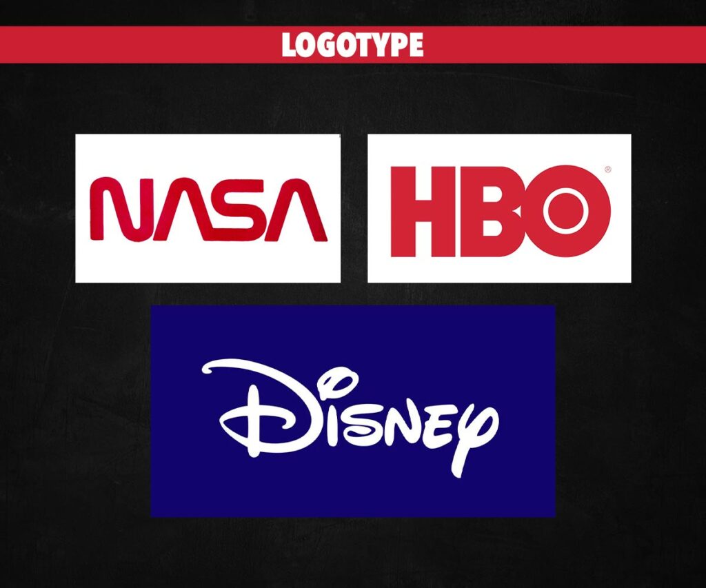
These logos are text-based and usually spell out the brand’s name or an acronym. They are the most popular type of logos.
Examples- are Disney, HBO, and NASA.
2 Logomark – What is a Logomark?
They are pictorial logos. They are usually symbolic. In pure form- they contain no text element. They can be literal (like Apple) or abstract (like Nike’s swoosh).
Examples- Pepsi, Apple, WWF.
3 Combination mark
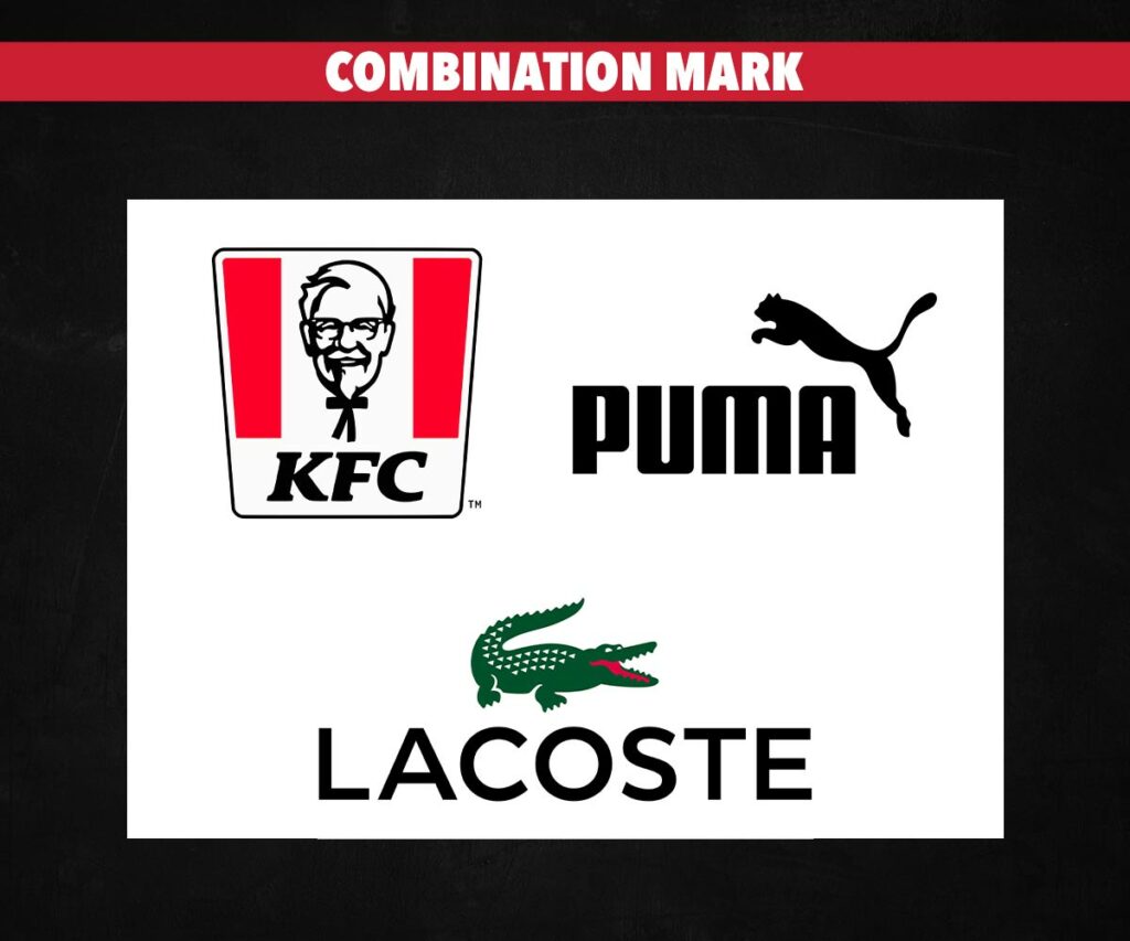
Combination marks combine both text and pictorial elements. Since logos have to appear on various media, materials, platforms, and spaces- most brands create a combination mark logo and then use individual logotypes or logomarks as needed.
Examples- are KFC, Lacoste, and Puma.
Now, let us look at each in detail.
What is Logotype Logo Design?
Logotype definition:
A brand logotype is the creative rendition of the name that you wish to represent. It may or may not work best because it needs to be paired with a logomark and/or combination mark.
If you are wondering what a logotype is, in simple words- it is the name of the brand or its acronym spelt out.
| Pros | Cons |
| Suitable across industries. Have high recall value. Promote brand awareness. No risk of confusion. They are compact, so they are ideal for the budget. | They are not suited for every occasion as they are compact. Less creative. Don’t work for hard-to-pronounce brand names. Fonts can become dated fast. |
Recommended for:
- Small businesses and startups
- If your brand name derives from a famous word, you can leverage that with a logotype.
- Especially well suited for finance and law concerns
What is Logomark Logo Design?
Logomark definition:
A logomark can be any symbol that communicates for you effectively. It may or may not work on its own because it needs to be paired up with a logotype and/or combination mark.
| Pros | Cons |
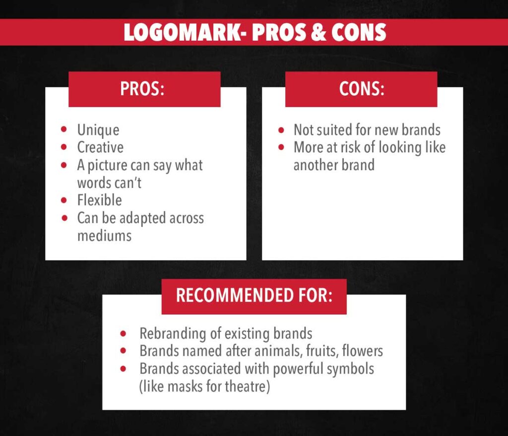
| Unique Creative A picture can say what words can’t Flexible Can be adapted across mediums | Not suited for new brands More at risk of looking like another brand |
Recommended for
- Rebranding of existing brands
- Brands named after animals, fruits, flowers
- Brands associated with powerful symbols (like masks for theatre)
What is a Combination mark Logo? How to combine Logotype and Logomark?
Combination logo definition:
A combination mark is typically the initial letter of your business name used with other symbols to make a logo.
A logotype is the text version of your logo, while a combination mark uses the company’s initial letter spelt out for branding purposes. This does not affect how either element works in regard to pairing it up with other elements to form a complete logo.
| Pros | Cons |
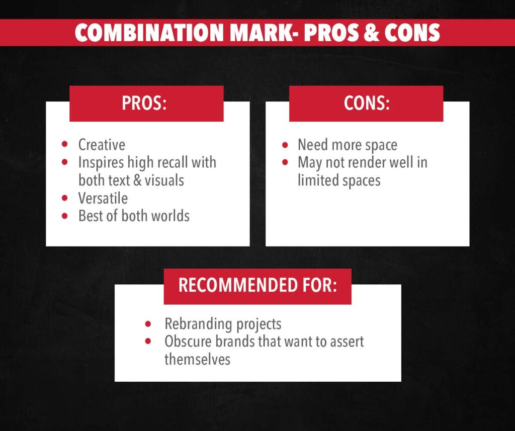
| Creative Inspires high recall with both text & visuals Versatile Best of both worlds | Need more space May not render well in limited spaces |
Recommended for:
- Rebranding projects
- Obscure brands that want to assert themselves
Logotype vs Logomark– What should small businesses opt for?
Many small business owners are interested in logo design but uncertain about the best logo. The first step is determining if you want your logo to be symbolic or functional. Read on for the pros and cons of each type.
Logo Design: Symbolic vs Functional
A symbolic logo uses abstract images or has no connection with the offered product or service. These are usually logomarks- like the logos for Target and Playboy.
A functional logo includes a symbol that represents the business. Logotypes, which spell out the brand’s name, fit this category. Think of brands like Coca-Cola, eBay, or CNN.
Symbolic logos can more effectively create an emotional response from those who view them because they don’t immediately bring to mind the product or service they represent. This can be a very effective branding strategy.
But when it comes to startups or small businesses, it can also cause some confusion and lead to missed opportunities.
Should small businesses go for logomarks?
When choosing a logo, you should consider whether your target audience is more likely to respond positively to an abstract image than one that looks like the product or service.
For example, Nike’s well-known swoosh logo can also represent speed and agility in sports by using lines that create an image of motion when looked at sideways or upside down.
Symbolic logos work well for brands that already have widespread recognition.
Functional logos are more advantageous when you want the symbol to immediately convey your product or service. They are good options for small businesses that want to build brand awareness.
If you want to know what type of logo will suit your brand, talk to the logo design experts at BrandLoom.
Questions to ask yourself before you design a logo:
FACTORS INFLUENCING LOGO DESIGN
1 Who is the target audience?
This is at the core of any brand. Unless you narrow down your target audience, you won’t be able to design a logo that appeals to them. Think about Barbie. Can you imagine the quintessentially girly brand having a black symbol in an emblem style? Of course not.
2 What is the brand’s personality?
Is it professional? Is it quirky? Does your brand have a feminine spirit? Think about what kind of a person your brand would be like if it took human form. The logo should reflect that.
For example, YSL, a luxury brand that stands for sleek sophistication, cannot have a logo that looks kitschy or have a lot of colours. It has to be all about simple, elegant lines and neat shapes.
3 What’s the budget?
Of course, any decision you take needs to factor in the budget you can spare for your project. If you hire a fly-by-the-night designer, they can design a logo for just a pittance. But it may not capture the essence of a brand, can cause delays, and may even be copied from another brand. Hiring good logo design agencies with a track record for integrity and creative excellence is best.
4 What colours should I use?
As a logo is to be seen, colours will play a vital part in logo design. Can you imagine a flamboyant brand like Virgin being set in a sombre brown? Or a brand like Whole Foods with a purple logo?
5 What should be the typography?
The font you choose for your logo will significantly affect its character. This is doubly important if you use a text-based logotype for your brand. Think of brands like IBM- the font looks serious and professional, matching the brand’s spirit. Read more about modern fonts for logo design here.
6 What symbols to consider?
Shapes play a big role in logo design. Does your logo need to feel angular and dynamic? Or does it need the serene, soft shapes that evoke circles?
7 What materials/medium will the logo be put on?
This is an important question- especially in the internet age where your brand needs both an offline and an online presence. To register your appeal across all platforms, you need a versatile logo.
What makes an effective logo design?
An effective logo can do the following:
1 Appeal to your target audience
Your logo is your brand’s most recognizable symbol. If you want to create a successful brand- it should be memorable. A good logo should resonate with your audience and be memorable to increase brand recall.
2 Convey your brand’s message and personality
A logo is the symbolic manifestation of a brand. It should give a “feel” of what your brand stands for. E.g., an emblem logo like that of Harvard University brings to mind the king’s seals. It gives a sense of prestige and inspires pride in the minds of those who are part of it.
3 Be versatile & adaptable
This is an essential aspect of logo design. In the digital age, a good logo translates well across mediums.
Think about how many different mediums your logo will be used and whether it can be tweaked for said media. Also, how much space is required to display the logo? If you need a one-colour logo, choose your designer because contrast plays a vital role in this design.
Carmakers Renault changed their logo in 2021 to a flatter, more straightforward design. The reason for that is that the old logo- a silver rhombus- did not render well on digital media.
Moreover- Renault’s planned foray into electric cars needed a logo that looked well backlit by light. Hence, they needed a more straightforward, versatile design that would look good against various materials.
Elevating your brand with logo variations: Importance of logo versatility
Imagine the Google logo. Universally known and instantly recognizable. The logo spells out the name of the brand. It is a classic logotype. If you want to put it on the side of a pen, it works great.
Think of fitting that horizontal logo in a small circle- like a Facebook profile picture. You can see how difficult that will be. Instead of the text-based logo, you need a logomark- a logo with a pictorial element that will represent the brand.
This is why you need logo variations. A logo that can be interpreted in multiple ways for different mediums, available space, and materials is essential for any brand today. Check here to see how Google interprets its logo in various ways- where only a small space is available, they opt for the monogram version.
Remember, as your business grows and as the market changes, you will have to rebrand and expand your brand’s iconography. You need to put your brand on different media to reach your customers across platforms. A logo that is versatile and adaptable will be a necessity.
Logo designing is no job for an amateur. If you want to ensure logo versatility for your brand- talk to expert branding agencies like BrandLoom.
Conclusion
Your logo is your brand’s most important symbol. So, when you design it, you must think about what type will be best for you. Of course, you can talk to the logo design experts at BrandLoom– who can guide you through the process and give you a logo that captures the essence of your brand in a versatile way.
If you want to read more about types of logos, check out our blog.
FAQs
Do I need a logomark?
Not necessarily. If you are a startup or small business, a logotype will work fine for you. However, you need an arresting font or typography to create a strong logo. Whether you are spelling out your brand’s full name or just using an acronym, you should ensure that your logo is visually appealing and renders well across mediums.
A custom or elaborate font will also protect you against copyright infringement and make it difficult for someone to copy your logo. Talk to expert branding agencies like BrandLoom to create a perfect logo for your brand.Is logotype a part of logo?
Most logos consist of text and visual elements. A logotype is the text-based part of a logo and refers to entirely text-based logos. Think of brands like Coca-Cola or Lego.
However, if you have a logo consisting of text and visual elements, your logotype can represent your brand on materials and mediums suited for it. E.g., if you want your logo to be put on the side of a pen- logotype is a perfect choice.
However, if you’re going to take up more space, the logomark rendition of your brand may be better suited for it. To create a good logo, entrust the job to expert branding agencies like BrandLoom.What is the difference between logotype and logo mark?
A logotype is a text-based logo or the text part of a logo. Think of the logos for KPMG or Sony- they spell out the brand’s names or acronyms. These are logotypes.
Logomarks are pictorial logos or the visual part of a logo. The apple of Apple or the Mercedes Benz logo falls in this category.
Logotypes are the most common types of logos and work very well for startups or small businesses to build brand recognition. More prominent, well-established brands often use logomarks. However, most brands today go for logos with both text and visual elements.
If you want a good logo to represent your brand, talk to a branding agency with a proven track record like BrandLoom.What is a combination logo?
A combination logo or combination mark is a logo with both a pictorial element (logomark) and a text element (logotype). Good examples of combination logos are those of Taco Bell, BP, and Master Card.
While a combination mark may take up more space (and be more expensive to print), it is the most adaptable type of logo. Depending on the medium, space, and material your logo has to go on, you can choose either the logotype or logomark parts of your logo- or the combination mark.
If you want to create the perfect logo for your brand, talk to a good branding agency like BrandLoom.What is a good logo design?
Here are some factors that make a logo a good one:
– Attractiveness- it should be eye-catching.
– Uniqueness- If you want to stand out, you need a distinct logo. If your logo brings to mind some other brand, it will confuse the audience; you will lose your edge and even lead to legal issues.
– Appropriateness – Does your logo capture your brand’s message, personality, and values? If your logo cannot capture the essence of your brand, it will not be a good representation of your brand.
– Simplicity – Overtly complicated designs don’t do well as they often put off people. Go for simple designs which are easy on the eyes.
– Versatility- Your logo must render well across a host of platforms, mediums, and materials. This is a must in the digital age- where your brand must be on virtual and tangible properties.
If you need an eye-catching logo that satisfies all the criteria above, talk to the experts at BrandLoom.What is a logotype?
A brand logotype is the creative rendition of the name that you wish to represent. It may or may not work best because it needs to be paired with a logomark and/or combination mark.
If you are wondering what a logotype is, in simple words- it is the name of the brand or its acronym spelt out.