You’ve likely encountered an infographic, whether you’ve been flipping through a magazine or browsing social media lately.
Information graphic designs offer a compelling visual storytelling format across industries and platforms, from healthcare to finance.
Educators and students enjoy infographics for their versatility inside the classroom.
While infographics come in varying sizes, shapes, and colors, the best ones all have something in common: they blend visuals and text to tell a story.
You’ve found the right article if you have never created an infographic before.
This guide includes everything you should know about designing an infographic, from how to create an infographic to an example of different infographic types.
Infographics can really enhance your message.
If you want to use good infographics to hook in your audience, enrich your blog or engage with your followers on social media- you can talk to seasoned graphic designers at BrandLoom.
Remember, infographics are easily digestible, and you can use them to repurpose your content easily.
So let’s understand what they are and how you can use them.
What is Infographic Design?
In general, an infographic is a visual representation of information or data of any type.
Whether it’s a study on market trends or a guide on how to wash your clothes, you can use an infographic to present that information in an attractive visual format.
It’s worth noticing how the use of colors, illustrations, and bold text immediately engages you and gives an overview of the topic as you browse.
A well-made infographic aims to inform as well as entertain and engage your audience.
It’s all about what you combine from different graphic design elements like colors, icons, images, illustrations, and fonts – to explain a topic in an engaging and easy-to-understand manner.
Why Should You Use Infographics?
In addition to their fun, engaging, and easy-to-share nature, infographics have tons of benefits for all kinds of content creators, including businesses, educators, and nonprofits.
Marketers can use infographics to drive website traffic, increase brand awareness, and stimulate engagement.
Educators and trainers can break down complex information into easy-to-understand visual formats.
Nonprofit organizations can use infographics to raise awareness about social causes.
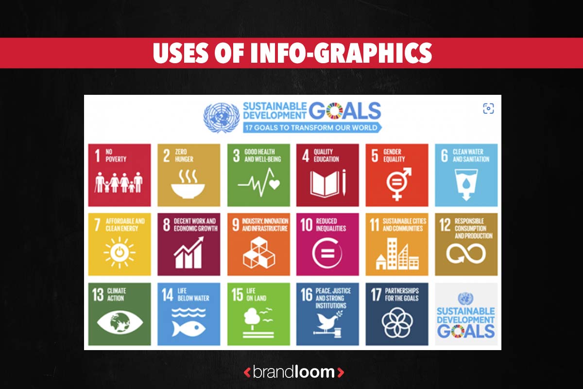
Here’s an example of how the Illinois Math and Science Academy (IMSA) is using an infographic to create awareness about the U.N. Sustainable Development Goals (SDGs).
You will find information about infographics and why it is important to invest in information design.
We will also cover how to get started with creating your own infographics.
If you need help creating infographics that lead to results, feel free to contact us for further assistance.
Let’s get started!
What are Infographics Design used for
A common way to convey information through infographics is through their versatility; You can upload an infographic to a blog post, share it on social media, or share it privately via email.
The visual nature of graphics is also a great way to capture your target audience’s interest.
Now that it is clear what an infographic is and how it is used, let’s look at the types of infographics.
Types of infographics:
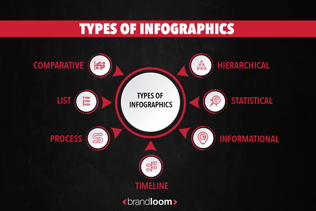
When you try to create an infographic, you can select from a range of types, including:
- Comparative
- List
- Process
- Timeline
- Informational
- Statistical
- Hierarchical
- Flowcharts
- Anatomical
- Data -Visualization
- Geographical
You can choose the infographic you want to use depending on your content or what you want to share with readers.
If you’re going to compare two things, like apples and oranges, you should probably use a comparison infographic because it is designed that way.
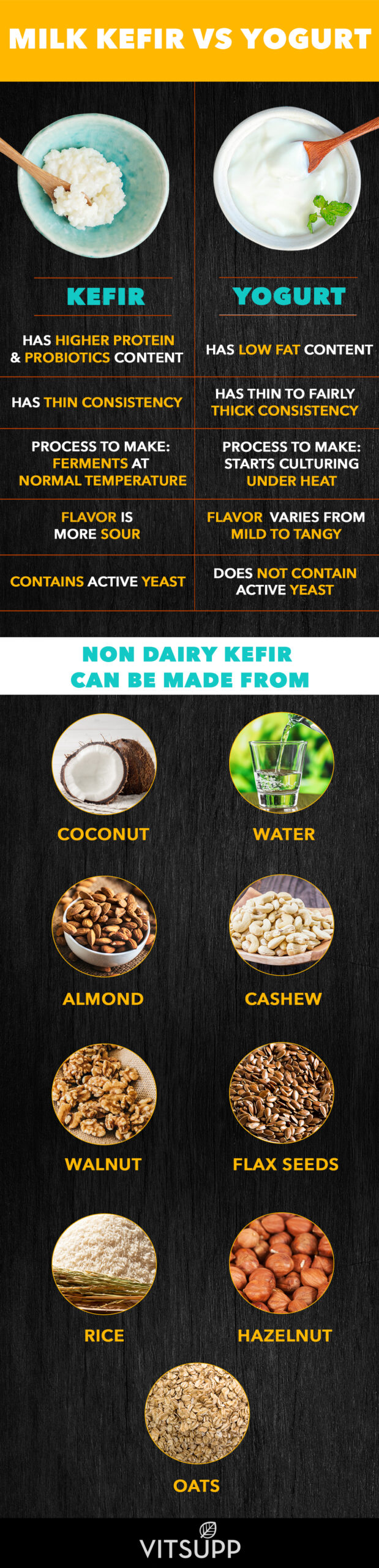
What Is a Comparison Infographic?
The purpose of an infographic comparison is to provide prospective customers with a general understanding of products, companies, events, or time periods in contrast to each other.
It is usually a chart that summarizes the main details concerning the objects being compared to facilitate their understanding and, consequently, their opinion about them.
Look at this example of a comparison infographic.
It is not difficult to create a comparison infographic since they simplify any presentation or report, but how can you make a decent one? Let’s figure this out together with BrandLoom‘s infographic design experts.
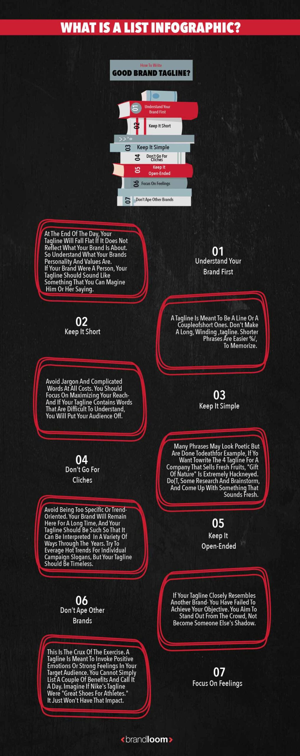
What Is a List Infographic?
It makes it smooth for your audience to skim content, which is useful if they are looking for useful information right away.
Whether one is trying to write an article, blog, or creating an infographic, organizing and summarizing information in a list will make it easier for your audience to understand.
While a list infographic does not follow a specific order, it may have a “top” list that arranges elements according to set criteria.
Regardless, everything in a list must collectively communicate a single thought or be related to a single topic. For example, have a look at Brandloom’s list infographic design.
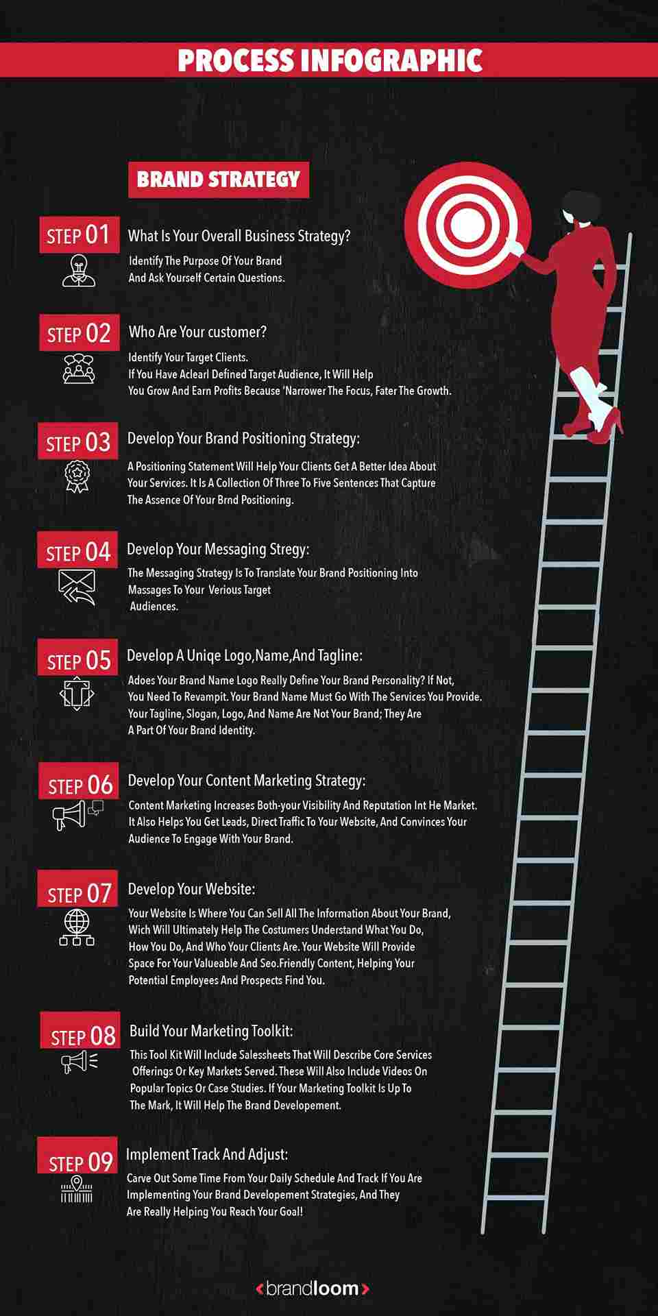
What is a process infographic?
A process infographic typically illustrates the steps or phases by simplifying and explaining steps in a process through a visual model.
It provides an intuitive layout so that the viewer can follow the information from start to finish.
A well-designed process infographic simplifies the concept you want to share and saves you and your audience time.
You likely encounter process infographics in some form pretty regularly throughout the course of your everyday life.
Imagine how much (more) puzzling it would be to assemble your new Ikea desk if the instructions only contained words, isn’t it?
We can visualize process information more quickly and clearly with process infographics, making them excellent educational and training materials. Additionally, they can serve as smart marketing tools.
Here’s an example of a process infographic for building a brand strategy.
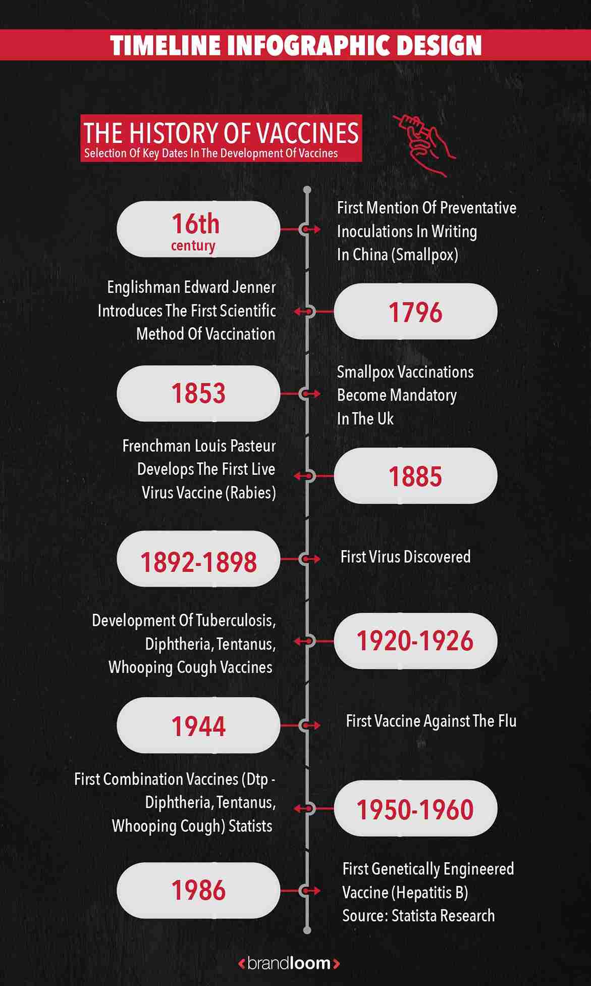
What is a timeline infographic design?
Timeline infographics are a very popular presentation format, especially in presentations, since they can illustrate a variety of time progressions, which can include any amount of information provided it is developed with good quality.
Timeline infographics are frequently used for presentations, mostly due to their flexibility, since they can convey any time progression and related information, as long as they are developed well.
One of the very common marketing trends in marketing is to use timeline infographics to illustrate planning and results during a month.
Knowing about the various uses is essential for better understanding it.
Here is one of the timeline infographics that make it easy to understand and learn about past vaccines created to combat diseases by AstraZeneca.
Project timelines
Are you required to submit a project plan for your marketing team? An infographic timeline can help illustrate what is expected of you within that general time frame. Each section in this infographic shows what is expected of you and the specific dates involved.
Processes timelines
An infographic timeline shows all the sequential steps in a time sequence in a company’s work processes. It’s the best way to illustrate all the steps.
Business Infographic design presentation
A timeline graphic is also an effective data visualization method. In this case, the timeline structure is useful for illustrating how marketing activities have progressed over time, such as months or weeks.
History timeline
In addition, timeline infographics can be used to present the evolution of a market, the history of a company, or the history of someone.
Generally, the milestones are divided into more specific periods in this format, such as year, month, or day. The idea behind it is to tell a story using facts contextualized with time.
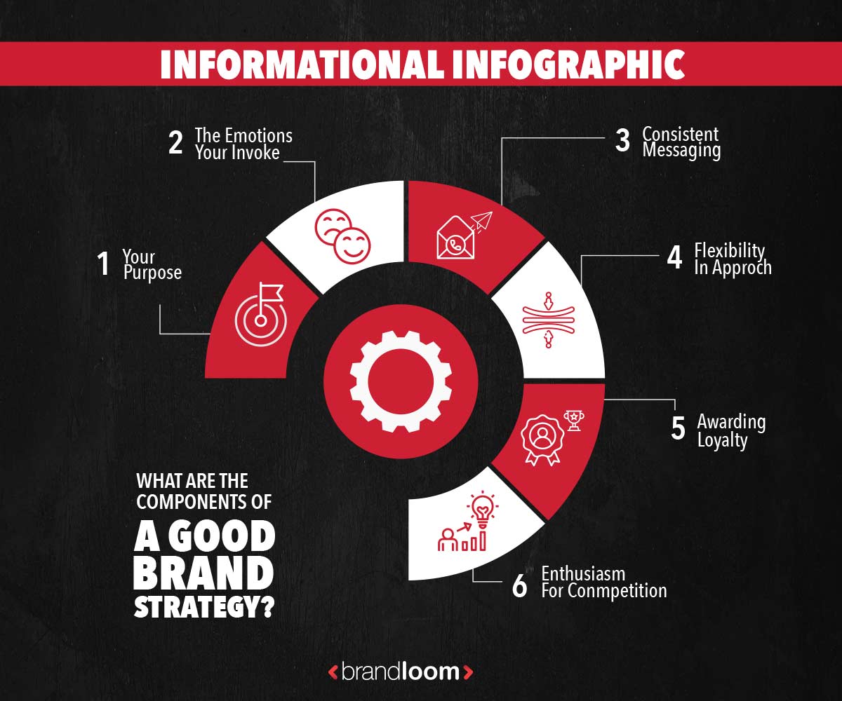
What are Informational infographics?
Number-heavy layouts combine a variety of graphs and charts to tell a story from data.
This layout best summarizes research reports, synthesizes data to support an argument, or presents entertaining or intriguing data.
Have a look at this informational infographic design.
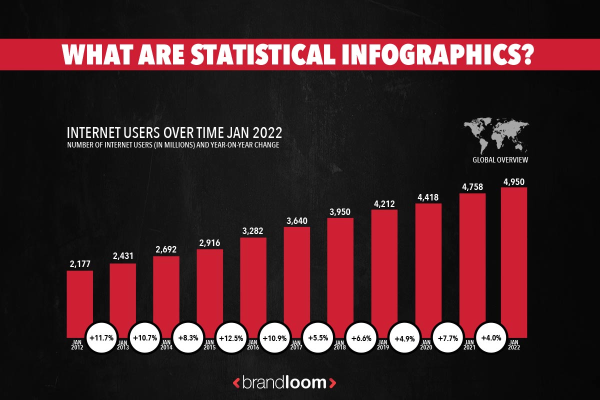
What are statistical infographics?
Research, facts, and figures can be presented visually through the use of typography, charts, and graphs.
This helps make data appear more interesting and digestible than a bunch of numbers or tables.
For example, look at internet users statistics by Statista.
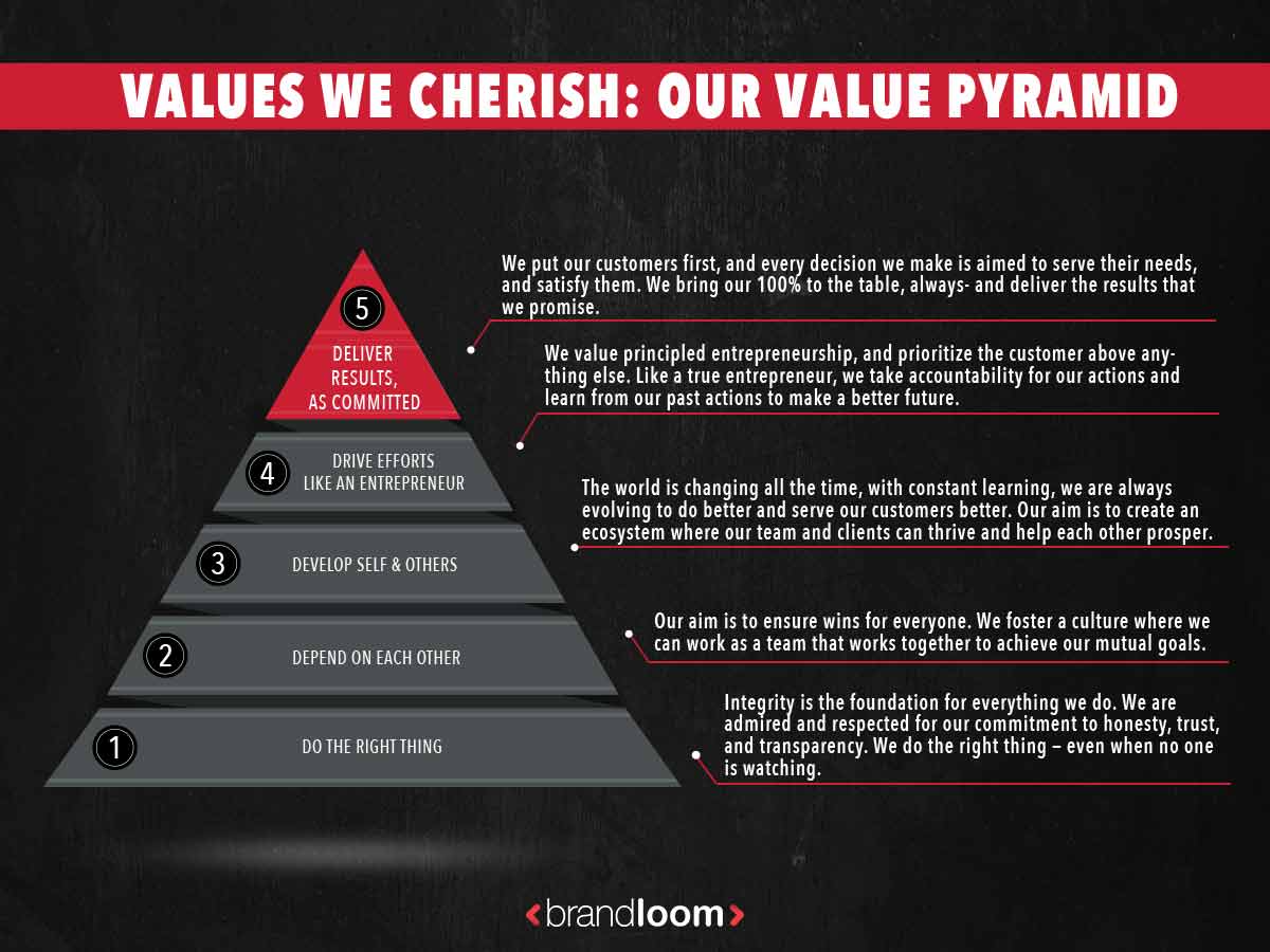
What are Hierarchical infographics?
Hierarchical infographics present information in pre-defined levels and detail how each level is connected to the next. Pyramid charts and flow charts are normally used to display this type of infographic.
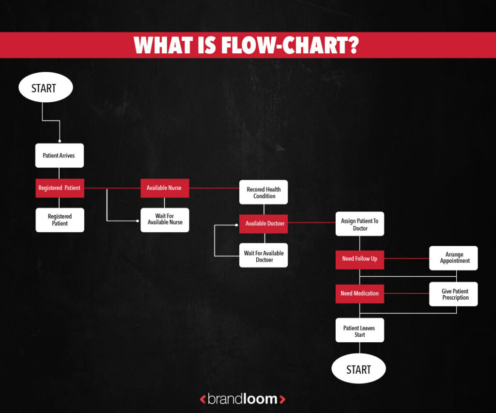
What is Flowchart?
A flowchart infographic shows a sequence of involving steps in a process or action. All stakeholders can easily understand the process, how it works, and its goals through a combination of images, text, and layout.
When would you use a flowchart infographic?
Flow charts are useful when you want to show the progress of an important decision-making process or a series of critical actions drawing conclusions.
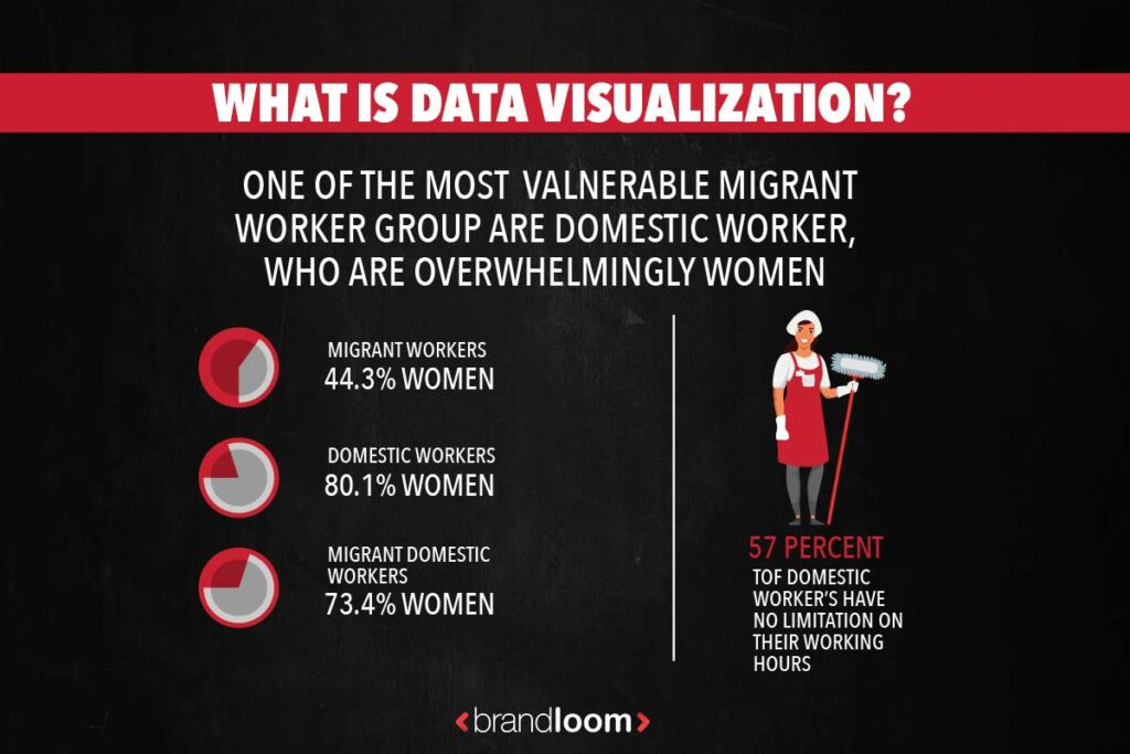
What is Data Visualization?
Data visualizations are visuals that help us visualize and understand data, ideally in a way that leads us to quick insights. In order for data visualizations to work, they need to be accompanied by some narrative.
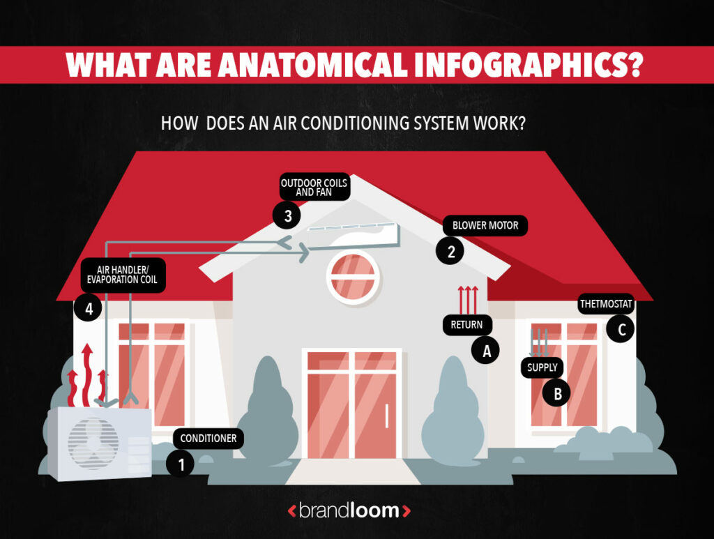
What are anatomical infographics?
You can use anatomy infographics to explain how things work or highlight different parts of an object. Their visual representations of complex information can simplify complex information and make it easier to understand.
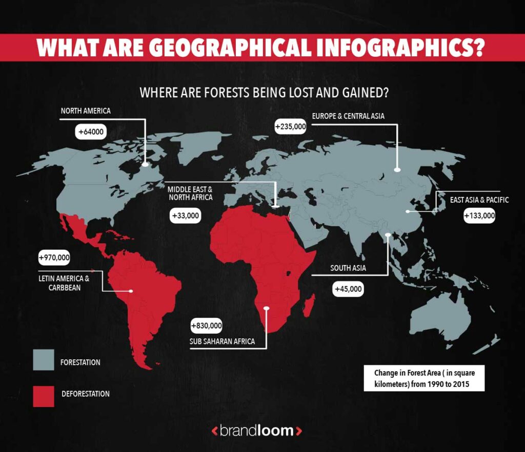
What are geographical infographics?
In geographic infographics, map charts are the primary visuals. Different types of map charts work best for different kinds of data.
In other words, when you use visuals to capture regional data, you’re basically designing a geographic infographic.
If you are not sure what type of infographic will represent your data the best, BrandLoom’s designers can help you out.
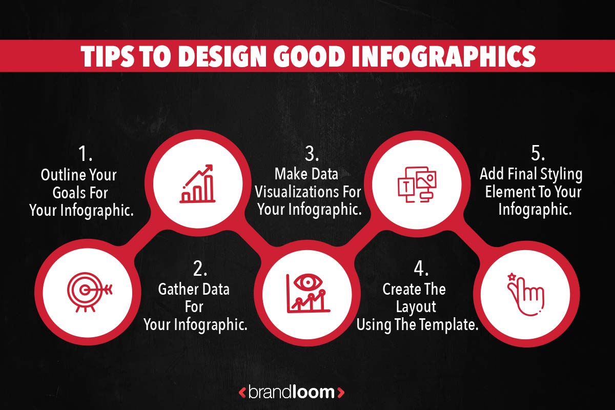
How to make the Infographic design in 5 Steps
If you want to design an engaging infographic that will engage, summarize, and inform, you are at the right place.
If you’re not a professional designer, creating an infographic that’s both visually appealing and effective may seem impossible, but it’s far from impossible.
The infographic design guide below will teach you how to do exactly that.
- How to design a good Infographic:
- Outline your goals for your infographic
- Gather data for your infographic
- Make data visualizations for your infographic
- Create the layout using the template.
Add style and a final touch to your infographic design to make it stand out.
1. Outline your goals for the infographic design
An infographic shouldn’t just be about aesthetics; it should be about the communication you’re creating with your readers. What will they gain from seeing your infographic?
What will they think of it? And What value will your infographic provide for them? Before you design any infographics, you need to know why you’re doing them in the first place.
A successful content marketing strategy shouldn’t just be about aesthetics; it should be about the communication you’re creating with your readers.
Set attainable goals for your infographic design. If you are unsure of what you want your infographic design to achieve, you won’t be able to put it all together into a cohesive format.
Use a SMART goals approach for the design of what you want to achieve:
- Specific: What do you want your infographic to inform the reader about the positive rise in remote working?
- Measurable: The infographic should inspire businesses to embrace remote possibilities for workers.
- Achievable: I will share my infographic via a blog, social media, and outreach.
- Relevant: The data in your infographic should be less than six months old.
- Time-Bound: must publish the infographic in two weeks
2. Gather data for your infographic design
To answer each question you defined in step one. You’ll need data. If you already have your own data, that’s great -move on to step three.
If not, it’s OK – there’s a lot of public data out there (the U.S. alone produced approximately 2.7 million gigabytes per minute) if you know the right places to look.
Here are some tips for getting access to useful data without conducting your own research.
Refine your Google searches
Google is often considered the best place to start your search. Make sure you target your Google searches more efficiently with a content-specific approach and search terms, including symbols.
- Try to use quotes to search for an exact phrase.
- For example, to understand better “product design process steps.”
- You can use a minus (-) sign to exclude terms from your search results.
- Example to understand better, product design -jobs
- Append ‘data’ to your search phrase
- Example to understand better product design data.
- Append a data-specific file format (e.g., Xls, CSV) to your search phrase
- For example, to understand better product design, Xls.
Search existing data repositories
While Google searches are quicker and easy, you’ll often end up with messy and irrelevant data that needs some cleaning and uncluttering, which demands a lot of time.
Peruse these data repositories to go for the data/information that’s ready to use:
- The U.S. Government’s Open Data: Has data on everything from climate, agriculture, and ecosystems to education, public safety, and health.
- U.S. Census Data for Social, Economic, and Health Research: U.S. census information from 1790-present.
- Statista: Information on market research
- Kaggle: User-uploaded information on everything from chocolate bars to startup funding
- Pew Research: Research data and information on demographics, public opinion, media content, and more
- Google Trends Datastore: Curated datasets and information from the Google News Lab
- Google Scholar: A convenient search engine for academic publications.
- Data is Plural: A well-organized list of interesting, topical datasets, updated weekly.
- AggData: Business locational data.
- Cool Datasets: A self-proclaimed “place to find cool datasets.”
If these strategies fail you, you might have to collect your own data.
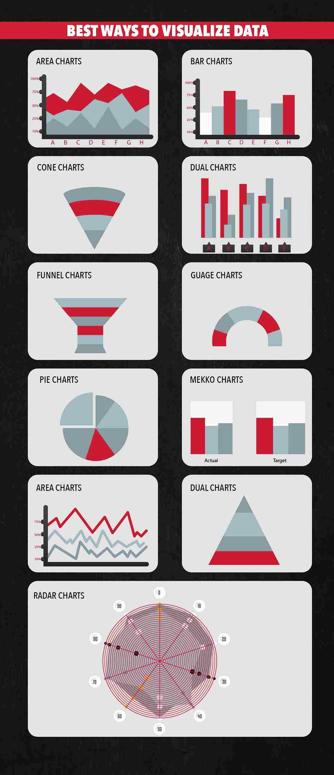
3. Make data visualizations for your infographic design.
Now you’ve got the questions and queries you want to answer and the data you need to answer them concisely. Then your next step should be to decide how to present data visually.
Opt out for the best data visualization category for your content.
Opting between a line graph or a pie chart — or any others — it all depends on the kind of data and information you have on hand.
- Area Charts
- Bar Graphs
- Cone Charts
- Dual Charts
- Funnel Charts
- Gauge Charts
- Line Graphs
- Mekko Charts
- Pie Charts
- Pyramid Charts
- Radar Charts
4. Choose a Template to Start With
Once you know what kind of infographic you are intending to make, you need to figure out the technicalities.
Browse the template gallery to find an infographic template that’s right for you.
Additionally, here are some tips on choosing the right template::
Look for inspiration.
When you’re unsure what you’d like your infographic to look like, looking at inspiration is a great help.
Choose an infographic template.
When you are designing an infographic, you should always start by using a template.
Sometimes, the templates themselves give you the idea for an infographic, and sometimes you have the idea already, and all you need is a template to start.
And the most important thing to remember is that you can either keep the template’s layout or customize it.
5. Add Engaging Elements of infographic design
Adding design elements is important but can be tricky for anyone who is not a designer.
Once you have all the information your infographic needs and are sure you only include the essential content for relaying the message, it’s time to ensure it is visually appealing.
Shapes.
Consider shapes as your best design tool when designing infographics. It may help the content and improve the flow from top to bottom.
Color Palette
Color palettes are all about contrast and legibility for an infographic.
One primary color and one complementary color must be used, and another two or three other colors should be utilized to complete the color scheme.
Contrast is essential for text over a background color or texture; the text must be comfortable and easy to read.
Fonts
Choosing the right font for the infographic should support the content and data without distracting or taking away from the flow. You should limit your use of fonts to two or variations of that font, stay away from novelty fonts that are hard to read, and use minimal color.
Icons
Icons are the key to effective visualization, visual flow, and balance when it comes to infographics. They instantly communicate the story within the content, separate it into sections, and create visual flow.
Animation & Interactivity
Why not create an interactive and effective infographic? You can include all sorts of animated and interactive elements, including links and pop-ups, animated icons, characters, and illustrations, as well as videos, quizzes, and GIFs.
Tips to Improve Your Infographic Design
The process of creating an infographic just follows the five steps outlined in this guide. However, you will also need good design, Which is why we offer you a large collection of infographic templates in different styles. If you don’t feel comfortable with design, you can hire BrandLoom‘s world-class digital marketing agency for help.
Conclusion
In order to deliver information and engage your audience, the best infographics use text, images, and data. When creating an infographic, follow these information design best practices to strike the right balance between fun and educational:
- Group related information
- Use lines, borders, and shapes.
- Use one contrasting color scheme to draw attention to key information.
- Create a text hierarchy with three different font styles.
- Use images, icons, and illustrations to make key takeaways.
Not a designer? No problem! BrandLoom has got it covered for you, hire us and let us help you with your business’s digital marketing requirement.
Frequently Asked Questions
Infographics examples are visual representations of information. They combine a variety of elements, including images, icons, text, charts, and diagrams, to convey messages at a glance.
The use of infographics has multiple applications in many industries. Infographics are visual tools to convey complex data in an understandable format, and they can also be used to focus attention on important details. Visual information and data graphics help people understand information quickly and easily. Infographics can also show changes or comparisons in data, time, and place, as well as statistics, maps, and hierarchies.
We’ve mentioned the seven major infographic categories, among which these are the most common types of infographics are:
– Statistical
– Informational
– Timeline
– Process
– Comparison
The different types of infographics that we will cover in this post require different elements. Timeline infographics need time and date stamps. Comparison infographics have columns and rows. We’ll show you examples of different infographic types so that you can choose the right one for your message.
With the use of visual data, charts, and statistics in infographics, people can easily digest much more information. When properly used, color, proportion, and negative space can transform information into a memorable, attention-grabbing, and persuasive product.
The following three components constitute a high-quality infographic: the intro, the body, and the images and icons. A good infographic should have a powerful intro that is sure to capture the audience’s attention, a well-structured body that is easy to understand, and professional images and icons so that the infographic has quality.
The subject of an infographic may be presented in a variety of ways based on the information that needs to be conveyed. This includes pie charts, bar graphs, statistical infographics, flow charts, etc. Furthermore, creating an infographic for social media platforms may also vary depending on the platform.
Several software options exist to help you create infographics from scratch. Some of the best ones include Canva, Venngage, Snappa, Piktochart, easel.ly, Infogram, Biteable, BeFunky, and Vizualize.me, Animaker, and Mind the Graph.
You can produce infographics for free using a variety of tools available online, including Canva, Visme, and Snappa, most of which just require creating an account. But the most important part is to understand how and when to effectively use your infographics for a successful content strategy.