If you’re a bank or financial institution- you must project an air of trustworthiness and professionalism. A good bank logo or bank symbol should communicate these qualities to the customers and distinguish itself from competitors.
So, today we will look at the logos of the most famous banks in the world- and use the inspiration to craft a trustworthy symbol for new banks and financial institutions.
If you’re heading your financial institution or bank and looking for a simple bank logo for your brand- talk to our branding experts at BrandLoom to get the perfect one.
Designing the Best Bank Symbols – Elements to take into account
A bank or a financial institution is a pretty conservative entity. It serves the public, handles their money, and deals with much public information. Hence, to be in business, it has to appear trustworthy, professional, and safe.
Money is a sensitive issue- and while banks are authoritative institutions, they are ultimately here to serve the people. As a result, bank branding takes a lot of work. Financial institution logos must straddle that sweet spot where they come across as professional without appearing dictatorial or unapproachable.
In order to do so, they must pay attention to the three important elements of bank logo design:
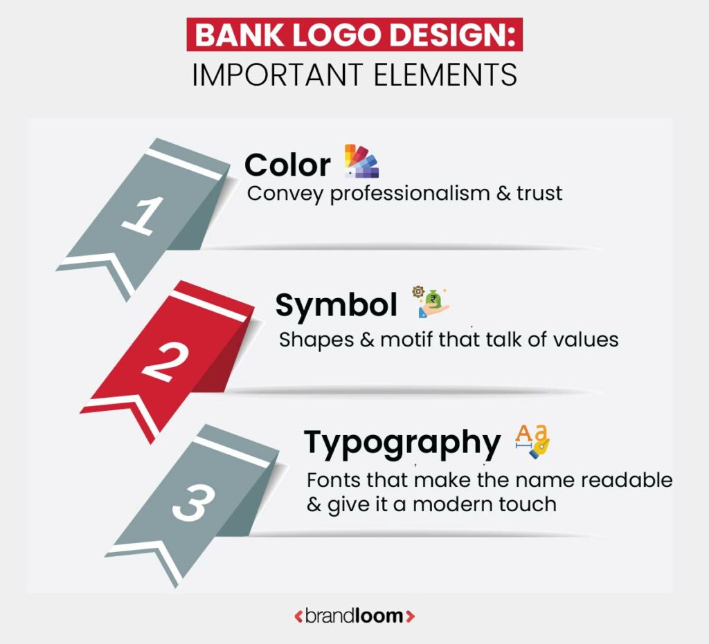
1. Color for bank logos
Colors are the most prominent elements in any logo design, and banks are no exception. Banks usually go for strong, primary colors that are declarative and help them stand out. For banking, popular colors are blue, red, and green.
Looking at banks worldwide shows that blue bank logos are extremely common. This is because blue- especially deep or navy blue- conveys professionalism and trustworthiness.
Deep blues are also conservative shades that invoke a sense of serenity and hence, are very popular for bank logo designs.
Some good examples are the State Bank of India, Standard Chartered Bank, Citibank, and Chase Bank.
2. Symbols for making bank logos
Shapes have powerful symbolism. The circle, for example, is regarded as the perfect shape with its all-encompassing nature. Triangles pointing up denote ascension and stability, whereas natural, free-flowing symbols like leaves, trees, or waves come with their symbology.
A bank’s values play a big role in selecting its branding symbols. By choosing the right sign, it successfully projects its aspirations and attracts its target audiences.
Many banks incorporate rectangles and squares in their logo designs. Square shapes convey a sense of stability and level-headedness. Of all the forms, rectangles are the most common motifs for bank logo designs.
They are used for popular banks like HDFC, Chase Bank, and TD Bank.
3. Typography for bank brands
Banks have to convey a sense of approachability and transparency. Moreover, they serve the general public. So, most financial logo fonts are simple and highly readable. By default, they are mostly sans serif, modern fonts.
Almost all bank logos have gone this route. Some examples are Citibank, Axis Bank, and Bank of America.
Let us look at some different bank logos worldwide and see what they communicate.
Top Bank Logos to take inspiration from
1. TD Bank Logo and Symbol
TD Bank, or Toronto Dominion Bank, has one of the most famous Canadian logos. The logo comprises a green square with the acronym in white. The green square brand logo is instantly recognizable.
The green denotes vitality, wealth, and growth- while the square shape projects stability. The two letters are joined- which signifies connectedness.
The bright green bank logo is eye-catching, and the color makes it singular. TD Bank chose a color that almost no other bank uses, and as a result, it has been able to appear completely different from its competitors.
2. Deutsche Bank Logo and Symbol
You all have seen Deutsche Bank’s blue square with the slash inside logo. The Frankfurt-based global banking giant deploys one of the most significant motifs in Western finances- the right-up slash. It stands for growth and prosperity, while the square denotes stability.
The font is extremely simple, which makes it easy to read and remember.
3. Chase Bank Logo and Symbol
If you don’t recognize the Chase Bank symbol, you must be living under a rock. JP Morgan Chase is one of the largest financial institutions in the world. The JP Morgan Chase bank logo deploys an unusual octagon shape- whose insides mimic a square.
The unique and unconservative JP Morgan Chase logo invokes a sense of motion and action, also giving a sense that it is like a funnel which money can flow into. The embedded square, on the other hand, claims stability.
The brand shows itself as “Chase Bank,” which is shorter, sounds more modern, and is simpler to remember.
4.UBS Bank Logo and Symbol
UBS Group AG is a Swiss financial behemoth. The famous bank logo with 3 keys denotes confidentiality- and the keys also symbolize how the bank keeps wealth secure. The logo with 3 keys also signifies the company values of confidence, security, and discretion.
The keys symbolize how the institution can unlock prosperity, well-being, and luck.
Unlike other common banks, UBS identifies as a prestigious and elite institution, and its serif font retains an appropriate level of formality.
5. Bank of America: Logo and Symbol
Nothing screams American like the Bank of America’s flag logo. The colors are that of the American flag- red and blue. It evokes a sense of patriotism.
The flag-like motif resembles a farm field- denoting prosperity, growth, and nourishment. It is among the most recognizable logos of America.
6. ING Bank Logo and Symbol
The bank with the orange lion logo is a familiar sight in all global financial centers. Headquartered in Amsterdam, ING is a multinational bank and financial institution. The Dutch lion emblem represents its national animal, and the orange is synonymous with The Netherlands.
Orange is a distinctive color in banking, so the lion emblem easily stands out. The lion symbolizes pride, strength, and courage. The vibrant orange color conveys a sense of energy- balanced by the font’s conservative blue.
7. State Bank of India: Logo and Symbol
The banker to every Indian, as the State Bank of India calls itself, also has a distinctive logo. Rendered in bold but a conservative deep blue, the bank logo also looks like a key. While the key symbolically talks about unlocking prosperity and keeping valuables safe- it is also said to be inspired by the Kankaria Lake in Ahmedabad.
The blue key symbol is often accompanied by the name of the bank, rendered in a conservative and stark black-and-white contrast. The full title is set inside a rectangular box that invokes stability.
8. Citibank Logo and Symbol
The American multinational started its journey as the City Bank of New York in 1812. Since then, it has become a global player and has one of the most recognized American bank logo images.
Of course, the blue and red logo in the Citibank symbol is synonymous with the USA and invokes a sense of patriotism. The conservative blue stands for stability, while the red arc caps the “t.” That arc acts like an umbrella, symbolizing the bank protecting its assets and customers.
9. HDFC Bank Logo and Symbol
Housing Development and Finance Corporation, or HDFC, is one of India’s most well-known banking and financial institutions. The logo looks like a stylized “H” in a square that invokes a home or house- which is what HDFC is the essence of HDFC.
The blue and red represent professionalism, strength, and passion, while the square shape invokes stability. The font remains simple and readable- denoting approachability.
The logo stands out and declares that HDFC’s core strength lies in the housing sector.
10. Raiffeisen Bank Logo and Symbol
The Raiffeisen Zentralbank Österreich is the central entity of the Raiffeisen Banking Group– “Raiffeisenbank,” meaning the cooperative banks of Europe. The Raiffeisen Bank today is a global financial giant, with a distinct yellow and black logo showing two horseheads crossed.
This distinct bank symbol is called the Gable cross. It stands for protection and stability- giving it a coat of arms-like appearance. This suits the Raiffeisen Bank’s history, which originates in the old credit unions of Europe.
Yellow is an eye-catching, optimistic color, and black contrasts it, providing an air of solemnity and power. The square shape invokes stability.
Having looked at some of the most distinctive and iconic bank logos from across the world, we can design a new symbol for our own banking or financial institutions.
Here is how to go about it.
Guide to creating the best financial institution logos
To craft an exceptional financial institution logo you need to understand your unique selling point (USP), define your core values, make thoughtful symbol selections, explore color psychology, and consider your target audience. You can elevate your branding with these invaluable insights:

1. Know your USP
What is your core strength? Like HDFC Bank, you can hint at your USP with your bank logo. Think of what you are known for or which field is your specialty.
2. What are your values?
Yes, you are here to serve the people and manage their money. But how you serve them is what makes you different than your competitors. Are you going to be known for your discretion? Will you open your doors to all and sundry? Are you here to empower the oppressed? Look at your brand’s values, and try to incorporate them in your logo.
3. Pay attention to your choice of symbols.
Shapes are powerful communicants- choose the ones that echo your values. You don’t have to stick to conventional rectangles or circular shapes- you can also look at unique or culturally significant symbols.
Don’t disregard natural symbols. When deployed right, symbols depicting animals, flowers, trees, or landscape features can be memorable, meaningful, and striking.
Think of the ING lion logo or the unique company logo with 3 keys that UBS uses. They are distinctive and unconventional- but in no way inappropriate.
4. Look at the colors
What emotions do you want to invoke in your audiences? Of course, every financial institution wants to inspire trust- but you can look at the other aspects of your services.
The colors you use to attract your audience do not have to be restricted to blue, red, black, or white- you can go beyond these colors- or use them in unconventional ways to create something truly unique.
5.Think of your audience.
And finally- think of who you want to appeal to. What do they like, dislike, expect, or relate with? Once you can understand the mindset of your customers, you can come up with a meaningful bank logo that will pull them in like a beacon.
Conclusion
If you own a banking or financial institution- you need a bank logo to help you stand out and inspire trust and hope in your audiences. You can use our tips to create a memorable one- or leave it to the expert logo designers at BrandLoom.
Frequently Asked Questions
Indian Bank is a well-known banking and financial institution. The bank logo is a stylized depiction of a banyan tree- the national tree of India. The logo stands for overall progress, sustainable growth, and increasing prosperity. The logo’s blue invokes a sense of trust, while the yellow stands for vitality. The unique bank symbol sets it apart from the other banks and conveys a sense of professionalism.![]()
The Citizen’s Bank has four arrows in its logo. The American financial institution is a well-known entity whose bank logo sets it apart. The green color stands for growth and money, while the motif is inspired by the Royal Bank of Scotland- the current owner of The Citizen’s Bank. The RBS logo uses the same symbol but in a different color.
The four inward-pointing arrows represent wealth and consumer interests. Using the same motif, Citizen’s Bank clearly marks its connection with RBS, while its green color proclaims its uniqueness & fresh approach.![]()
The Bank of India has a well-known logo comprising a star set against a blue background. The bank’s blue color conveys a sense of professionalism and trustworthiness, and the orange underscores it by adding energy and optimism. The star is dual-toned, with orange and yellow invoking energy.
At the center of the star sits a pentagon. The number 5 is associated with Lord Shiva, the supreme deity of Hinduism. Inside the pentagram is a white circle, in which we see the picture of a woman wielding a trident and leaning on a lion. This is a clear allusion to Shakti or Durga, the consort of Lord Shiva and the embodiment of the creative energy of the universe. The lion is an animal familiar to the goddess, and by itself, it represents power.![]()
The World Bank logo depicts a tilted globe. It is tilted on its axis like the Earth, and you can see its latitudes and longitudes. The World Bank symbol is rendered in blue and white- with the blues communicating a sense of professionalism, trustworthiness, and authority; while the white conveys a sense of unity.
Of course, the globe motif proclaims The World Bank as a global institution and its inclusiveness.
The Syndicate Bank logo shows a dog. Of course, the dog is man’s best friend- and by showing it, the bank wants to convey a sense of trustworthiness, loyalty, and care. Dogs are also guardian animals. Hence they also represent the bank’s commitment to keeping its customers’ assets safe.
The orange color helps it stand out and conveys a sense of optimism and energy. It is indeed a unique and eye-catching logo.![]()
The color blue is widely used by banking and financial institutions. Dark blues like navy convey a sense of professionalism, trustworthiness, and authority. Blue is also frequently associated with many countries and flags, so including shades of blue in your bank logo invokes a sense of patriotism.
Some famous blue bank logos are State Bank of India, HDFC, Citibank, Bank of America, Chase Bank, Barclays, and Deutsche Bank.
Red, as a color, conveys power, passion, strength, and vigor. It is also an eye-catching color that invokes a sense of urgency in the viewer. Red is also present in the flags of many countries, which makes it a popular color in banks and financial institutions across the globe.
Bank of America, HDFC, Axis Bank, HSBC, UBS, Bank of China, Kotak Mahindra Bank, and ICICI Bank are some banks with red logos.
The Reserve Bank of India famously uses a tree logo. The bank logo depicts a tiger and a palm tree. The logo was originally inspired by the gold mohur of the East India Company, which showed a palm tree and a lion. However, after independence, the logo was modified, and the tiger replaced the lion to represent India better.
The tiger represents India and is a symbol of power and authority. The palm tree has historically been associated with singleness of purpose, triumph, peace, and eternal life.![]()
Blue is the most popular color for a bank logo, especially deep blues like navy. Blue is a grounded color, and its darker hues convey authority, trustworthiness, and professionalism. This is why almost every banking and financial institution uses dark shades of blue in its logo. Some banks that use dark blues in their logos are Bank of America, SBI, and HDFC.
Lighter blues convey serenity and invoke a sense of tranquility. Standard Chartered Bank, Barclays, Bank of India, and Syndicate Bank use lighter shades of blue.
The color green often represents money. Green is the color we associate with prosperity and vitality, so it becomes the most obvious color to represent money. Some banking and financial institutions use green to convey prosperity and growth. However, it is used relatively uniquely in this space. Some examples are TD Bank, BNP Paribas, Standard Chartered, and Sumitomo Mitsui Banking Corporation (SMBC).
The SBI logo is a contrast in blue and white. The keyhole motif symbolizes the bank’s commitment to keeping its customers’ assets safe and confidential. Some say the bank logo may also represent the Kankaria Lake in Ahmedabad. The blue color symbolizes tranquility, professionalism, authority, and trustworthiness.![]()