Did you know that 85% of customers say color is the main reason why they buy a particular product? Or that 66% of people won’t even buy an appliance if it does not come in their preferred color? So, the next time you look at your brand’s logo, packaging, or overall aesthetic, ask yourself: is this color scheme working for my brand? Or is it putting the buyers off?
Colors deeply affect human behavior. Think of how we feel refreshed when staring at greenery, or how looking at clear blue waters immediately calms us down. Whether you’re a designer, marketer, or business owner- it’s crucial to understand how to use color schemes to communicate with your audiences and influence their behavior.
In this blog, we’re going to look at the art (and science) of creating effective color themes for brands and look at some great color palettes to take inspiration from.
At BrandLoom, our award-winning design team has helped many brands across the globe create their strategic visual identity. If you want to understand what your brand should look like and communicate its promise effectively, entrust it to the best brand design agency to click with your audiences.
What’s a Color Scheme?
In color theory, color schemes are combinations of two or more colors that designers deploy for creating an aesthetic. When we create a brand’s color scheme, we try to create a harmonious effect, so that the colors look pleasing when viewed together.
When we design a logo, we look for colors that go with each other. Think of famous logos like the classic red and white of Coca-Cola or the eye-catching purple and orange FedEx logo. These are good color combinations because they create a harmonious effect.
Now think of a logo which uses colors that just don’t gel- like aqua with maroon, or neon pink with chartreuse. You’re probably shuddering just thinking of the jarring effect they will create.
Choosing the Right Brand Color Scheme
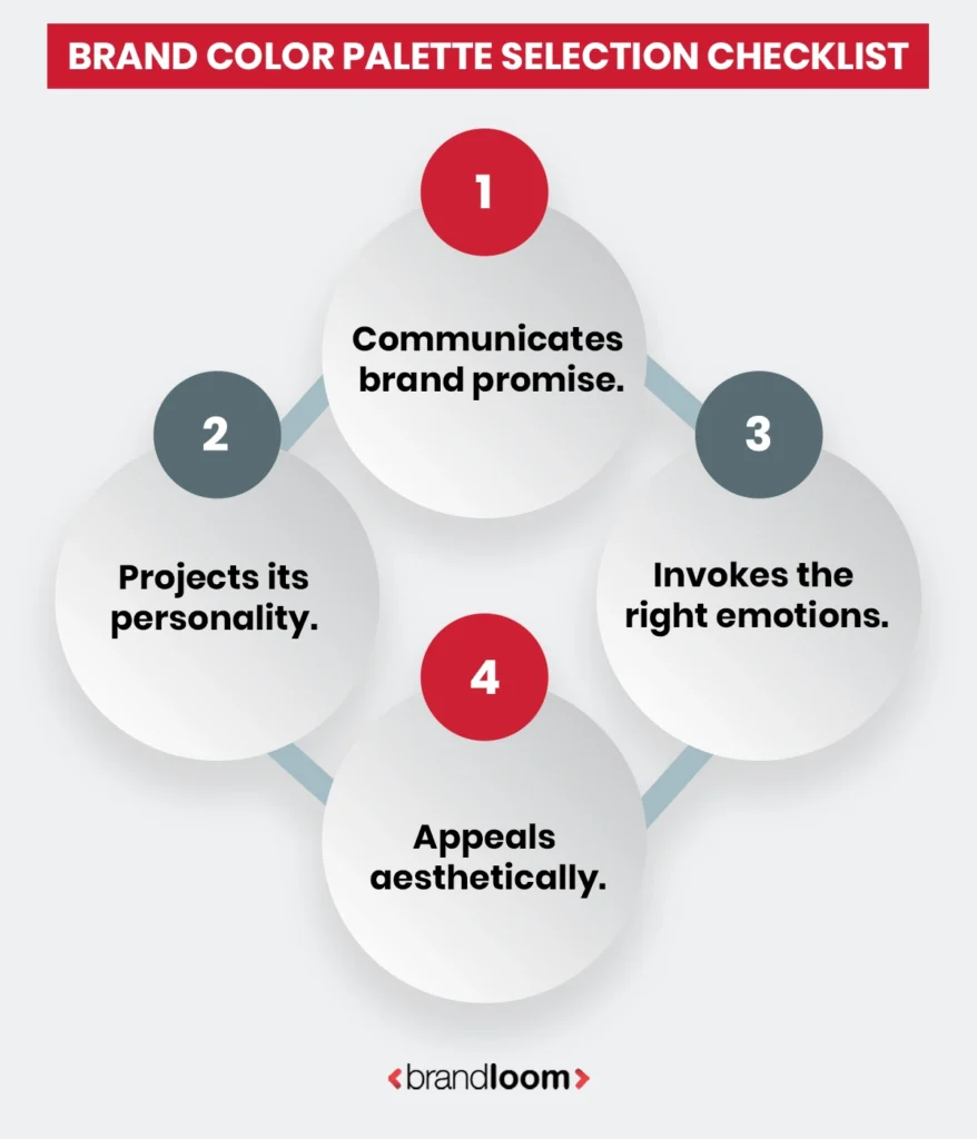
A savvy brand owner or designer should choose colors by asking themselves the following crucial questions:
- Are they communicating the brand’s promise?
- Are they projecting the right personality?
- Do they invoke the emotions that I want my audiences to feel?
- Are they going together and looking aesthetically pleasing?
Remember, the best color scheme for your brand is one that ticks off all the boxes.
Now that you know which perspective to take when choosing your brand’s color palette, let’s start learning about the basics.
Using Color Wheels In Designs For Marketing
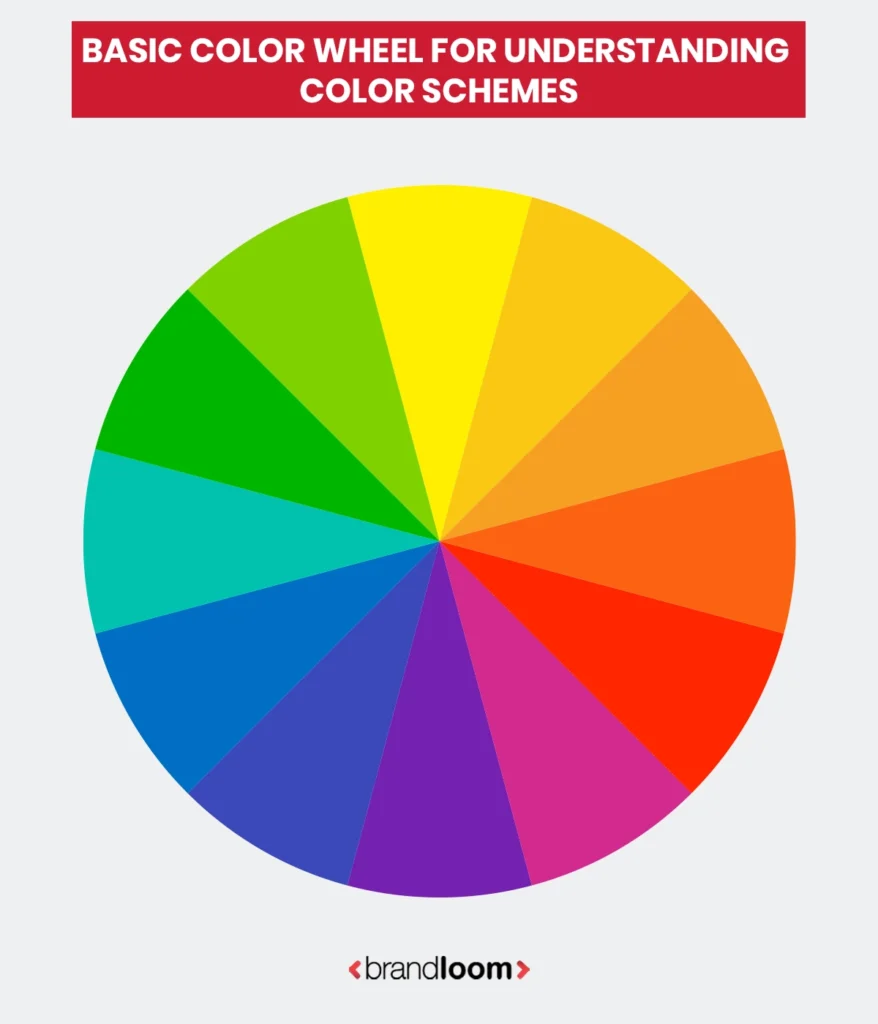
Before we start creating color combination charts, we must know about the color wheel. In color theory, the color wheel is a tool used to organize all color hues in a circle that illustrates the relationship between primary, secondary, and tertiary colors.
When it comes to brand identity creation or designing for marketing purposes, designers use creative color wheels to come up with harmonious and strategic color schemes.
So, when you say you want to create a color template for your brand, you have to choose colors from the existing color wheel to create your own color palette.
Now that you know which perspective to take when choosing your brand’s color palette, let’s start learning about the basics.
Types of Colors
There are three main types of colors:
Primary Colors
Red, Blue and Yellow are primary colors- the ones that cannot be “created” by combining any other colors. By mixing them in varied proportions, you can create all other colors on the color wheel (of course, with black and white to create different shades and tints of them).
Secondary Colors
These are orange (red+yellow), green (blue+yellow) and purple (red+blue). Designers use primary colors in equal proportions to create them.
Tertiary Colors
These colors are made by mixing primary colors in varied proportions. They are: red-orange, yellow-orange, yellow-green, blue-green, red-violet and blue-violet. Depending on how much each primary color is used, each combination contains a multitude of shades and tints within their spectrum.
For example- teal and turquoise are both made of blue and green. Where teal is more muted and sophisticated, taking its name from the teal bird which has a stripe on its head with the same color. Turquoise leans more towards blue, and is lighter and more vibrant. It shares its name with a semi-precious stone.
Next step- understanding variations of colors.
Color Combinations and Essential Definitions
While in general life we use shade, tint or hue interchangeably, when designing a color scheme, you must understand their technical definitions.
Hue : the primary form of the color on the RBG color spectrum. Like red, blue or green.
Tint: combining white in varying proportions with a base color. Pink is a tint of red.
Shade: combining black in varying proportions with a base color. Maroon is a shade of red.
Tone: blending grey in different proportions with a base color. This gives the color a more muted (and for some, more “refined) appearance. Think of sage green.
Saturation: also called intensity; is defined as the amount of the base color present. The more the saturation, the brighter it looks.
Warm vs cool: colors are attributed “temperatures” based on the type of feelings they inspire and the undertones they carry. Colors with yellow-red undertones are “warm”. Think of caramel- this brown has a clear orange-ish undertone. It is a warm color. On the other hand, we have taupe, a decidedly cool color that has a more muted and calming effect.
Now, let’s look at color schemes. The terms primary, secondary and tertiary take on completely new meanings when it comes to discussing branding design.
Essential Elements for Creating A Brand Color Scheme
1. Primary Color Chart
These are the primary colors for designing your brand’s look and feel. These are the ones that are featured in your brand logo and primary elements. They are the signature colors that people associate with your brand. Think of the Starbucks green, the red of Netflix, or the rich Cadbury Dairy Milk purple.
2. Secondary Palette
This is the secondary color scheme that supports your brand’s primary color palette. It is often used in backgrounds and secondary elements, and to add variety to your brand’s visual palette. They help create depth and visual hierarchy on your marketing materials, website, social posts, packaging, or space designs.
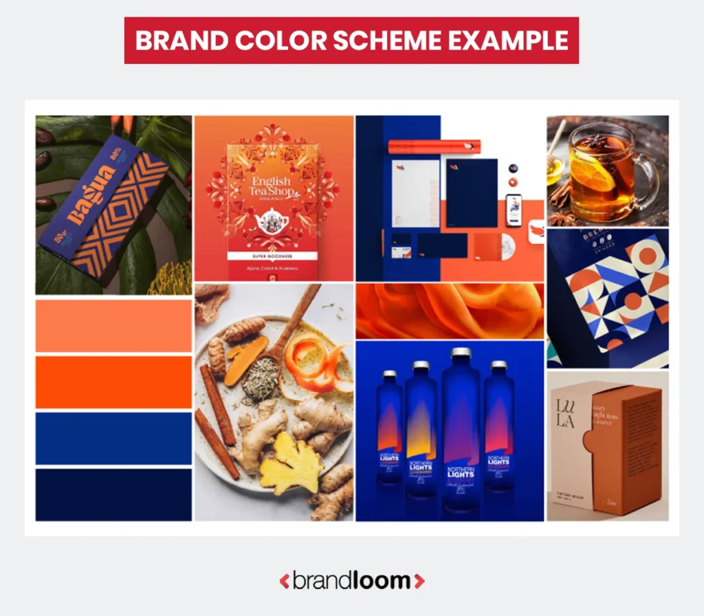
Complementary colors are carefully chosen to ensure they don’t clash and effectively highlight your visual messaging. For example, if your primary colors are navy blue and black, it makes sense to use silver or grey as your secondary palette.
3. Accent Colors or Tertiary Color Scheme
Now, when you want to highlight your messaging and add some finishing touches, you go for the tertiary colors. Designers use them to highlight standout elements like call-to-action buttons, special offers, important announcements, or interactive elements on the brand’s website.
For example, if your website is an orange and black one, the tertiary color to highlight CTA buttons can be green.
Now that we know the basics, let us dive deeper. When making your brand’s color combination palette, you may have to play around with different color combinations before you nail it.
While that itself is an essential creative process, you can save a lot of time if you know about the different types of color schemes.
So, what are they?
Different Types of Colour Schemes
A brand color scheme must be logical if it wants to satisfy all aesthetic criteria. By applying color theory in design, you can create powerful palettes that communicate your brand’s promise convincingly.
In order to do that, you must understand the predefined color scheme standards.
Traditionally, here are the eight different types of color schemes:
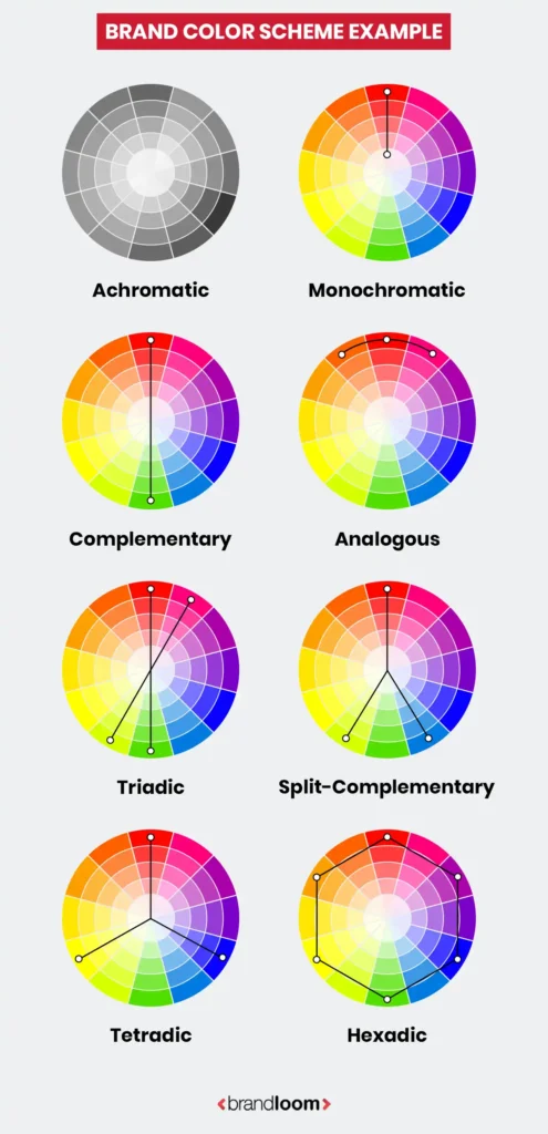
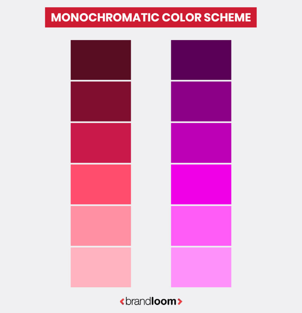
1. Monochromatic
Monochromatic color schemes are made of different shades/tints of one color. These are the simplest types of color schemes- with all the shades being of the same color, it is extremely rare for them to create a non-harmonious effect.
Remember the original Facebook logo? That followed a classic monochromatic approach with shades of blue.
Monochromatic palettes often convey unity and sophistication. In fashion, they are often deployed for “classic styles”, like layering a camel coat with a brown dress.
Here is an example of a monochromatic color palette:
On a website, for example, the first shade can be used for the headlines, while a lighter version can be used as the background.
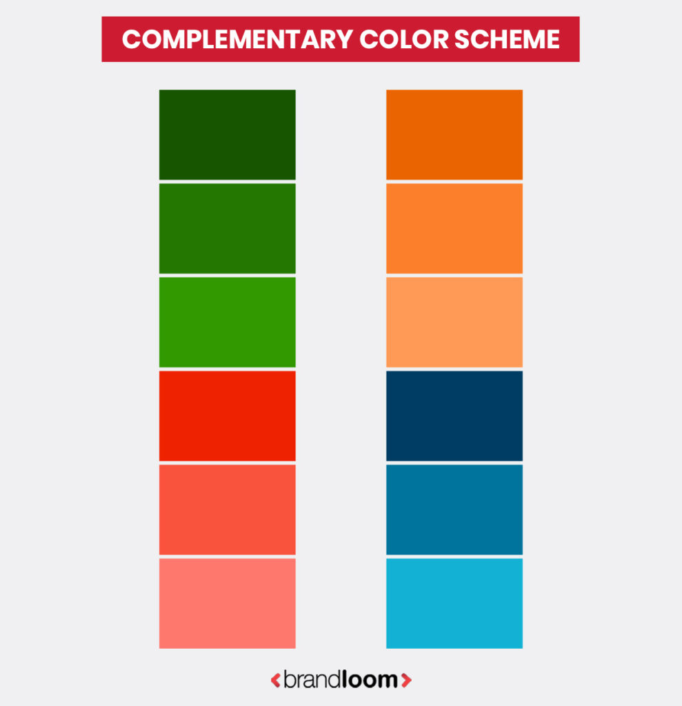
2. Complementary
Complementary color palettes comprise colors that are located opposite to each other on the color wheel. These kinds of palettes are made of the best contrasting colors and are energetic, which is excellent for drawing attention and conveying a dynamic or vivacious nature.
Complementary color schemes often feature a wide range of shades, tints, and hues, which gives the brand a lot of flexibility in terms of expressing itself.
Some common color combinations falling in this category are- red/green or blue/orange. Mozilla Firefox, the beloved browser, features a classic complementary color combination with an orange fox curled up against a blue globe.
The Los Angeles Lakers are famous for their purple and orangish yellow colors.
When creating a complementary palette, you must be very careful. Combining contrasting colors is a tricky job, and if you don’t pay attention, the results can be jarring.
In a diverse color palette, there may be hues that clash with each other. You can avoid a discordant effect by either adding a buffer or transitional color between them, or separating them with white.
Here is what a complementary color palette looks like
As you can see, there are lots of options to pick from. Complementary color schemes are extremely popular, and savvy brands play with them to create unique and memorable designs, as well as experiment with different types of messaging.
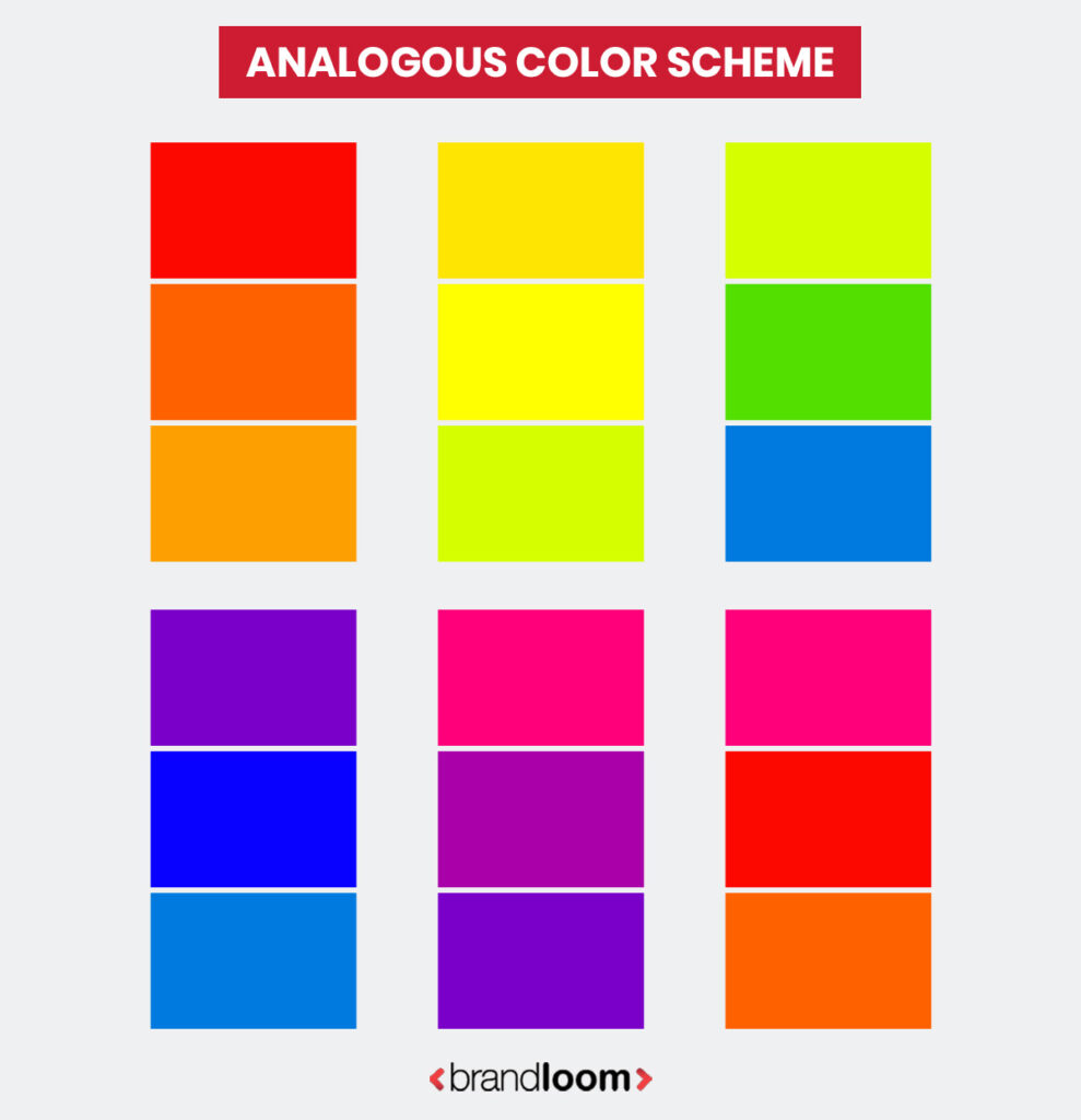
3. Analogous Color Schemes
Analogous color palettes combine colors adjacent to each other to create a harmonious effect. In some cases, these project a sense of calm- like serene blues and greens. However, when you use bright hues- like red and yellow color palettes, they can feel vivid and energetic.
The green and yellow logos of Subway and British Petroleum are great examples of analogous colors in use.
After monochromatic, analogous color schemes are the easiest to create. They are usually made of three adjacent hues on the color wheel- those that have the same temperature. Hence, analogous color schemes can have only warm or cool shades.
Think of cool color schemes made of blue and green shades. Or warm ones, which embrace the joyful red/ orange/ yellow hues.
While harmonious, analogous schemes may not be as vibrant as a complementary one.
Here is an example:
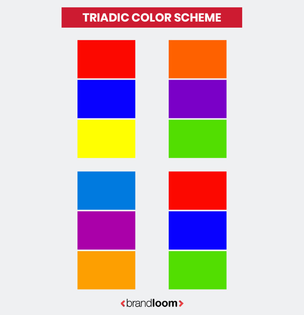
4. Triadic Color Schemes
These color palette combinations are made of three evenly spaced colors. Attempting a triadic color scheme is a matter of thorough research and skillful execution. However, if you get it right, the end result is usually very interesting.
Some memorable triadic color combinations are the logos of NBC and Mastercard. Notice the effective contrast of these logos- that’s the signature of triadic color schemes. They offer a visually harmonious and lively contrast color palettes. This is even true for pale or unsaturated hues.
Triadic schemes are very balanced, and are often used to create forward-looking, youthful identities and designs.
Here is an example of a triadic color palette.
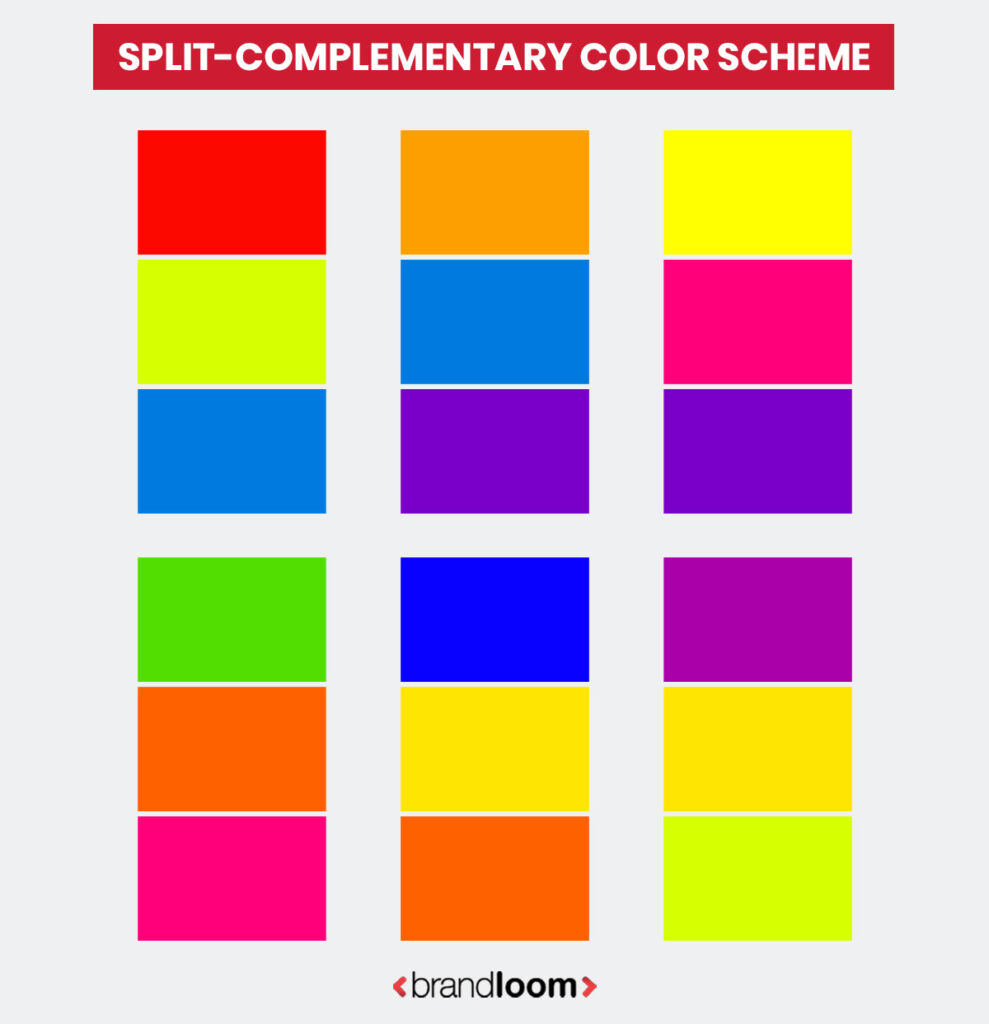
5. Split-complementary Color Schemes
Also called compound color schemes, these palettes offer good contrast with less visual tension. For this, you choose one primary hue and take two colors from either side of its opposite hue in the color wheel.
For example, the opposite of the blue hue on the wheel is orange. Instead of contrasting the blue with a simple orange, in a split-complementary or compound colors scheme, you choose two shades from the orange color family – like yellow-orange and red-orange- to go with it.
Nickelodeon uses blue and purple with its signature orange color for that kid-friendly effect. These color schemes are popular with peppy brands and invoke joy and optimism.
Have a look at a sample split-complementary color palette:
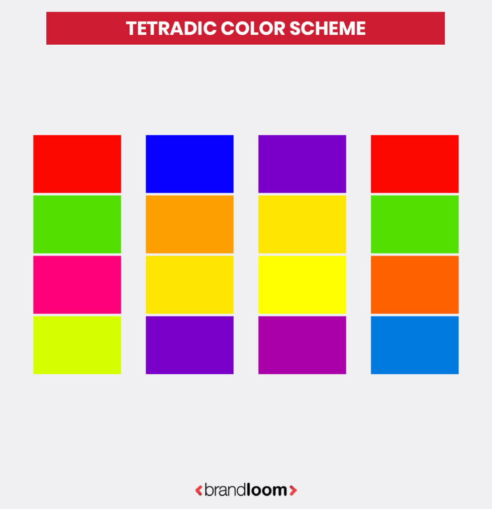
6. Tetradic Color Palettes
Tetradic or double complementary palettes comprise four colors. These are considered to be the richest color schemes, with two complementary color pairs making up the palette.
Tetradic color schemes are difficult to balance. It uses one dominant hue, with the other supporting colors being subdued. If all colors are given equal importance, the scheme may look dissonant.
There are two types of 4 color combinations possible :
Rectangular
One color dominates. On the color wheel, the other three colors are located 60 degrees, 180 degrees, and 240 degrees away from the dominant color, respectively.
Square
In which the three secondary colors are 90 degrees apart from the base color. Square color schemes offer more variety. While challenging to execute, they can result in arresting imagery.
Google’s logo is an excellent example of a tetradic color scheme in use.
Here is an example of a Tetradic Color Scheme:
7. Hexadic Color Scheme
These utilize two sets of triadic color schemes. They are 6-color palettes, with hues evenly spaced on the color wheel. Hexadic color palettes are the most varied of all color schemes. You can create a vibrant, experimental, and complex aesthetic with this kind of scheme.
However, while they allow variety, hexadic color schemes can often feel overwhelming. A good designer finds that perfect balance between vivacity and professionalism when deploying a hexadic scheme.
Think of brands that use almost all major colors- red, blue, green, yellow, and purple. The end effect is often flashy, which is why almost no brands use a pure hexadic scheme. The closest may be the NBC peacock logo. In real life, designers use one or two dominant colors and the rest as support.
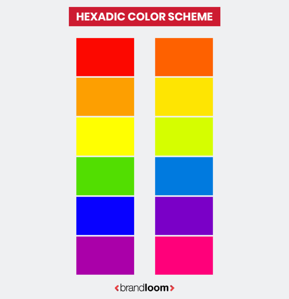
Here is an example of a hexadic color scheme:
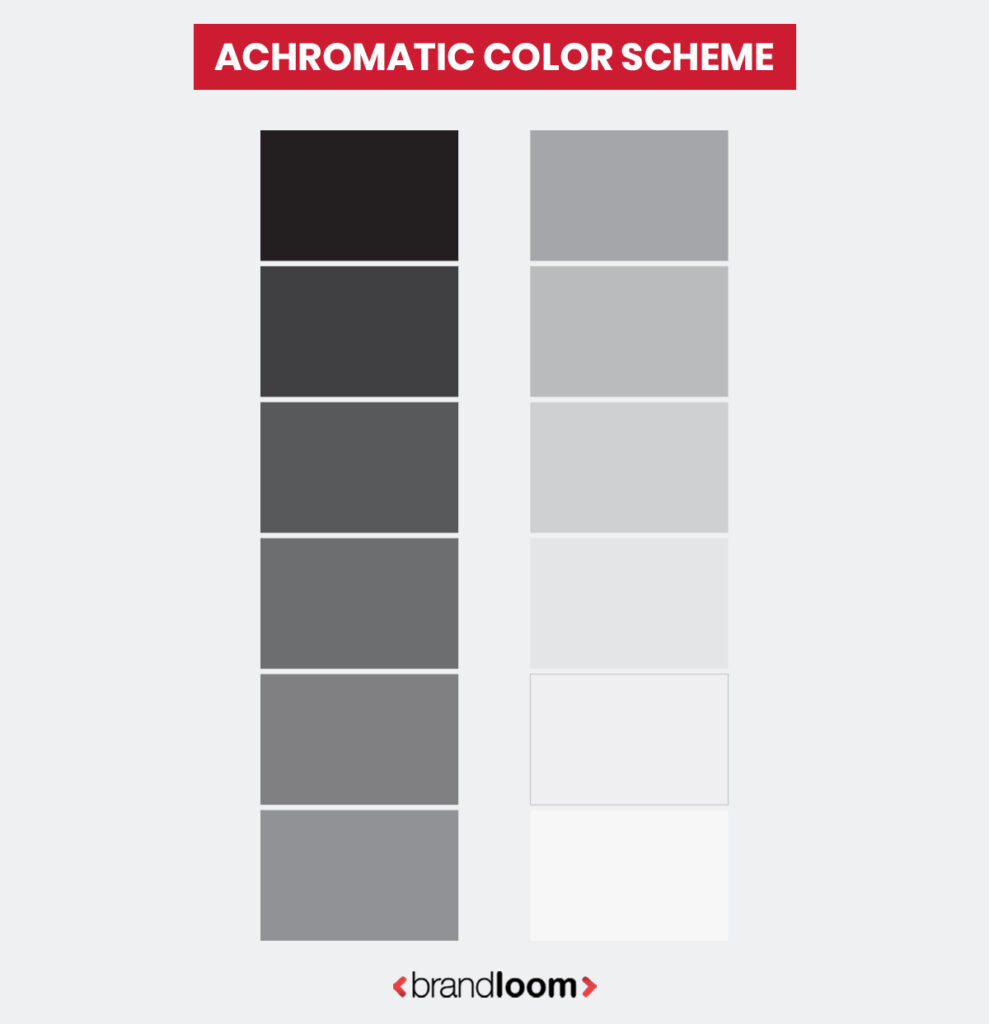
8. Achromatic Color Scheme
And finally, we come to the classic, neutral color combinations or the achromatic color schemes. Any color that lacks an intense hue or is unsaturated is called an achromatic color. So think of black, white, greys, and beiges.
Black and white is the most popular achromatic scheme. The biggest of brands, that boast of prestige and cult followings, usually follow achromatic schemes. Think of the aesthetics of Apple, Chanel, Nike, or Mercedes-Benz.
Achromatic color schemes are evergreen, chic, and sophisticated, but can limit creative expression. They often create a retro effect, which doesn’t gel with youth-focused brands.
Here is an achromatic color palette for reference:
Now that you know about the different types of color schemes, you can have a fair idea about what can suit your brand. For example, for a youthful, vivacious brand, it’s best to go for complementary, tetradic, or hexadic color schemes.
On the other hand, if your brand screams “old money” or luxe vibes, it’s best to go with a more minimalistic or sophisticated achromatic or monochromatic palette.
So, what about creating a custom color palette for your brand?
Creating and Deploying a Custom Color Scheme
Custom color palettes are complicated to make because they require a lot of research, a strong sense of aesthetics, and sharp strategizing about the brand’s identity. However, if you want to create a truly unique and creative brand identity, the best color palette for you is a custom one.
A custom color palette does not follow any rules, so you can let your creativity fly high. You can interpret your brand as you want, or freely express yourself. However, you still must take heed of the rules of applying color theory in graphic design, because at the end of the day, they help you craft an aesthetic that’s harmonious and balanced.
Creating Color Schemes: Common Mistakes to Avoid
When you create your brand’s color scheme, you must make sure it is logical, aesthetic, and strategic. Unfortunately, many brands fall prey to bad color schemes because designers fail to check for blind spots in their approach.
Here are a few pointers to keep in mind:
1. Overcomplicating Color Schemes
This is the biggest trap brand owners and designers fall into. When they lack direction or a clear vision for the brand, they tend to think, “more colors = better design.” This results in chaotic color palettes- often with seven or eight hues.
Not only does it confuse audiences, it makes your brand look amateurish and unsophisticated. Choose 2-3 main colors, along with a couple of accent colors. Remember, clarity and simplicity are your besties here.
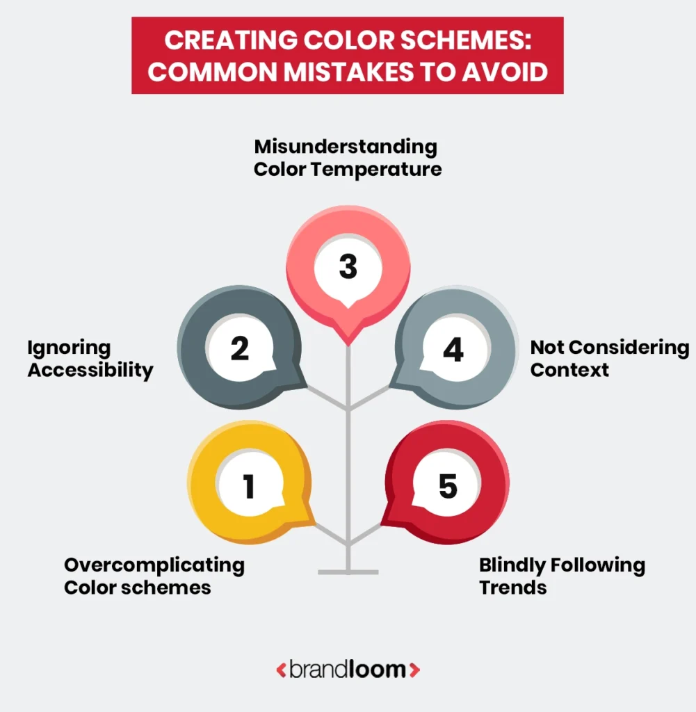
2. Ignoring Accessibility Standards
This is a very costly mistake. Sometimes, you may be so wrapped up in your idea of the brand that you ignore practical concerns like proper contrasts. This may lead to illogical color schemes that make text unreadable and effectively alienate audiences with visual impairment.
Vet your color scheme before you deploy it and test it out. There are many tools that can help you understand proper contrast ratios- use them to fine-tune your palette.
3. Not Considering Color Context
Colors behave differently depending on what surrounds them. That perfect blue you chose might look completely different on a white background versus a dark one. A bright red sofa may make the grey walls against it look green. Always test your colors in their actual environment—on your website, business cards, or packaging before you start designing your brand collaterals.
4. Misunderstanding Color Temperature
Mixing warm and cool colors without intention creates visual tension. Cool blues and greens feel calming and professional, and are suitable for brands that want to project serenity. On the other hand, reds and oranges feel energetic and urgent, and may be more suitable for food-related businesses. Choose your temperature based on the emotion you want to evoke, and use it consistently.
5. Copying Trends Without Purpose
Just because the comic book yellows and greens are trending doesn’t mean they are right for your law firm’s logo. Remember the time when everything was sepia tinted? The fad ended, and we completely forgot the brands that made it their identity.
Trends come and go, but your brand must be timeless. Instead of following trends, choose colors that align with your brand values and target audience. A strategic palette will serve you better than constantly chasing what’s fashionable.
Now that you have an idea about how color schemes work- let’s look at some real-life examples of how they are deployed.
Practical Applications of Color Schemes in Marketing Design – Case Studies
R3set: A Brand Identity Design Case Study
Venus Remedies wanted to rebrand their legacy pain relief solution, Trois. The aim was to reposition it as a premium brand. The product promised to provide pain relief, revive the body, and rejuvenate the spirit with regular application.
The star ingredient for it was the oil of wintergreen. We drew inspiration from the eponymous fruit and created a complementary red and green color scheme, paired with sophisticated neutrals of black and white.
The result was a refined brand look, with premium appeal.
Complementary Color Scheme with Neutral Colors For Premium Brand Identity Design
Employer Branding for Sriram Transport with Space Design
Here, you can see how interior design color schemes work. Sriram Transport Finance, a leading NBFC with a legacy of over four decades, wanted to revamp its office spaces to better reflect its modern, forward-thinking identity. We redesigned key areas such as reception zones, meeting rooms, and cafeterias using branded storytelling walls, consistent pillar design, and motivational artwork.
Since this was an interior design brand design project, we designed the new branding elements to fit harmoniously with the existing color context of the spaces in question. The transformation led to a more connected workforce, improved internal engagement, and a stronger employer brand appeal — especially among younger professionals.
Office Space Revamp For Employer Branding : Deploying Color Schemes According to Context

Website Design Case Study: Bringing a Human-Centric Technology Brand To Life
In this case, you can see how to choose a color scheme for a website. A3logics, a full-service IT company with two decades of experience, sought to reinvent itself. We completely repositioned it as a Hero Archetype brand that embodies speed, security, and reliability- dedicated to crafting human-centric technology.
A complementary color scheme with blue and shades from the orange color reflected its dynamic personality. We crafted a sleek website and distinctive visual style to illustrate its high-impact nature.
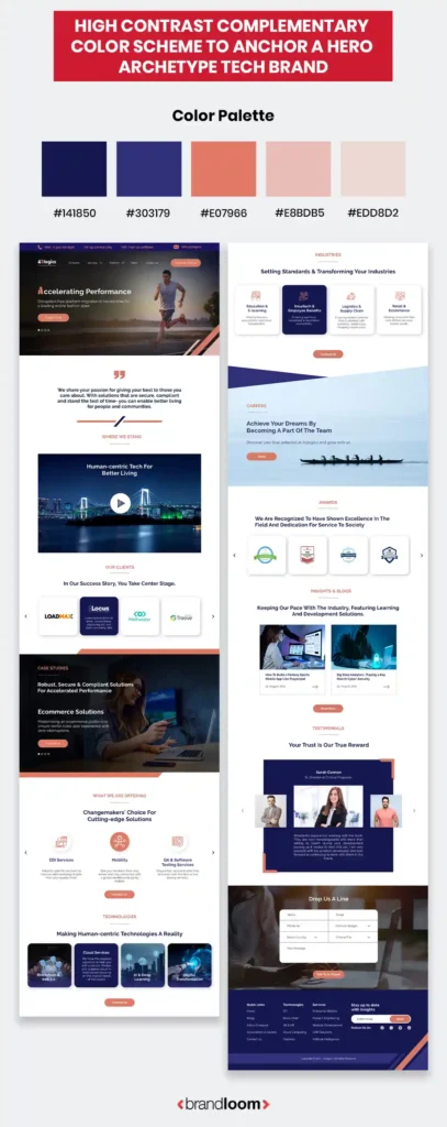
High Contrast Complementary Color Scheme To Anchor A Hero Archetype Tech Brand
Color Palette
Website Layout
As you can see, the intelligent use of colors can help you craft perceptions and influence the actions of your target audience. The color schemes you choose for creating your brand’s look and for designing its essential elements (like logo, website, packaging, collaterals, etc) must be strategic and logical.
With a solid understanding of color theory and how the color wheel works, brand owners and designers can create color palettes that appeal to their audiences and effectively communicate with them.
The best way to design your brand’s color palette is to start by looking at existing types of color schemes- achromatic, monochromatic, complementary, analogous, triadic, split complementary, tetradic, and hexadic. Once you understand how they work, you can decide which suits your brand the best.
Of course, the key is to not overcomplicate your color scheme, chase trends, or overlook color context when designing your color scheme. How do we know? Because we have followed this approach to help our clients with different types of marketing designs to achieve their goals.
At the end of the day, your brand’s color palette is a crucial part of its identity and is an essential tool for audience communication. If you want to create one that fits your brand perfectly, talk to the best brand design consultants.
FAQs:
Color theory is basically the science and art of using color in a way that feels balanced and appealing. It helps us understand how colors interact, how they affect emotions, and how they combine to create visually engaging results.
In branding or marketing, we utilize color theory to create color schemes that reflect the brand’s promise and personality, and communicate with its audiences.
Keep in mind, color theory is deployed purposefully- beyond making a brand “look nice.” The best way to create a color scheme is to entrust the task to good brand designers who know how to apply color theory effectively.
There are three main aspects to color theory. Designers follow different systems for organizing and understanding color: the color wheel, color harmony, and color context.
The color wheel maps out primary, secondary, and tertiary colors in a circle so you can easily see how they relate. This makes it easier to find combinations for brand color schemes.
Color harmony is all about finding pleasing groupings or pairings of colors, like complementary or analogous colors. And then there’s color context, which looks at how a color changes depending on what it’s paired with or placed next to. For instance, white might take on an aqua tint when placed next to bright blues, while a grey wall against an orange painting can look bluish.
These three theories together help designers and artists make smart, intentional color choices.
The “color theory rule” refers to a set of guidelines or principles for choosing harmonious color combinations. The most common one is the 60-30-10 rule, often used in interior and graphic design. It suggests using a dominant color for 60% of your palette, a secondary color for 30%, and 10% for the raccent colors. This keeps things balanced, and designers can use them skilfully to direct the viewer journey as intended.
Determining which shades can comprise your color palette and how you can deploy them to achieve your objectives is best left to good designers, like those at BrandLoom.
When people refer to the “7 types” in color theory, they’re usually talking about seven types of color schemes derived from the color wheel. These are:
Monochromatic : variations of a single color.
Complementary: colors opposite each other.
Analogous: colors next to each other
Triadic: three evenly spaced colors
Split complementary: a base color plus two adjacent to its complement
Tetradic: two sets of complementary pairs.
Hexadic: six colors or two triadic color sets.
Achromatic: Palettes made of “neutrals” or colors with low saturation, like blacks, greys, whites and beige.
Each of these create different moods and suit different types of brands. You can refer to these predefined color schemes to build custom brand palettes.
The color wheel is a design tool that organizes colors according to their relationships. It starts with three primary colors—red, blue, and yellow—and expands to include secondary and tertiary colors. It is a foundational tool in design, art, and fashion.
Designers use the color wheel to build color schemes that feel intentional and balanced. Want a high-energy look? Go for complementary colors from opposite sides of the wheel. Need a more calming, unified feel? Try analogous colors like blue and green that sit side by side.
If you want to create a color scheme for your brand, you must understand how the color wheel works.
Primary colours are the foundation of all other colours—they can’t be created by mixing different hues. In traditional color theory (used in optics, art, and design), the three primary colours are red, blue, and yellow. These are the building blocks, and when you mix them in pairs, you get secondary colours.
Secondary colours are created by mixing two primary colours:
red + yellow = orange,
blue + yellow = green
red + blue = purple.
Tertiary colours are made by mixing a primary with a neighboring secondary colour. Think of shades like red-orange, yellow-green, and blue-purple.
Together, primary, secondary, and tertiary colours form the basis of the color wheel and help designers build harmonious brand color schemes.
Complementary color schemes utilize colors that are opposite each other on the color wheel, such as blue and orange or red and green. Think of Mozilla Firefox or Mountain Dew logos.
Complementary palettes are high contrast, which creates a strong impact. Bold and attention-grabbing- you can deploy complementary colors to highlight sales or CTAs.
Analogous color schemes utilize colors that sit next to each other on the color wheel, such as blue, blue-green, and green. These are used to create subtle color palettes, perfect for creating a calm, cohesive feel. Think nature color palettes or elegant, minimalist branding
The temperature of colors is determined by the grey undertones they have.
Warm colours like red, orange, and yellow tend to feel energetic, inviting, and stimulating. They can create a sense of enthusiasm or urgency. That’s why they’re often used in fast food branding or quick commerce (think of McDonald’s or Blinkit). These shades pop and are great for action-driven elements like “Buy Now” buttons.
In contrast, cool colours like blue or green have a calming, relaxing effect. They’re associated with trust, stability, and professionalism—often used by banks, healthcare, and wellness brands. Designers use cool tones to create balance and space.
So if your brand is promising scrumptious, spicy dining, go for a warm color palette. But if your brand promises clarity or purity, go for cooler color schemes. To understand what suits YOUR brand best- talk to the best brand design consultants.
As the name suggests, a triadic color scheme comprises three colors. These have to be evenly spaced on the color wheel—like red, yellow, and blue, or purple, green, and orange. Depending on the chosen colors, triadic color schemes can be vibrant and well-balanced. They are widely used because they are colorful and harmonious.
Triadic color palettes are great for brands that are dynamic and full of life. Often, one color acts as the dominant shade while the other two play supporting roles. If you want to deploy a color scheme smartly to resonate with your audience, talk to India’s top design agency.
Contrast is everything in design. How colors contrast against each other on your chosen palette will determine the visual personality of your brand and influence viewer emotions. High-contrast colors like black and white or red and yellow are eye-catching, while muted colors like moss green and fawn brown will have a more earthy, grounded effect.
Carefully deployed, contrasting colors create separation, focus, and hierarchy. This helps you guide a viewer’s attention to specific elements like a headline, button, or logo. Contrast also plays a key role in accessibility. Ensuring text stands out from the background helps everyone, especially those with visual impairments get a smooth brand experience.
Tints, tones, and shades can add depth and flexibility to your color scheme. A tint is created by adding white to a color, making it lighter or softer—great for airy or minimal designs. A shade is made by adding black, which darkens the color and gives it a more dramatic or moody feel. A tone is a mix of both black and white (or gray), muting the original hue and making it feel more balanced or sophisticated.
You can use just a couple of base colors to build a complete palette. The best use of this concept is found in monochromatic or achromatic color schemes. The sophistication of the Mercedes logo is a great example.
So if you want your brand to reflect a more artistic and refined identity, deploy tints, tones and shades effectively. And if it feels overwhelming, leave it to India’s top design agency.
Colour psychology looks at how different colours influence human emotions and behaviour. For example, reds can evoke passion, energy, or urgency, while blues feel calm, trustworthy, and stable. These associations aren’t random—they’re deeply rooted in both cultural meaning and evolutionary responses.
By using colour psychology correctly, you can influence buying decisions or invoke certain moods in your customers. Want your product to feel eco-friendly and fresh? Go with green. Need your app to feel reliable and professional? Blue’s your best friend.
Of course, it goes much deeper than this. If you want to resonate with your audiences and influence their behavior, choose your color scheme carefully. Talk to experienced brand designers to know more.
Today, you can find many good tools for creating your brand color scheme. Here are some popular ones:
Adobe Color : The designers’ favorite; it lets you explore various harmony rules like triadic, complementary, or analogous schemes and see how colors work together instantly.
Coolors : User-friendly tool that helps generate palettes with just one click. Lets you lock colors as you shuffle others.
Canva’s Color Palette Generator or Colormind are excellent picks, too.
However, the best way to achieve your custom color scheme is to entrust it to a reliable brand design agency that combines human intuition and creativity to create something truly unique and wonderful. Try it with BrandLoom’s award-winning team.