Redesigning Prestige: How Rotary News Went Fully Modern – A Case Study
Rotary India is a prestigious name, as the organization that has been synonymous with humanitarian work, community development, and youth empowerment in the country. With its many chapters and its many activities, Rotary India needed its news website to provide all relevant information to stay transparent and keep all stakeholders informed. Having already partnered with BrandLoom for redesigning the Rotary India website, the brand decided to entrust us with another one of their prestigious platforms, and we couldn’t be happier.

The Challenges
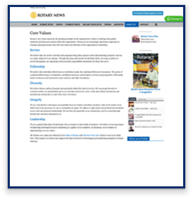
The existing Rotary News website had many issues, which neither reflected the brand’s prestige nor made it easy for visitors to get a sense of what was happening.

Clunky, Cluttered Design
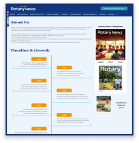
The site looked outdated and did not do justice to the brand’s rich legacy and reputation. It was also too crowded.

Overwhelming Information
While the site had a lot of information, it was scattered everywhere and often buried under piles of unnecessary materials. This made it difficult for visitors to find what they needed.

A Non-Intuitive, Non-User-Friendly Site
The site was neither easily navigable nor responsive, which put visitors off and created a subpar brand experience.
Understanding the Assignment
When we came into the picture, we knew that we had to make sure that we had to create a website befitting the brand’s image. These were our objectives to focus on:
A Website Reflecting The Brand
The website had to look modern, clean, prestigious, and inviting- in line with what Rotary stood for.
User-friendly and Modern Design
Issues included – difficult navigation, outdated product pages, and inconsistent content.

Making the Browsing Experience Engaging
Make the website user-friendly, responsive, and engaging so that users have a memorable brand experience.
Our Step-by-Step Strategy
Once the goals were clear, we knew what to do. Our aim was to create a website that was modern, functional, informative, and user-friendly. So this is how we went about it:

Thorough Site Audit
We identified and eliminated redundant or duplicate content, navigation gaps, and missed opportunities for engaging visitors.

Full Website Redesign
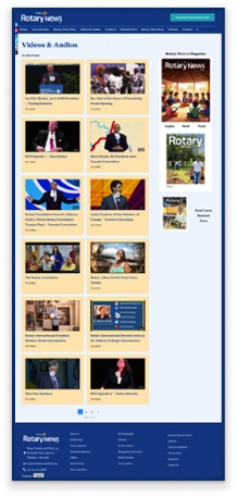
We revamped the website completely- with a modern interface, intuitive navigation, and clearly organized information.

Streamlined Content Flow
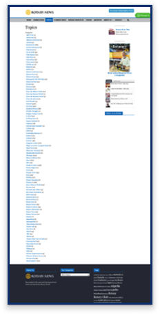
We reorganized content- creating groups of related information and topics so that visitors could easily find what they were looking for.

Highlighted CTAs
Earlier, the CTA buttons did not look clickable. We made them clear and clickable, and placed them strategically to direct the user journey smoothly.

Overhauled Pages
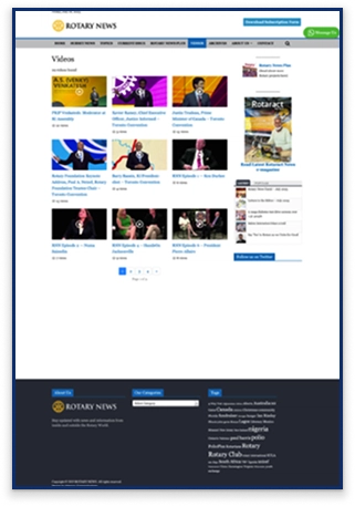
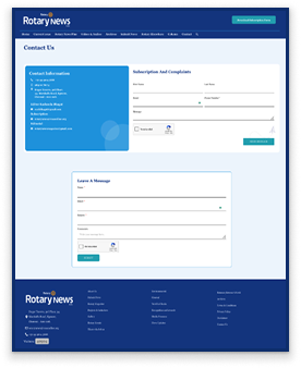
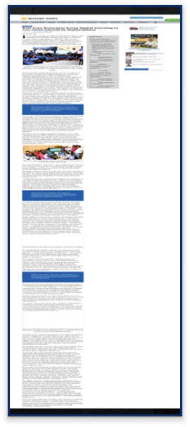
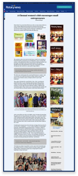
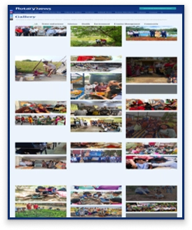
We redesigned Home, Current Issue, Video & Audio, and Archives pages, added new Column and Gallery pages to spotlight editorial and visual content, refined Category, Submit News, and Contact pages, and made the site more mobile responsive.

The Results
The Rotary India News site makeover was a huge success.

Modern & Polished Look
The revamped site was the perfect representation for a prestigious brand like Rotary- modern, timeless, and inviting.

User-friendly and Clear Navigation
With clear, intuitive navigation and organized information, visitors, donors, and volunteers could easily find relevant information.

Higher Engagement
With a refreshed look and easily navigable site, more viewers started engaging with the brand- and spent more time on the site.
Conclusion
BrandLoom’s Rotary India News site redesign was exemplary. It reflected Rotary’s timeless values, rich legacy, and inviting personality effectively. The visitors also walked away with a superior brand experience. The new website ensured that every visitor, donor, and volunteer connects with the spirit of “Service Above Self.”
Take A Sneak Peek
Before

After

Before

After

Before
After
Before
After
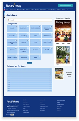
Before
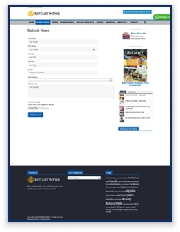
After
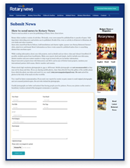
Before
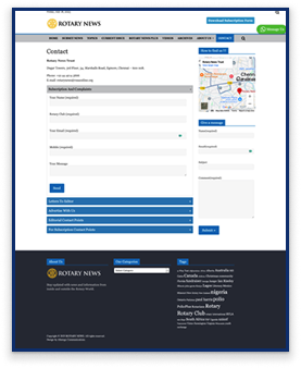
After
Before
After
Before
After

