Have you ever clicked on a website and left in five seconds? You’re not alone. Most users bounce when a site feels slow or hard to use. First impressions matter, and online, they happen in milliseconds. The same applies if you own a business website.
A good-looking website isn’t enough anymore. If people can’t find what they need, they’ll leave fast. That’s where user experience (UX) steps in. It’s not just about colors and fonts. It’s about how easy your site is to use, how quickly it loads, and how well it guides users from point A to point B.
Your design either invites people in or pushes them away. That’s why user experience isn’t optional. It’s the secret sauce behind longer visits, higher clicks, and more sales. With the best web design tips and assistance from a web design agency like BrandLoom, you can nail the Ux/Ui of a website.
Great website design is about removing friction. Every click, scroll, and swipe should feel natural. So let’s explore some useful design tips that improve user experience.
Website Design Tips: Understanding User Experience (UX) in Web Design
When someone visits your website, they usually don’t care how smart your tech is. They care about one thing: how easy it is to use. That’s what user experience (UX) is all about. It’s the feeling people get when they scroll, click, and move through your site. If it’s smooth, they stay. If it’s hard, they leave.
Now let’s clear up a common mix-up. UX is not the same as UI. UI stands for User Interface. It’s the buttons, colors, fonts, and layout. It’s what people see. UX is what people feel. Think of it like this – UI is the look, UX is the walk. A beautiful site that’s hard to use will still fail.

This is why UX is the backbone of a successful website. Even if your branding is strong, poor UX can kill conversions. Users must know where to click, what to read, and how to take action. If they struggle, they won’t come back. You want them to enjoy the journey, not feel stuck in a maze.
To fix that, focus on effective website design tips. Make things simple. Keep your site fast. Use clear words. Guide users, don’t confuse them. Smart UX needs smart visuals too, so don’t ignore UI design tips. Clean buttons, readable text, and mobile-friendly layouts matter. If you follow these website design tips, your users will stay longer and buy more.
Website Design Tips: How Do Users Think?
Think of users like shoppers in a store. They walk in, look around quickly, and grab the first thing that catches their eye. It’s the same on a website. People don’t read everything first. They just scan the page. If something looks useful or interesting, they click. If not, they leave.
1. Users Don’t Scroll, They Scan (Unknown Website Design Tip)
Most users won’t scroll slowly or read line by line. They jump around. They’re hunting for something clickable. And if they don’t find it fast, they hit the back button. That’s why smart website layout design tips focus on keeping things simple, clear, and easy to find.
2. Content Beats Fancy Design (Unbelievable Website Design Tip)
One thing matters more than fancy graphics: content. People stay on websites that have good, helpful content even if the design isn’t perfect. That’s why some old-looking sites still get tons of traffic. If you want more visitors, focus on quality. This applies to all websites, even business ones. Want people to trust you? Start with strong content and smart company website design tips.
Now here’s what else you need to know. Users want control. They don’t like lots of surprise pop-ups or new windows opening without warning. They want to go back and forth easily. So, don’t overdo the fancy stuff.
Whether you’re working on a food brand or a café, follow clean restaurant website design tips and avoid clutter. And when it comes to graphics, keep your banners simple—use clear text, one main message, and strong visuals. That’s the best way to apply website banner design tips that actually work.
Essential Elements of Website Design Requirements
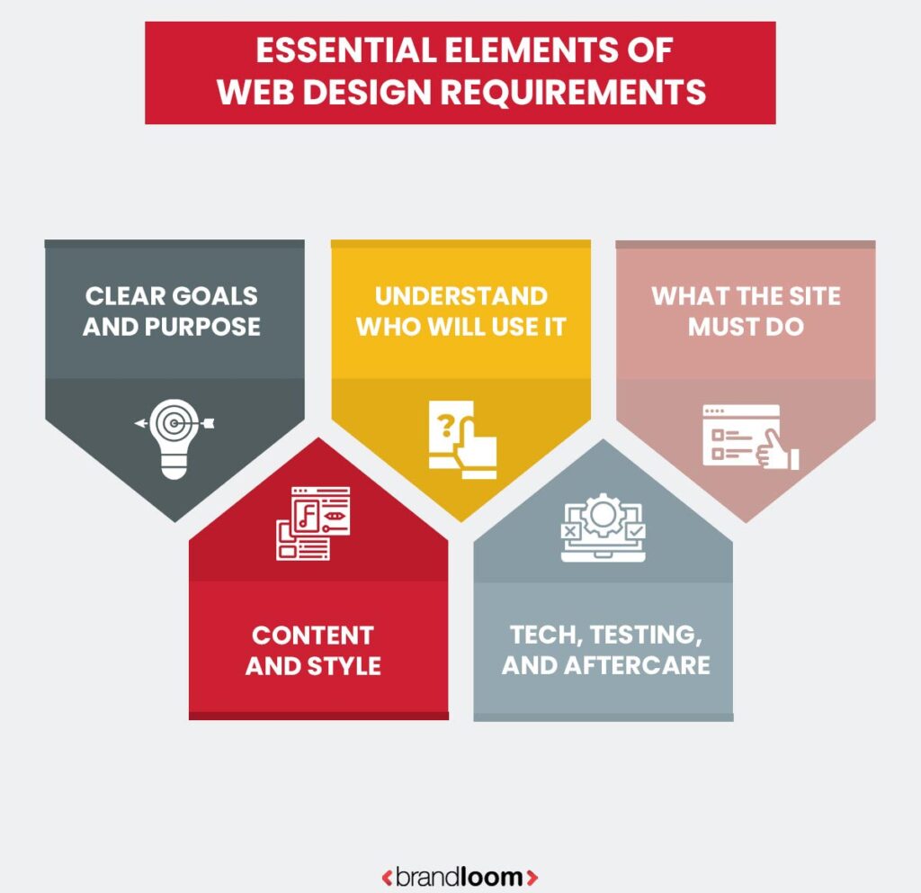
Before you start building a website, there’s one thing you need—clarity. You must know why you’re building it, who it’s for, and what you want it to do. This section breaks down the must-have parts of a good web design plan.
1. Clear Goals and Purpose
First, ask: What is this website for? Is it to sell, educate, build trust, or collect leads? Set clear goals. Know your audience. A site made for college students will look and feel different from one made for working moms or B2B clients. These choices shape every design move. These are some of the best website design tips most people skip.
2. Understand Who Will Use It
Create user personas. These are sample profiles of the people who will visit your site. What do they need? What problems are they trying to solve? Once you know that, you can design pages that help, not confuse. This step is often skipped, but it’s one of the smartest tips on website design and layout.
3. What the Site Must Do
List every feature the site needs. Maybe it’s an online store, a booking system, a blog, or even a chatbot. These are your functional requirements. Then, list the background things that matter: page speed, mobile responsiveness, accessibility, and security. These are non-functional requirements, but they’re just as important. This is where good seo website design tips make a difference, too.
4. Content and Style
Decide what kind of content you’ll use. Will you need 50 product photos? A blog section? Videos? Make sure your design supports all of it. Also, set rules for the look of the site—colors, fonts, layout, and image style. These keep things consistent. These tips for designing a website layout help make the user journey smoother and less confusing.
5. Tech, Testing, and Aftercare
Pick your tools – will you use WordPress, Shopify, or code it from scratch? List browser and device requirements too. Then, plan how you’ll test it before launch and what happens post-launch. Who updates the site? Who fixes bugs? How will you track if it’s working? Setting performance metrics and a maintenance schedule is key.
Easy Things That Make Your Website Work Better
A website isn’t just about looking pretty. It’s about helping users find what they want without confusion. Whether it’s for a game, a store, or a company, these small changes can make a big difference.
If you’re looking for solid website design tips and tricks, start with these. They work across the board from ecommerce website design tips to game UI design tips and everything in between.
1. Don’t Make People Guess
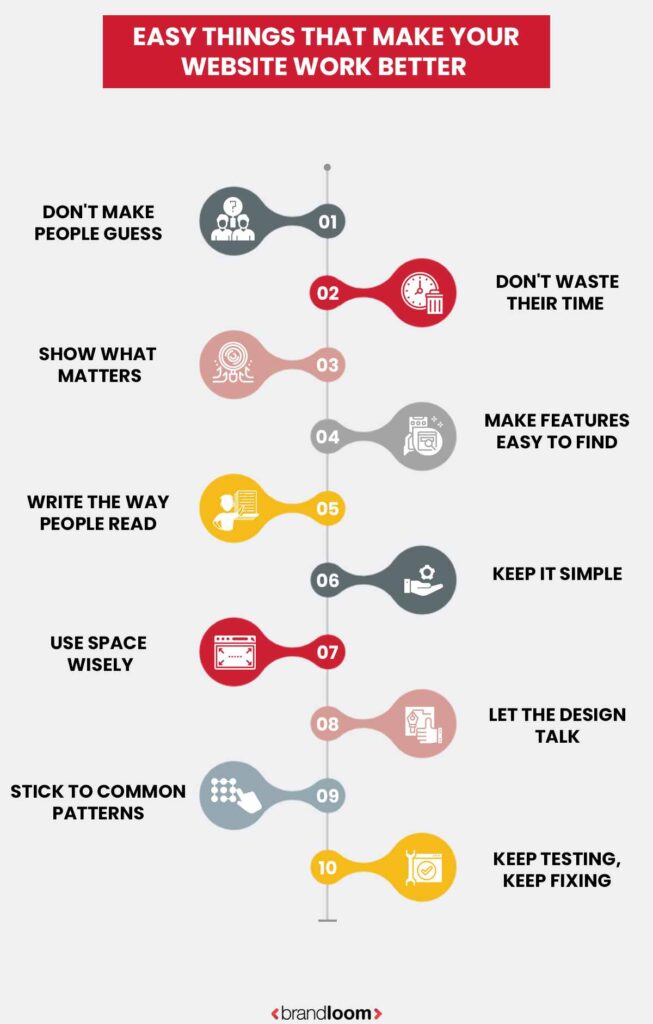
Visitors should know what your site is about within a few seconds. That means clear headlines, obvious navigation, and smart layout. Don’t let them wonder what a button does or where a link goes. If they have to think too much, they’ll leave. Often, most people don’t read every word – they scan. So make it easy to spot what they need.
If your UI design tips and tricks make life easier for the user, you’re on the right track. Keep your homepage clean, use simple language, and stick to familiar words. Use visuals and calls to action that make sense. If you’re a store, show your products up front. If you’re a service, highlight the benefits. Make your pitch instantly clear.
2. Don’t Waste Their Time
People are impatient online. If you make them wait or jump through hoops just to try your product, they’ll bounce. Let them explore your site or test your service without a full sign-up process. Only ask for an email or extra info once they’ve seen value. This is especially true in ecommerce website design tips let shoppers browse before forcing them to register.
Keep forms short. Only ask for what’s really needed. Quick, no-fuss access builds trust. Add social login options or guest checkouts to make it even easier. If people feel they’re being rushed or trapped, they’ll leave. Simplicity keeps them in.
3. Show What Matters
Important things should stand out. That could be a call-to-action button, a special deal, or a key feature. Use contrast, color, and size to make those items pop. But don’t go overboard. A clean design with clear focus works better than flashy distractions.
Game UI design tips often use highlights or animations to guide users – apply the same logic to your website. Direct their attention where you want it. Show one core offer or feature per page. Don’t clutter with too many messages. Highlight user benefits. Prioritize what’s in it for them, not just what you’re offering.
4. Make Features Easy to Find
Your website should not feel like a treasure hunt. Put your best stuff up front. Whether it’s services, features, or pricing, make sure it’s visible and clickable. Don’t bury it under three menu levels. A good layout helps people know what they can do on your site right away.
That’s one of the strongest website design tips and tricks – visibility breeds engagement. Label your buttons clearly. Group things that belong together. Use icons and headers to break up space. Think like a first-time user. What would you want to find in 10 seconds? Put that where they’ll see it.
5. Write the Way People Read
Most online readers are skimmers. They glance at titles, bolded text, and lists at first. So ditch the fancy language and focus on clarity. Keep sentences short. Use bullets and subheadings to help them navigate. And get to the point fast.
In all UI design tips and tricks, clarity in text is just as important as clarity in layout. Use everyday words. Cut the jargon. The faster they understand, the faster they act. Break long paragraphs into two or three lines. Make your message scan-friendly, like a social feed. Your text should be so easy, a 10-year-old could follow it.
6. Keep It Simple: Most Ignored Website Design Tip
More content doesn’t mean more value. In fact, too much can drive people away. Don’t overload your pages with unnecessary text, images, or features. Focus on what matters. The “keep it simple” rule is a core part of all ecommerce website design tips, and for good reason. Simple sites load faster, work better on mobile, and keep users focused. Every extra element should earn its spot. If it doesn’t help the user, remove it. Don’t chase trends that confuse users. Choose clarity over cleverness. Clean design always wins in the long run.
7. Use Space Wisely
White space helps users breathe. It gives your content room to stand out and reduces visual clutter. You don’t need to fill every inch of the screen. In fact, empty space helps guide the eye and create order. That’s why so many UI design tips and tricks emphasize spacing.
It’s not wasted space – it’s design strategy. Use it to group related items, separate ideas, and highlight key parts. It makes your site feel modern and calm. Let sections breathe. Avoid stacking everything close together. A good layout is 50% content, 50% space.
8. Let the Design Talk
Design isn’t just decoration. It’s how you communicate. Use layout, typography, and visuals to guide users through your site. Make buttons look clickable. Keep fonts consistent. Use colors that align with your brand. This is especially important in game UI design tips, where visual cues help users understand what to do next.
Your design should tell a story – what’s important, what’s next, and where to go. If the design talks clearly, the user doesn’t have to guess. Every visual element should have a purpose. Icons, colors, and spacing should all help the user move forward.
9. Stick to Common Patterns
You don’t always need to reinvent the wheel. People are used to certain layouts – menus at the top, logo on the left, cart icon on the right. Stick to these patterns unless you have a very good reason not to. It makes your site feel familiar and easier to use. That’s why even creative ecommerce website design tips recommend following standard formats.
Conventions lower the learning curve and make users feel at home. Don’t fight habits, use them. Familiarity helps users act faster. It’s not boring, it’s user-friendly. Predictable navigation keeps people from getting lost.
10. Keep Testing, Keep Fixing
Don’t wait until launch to test. Start testing as early as possible. Ask friends, teammates, or even strangers to use your site and see what they struggle with. Fix what confuses them. Then test again. This loop is what makes great websites better over time.
According to smart website design tips and tricks, one early test is more valuable than dozens later. Testing doesn’t need to be fancy, just real users doing real tasks. That’s how you improve. Keep watching analytics. Run A/B tests. Learn what works, then do more of it. A good site is never really finished—it’s always evolving.
Common Webpage Design Mistakes to Avoid
A beautiful website doesn’t always mean a successful one. Many websites look great but fail to deliver results. That’s usually because of simple mistakes in structure, content, or usability. If you want to create a strong online presence, here are the biggest traps to avoid, especially if you’re looking for website design tips for beginners.
1. Ignoring the User Experience (UX)
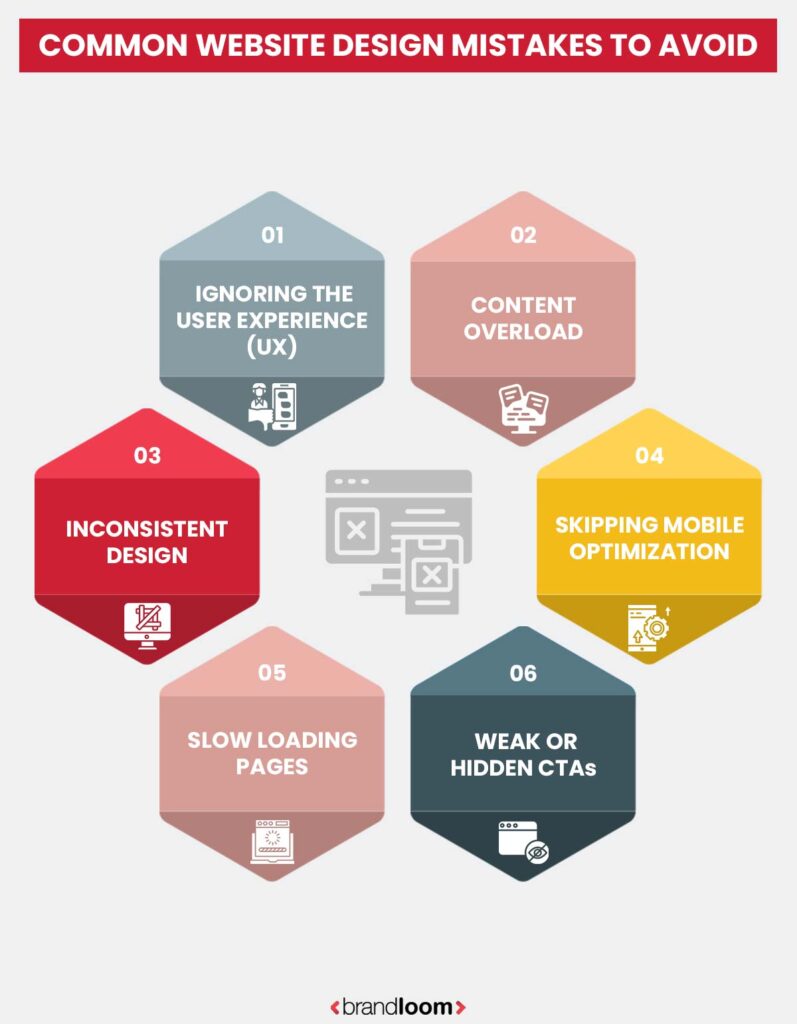
This is one of the most common (and costly) errors. Some websites focus too much on flashy visuals and forget about function. No one wants to scroll endlessly trying to find a menu or button. Good design should be easy to use without a learning curve.
Tips for good web design, like WordPress website design tips and Wix website design tips, often emphasize user-friendly templates for this reason. Always prioritize smooth navigation, simple menus, and clear paths for users to follow. This improves trust and helps users stay longer.
2. Content Overload
Less is more. When users land on your page and see a wall of text or too many images, they tune out. Clear, short paragraphs with helpful subheadings work better. Use bullet points or icons when you can. This is one of the key website design tips for beginners—structure your content for scanning.
Think about what matters most to the user. Focus on relevance, clarity, and what action you want them to take next.
3. Inconsistent Design
A mix of colors, fonts, and layouts can confuse visitors and make your brand feel unprofessional. Consistency creates trust. Whether you’re using WordPress or Wix, stick to a single visual theme throughout the site – consistent colors, font styles, and a clear design language.
Your website should feel like one brand, not five stitched together.
4. Skipping Mobile Optimization
Many beginners build for desktops only, forgetting that most people visit from phones. If your text is too small, buttons are hard to tap, or the layout breaks, users will leave fast. One of the most essential website design tips for beginners is to test your site on different screen sizes.
Choose mobile-responsive themes (especially in WordPress or Wix) and regularly check how the site works on both Android and iPhone.
5. Slow Loading Pages
Speed matters. This is not just a user issue; it affects SEO too. Compress images, reduce unnecessary plugins, and use good hosting. These WordPress website design tips can save you time and traffic.
Remember: faster sites get more views, better rankings, and higher conversions.
6. Weak or Hidden CTAs
A call to action (CTA) tells users what to do next—sign up, book a call, buy now. If your CTAs are buried or unclear, users get confused and leave. Use bold buttons, simple wording, and place them where the eye naturally goes.
Conclusion: Best Website Design Tips
Avoiding common website design mistakes is the first step to building a high-performing site. A clean layout, strong CTAs, fast load times, and mobile-friendly design can make or break user engagement. Whether you’re updating an old site or starting fresh, the right guidance matters.
That’s why many businesses choose a professional web design company in India like BrandLoom. With expertise in UX, SEO, and responsive design, BrandLoom helps you create a website that not only looks good but also performs. If you’re serious about growth, don’t just settle for any design – build one that drives results.
Frequently Asked Questions
The 7 core principles of user experience design are useful, usable, desirable, findable, accessible, credible, and valuable. A good website layout applies these consistently. The goal is to create a site that serves a purpose, is easy to use, and builds trust with users.
From structure to visual elements, every part should help users achieve their goals quickly. Failing to apply these principles can frustrate visitors and drive them away. With the best web design company in Mumbai like BrandLoom, your website can be both stunning and user-friendly—built to impress and convert.
To boost user experience, make sure your web page is easy to navigate and loads fast. Reduce clutter, write clear content, and use relevant visual elements that help users, not distract them. A responsive design that works across all screen sizes is essential.
Test your layout with real users to catch hidden problems. Use clear CTAs and accessible menus. Follow design tips like keeping forms short, using white space, and prioritizing important info. When you partner with a top web design company in Bangalore, such as BrandLoom, you get a site that works beautifully across devices and drives real results.
The 5 golden rules of web design are: keep it simple, make it intuitive, focus on content, ensure responsiveness, and maintain consistency. These rules help build a web page that users can trust and navigate easily.
Simplicity in design layout means fewer distractions and more clarity. Intuitive flow allows users to find what they need quickly. Great content adds value, while responsive design ensures access across all screen sizes. Lastly, consistency in fonts, colors, and layout keeps the experience smooth. Follow these rules to meet users’ expectations and create a more effective website.
The 4 C’s of website layout are Clarity, Consistency, Content, and Conversion. Clarity means every part of your design should be easy to understand. Consistency ensures that navigation, colors, and fonts stay the same throughout the site.
Content must be useful, relevant, and high quality. Finally, Conversion refers to guiding users to take action, whether it’s a sign-up or purchase. These four C’s help create a layout that looks good and performs well. With BrandLoom, one of the best web design companies in Pune, you get more than design—you get a growth-focused digital presence.
User experience (UX) in web design refers to how people feel when interacting with your site. It includes how easy it is to navigate, how quickly they find what they need, and how pleasant the experience is overall.
A good UX keeps things clear, fast, and intuitive. It blends functional design layout with helpful content and smooth interactions. From color choice to button placement, every part of the site affects how users engage. Sites with strong UX meet users’ expectations and keep them coming back. In short, UX determines whether visitors stay or bounce.
More users now access websites via phones or tablets. If your site doesn’t adjust to different screen sizes, it can ruin the user experience. A mobile-responsive design adapts your web page layout, images, and buttons for smaller screens, making it easier to navigate and interact.
This matters not just for users but also for search engines like Google, which favor mobile-friendly sites. Without mobile responsiveness, users may leave quickly, hurting engagement and conversions. Ensuring that your site works well on all devices is no longer optional—it’s critical to meet modern users’ needs.
Page speed is a major factor in user experience. A slow-loading web page frustrates users and increases bounce rates. Research shows that even a delay of one second can lower satisfaction and conversions. To improve load times, optimize images, reduce unnecessary scripts, and use caching tools. Faster sites also rank better on search engines.
A quick-loading website feels smoother, keeps users engaged, and supports better performance across all screen sizes. Good design isn’t just about looks; speed is a key part of making your site useful and enjoyable for visitors.
Accessibility ensures your web design is usable for everyone, including people with disabilities. A site should support screen readers, use strong contrast, and offer keyboard navigation. These features improve user experience for a wider audience.
Accessibility also boosts your brand image, shows inclusiveness, and meets legal requirements. From headings to visual elements, every part of the layout should be easy to understand and interact with. Prioritizing accessibility doesn’t just help a few—it improves usability for all users and keeps your site aligned with universal design tips and standards.
To test user experience, start with usability testing. Ask real users to complete common tasks and observe their behavior. Check if they can find information easily, complete forms, and navigate without help. Use analytics to track bounce rates, session times, and click paths. Heatmaps also reveal what people focus on.
Check how your design layout performs across screen sizes and browsers. Collect feedback through surveys or live chat. If users find your site easy and enjoyable to use, you’re on the right track. Testing is key to refining your web design for better results.
Avoid cluttered layouts, hard-to-read fonts, and poor mobile support. Don’t sacrifice clarity for flashy visual elements. Failing to optimize images or ignoring page speed slows down your site and drives users away. Weak navigation, unclear CTAs, and inconsistent design frustrate visitors. Neglecting accessibility leaves out many users. Skipping testing can hide serious flaws.
These mistakes damage your user experience and hurt your rankings on search engines. To improve UX, follow proven design tips, stay user-focused, and test often. A clean, helpful, and fast website makes a lasting impression.

